+ Interiors
A Victorian Semi Gets a Lift
+ RAISE THE ROOF BEAMS
Elias + was approached by a young couple who needed more living space for their growing family. Buying a larger home was out of the question given the increased cost of Toronto real estate. It made more financial sense to renovate the home they had been in for seven years.
In order to do this we had a three-branched strategy.
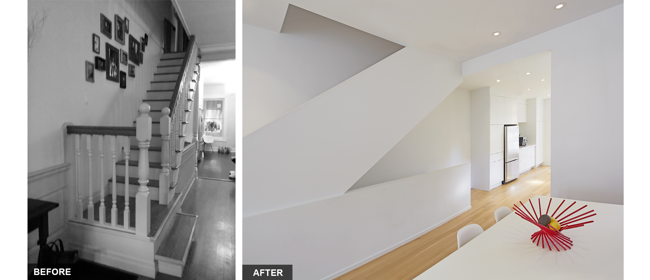
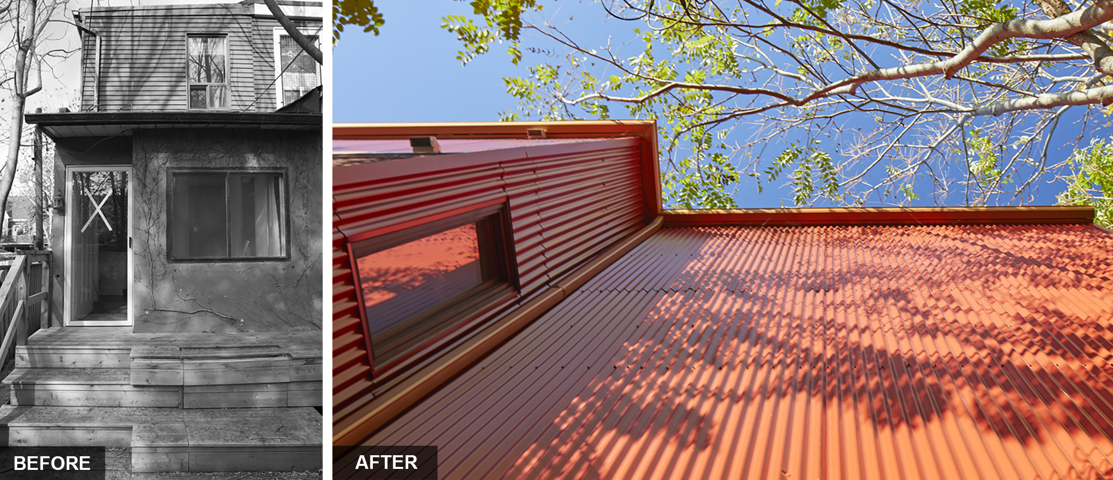
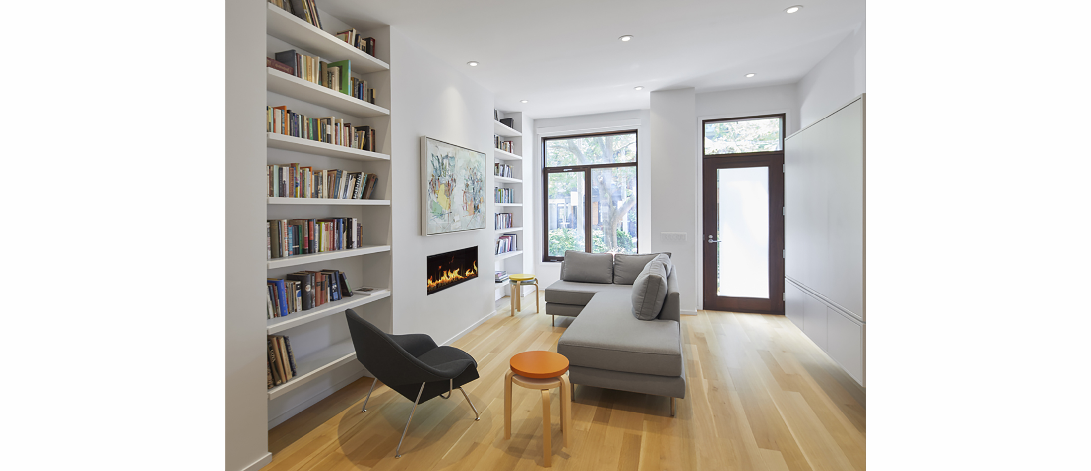
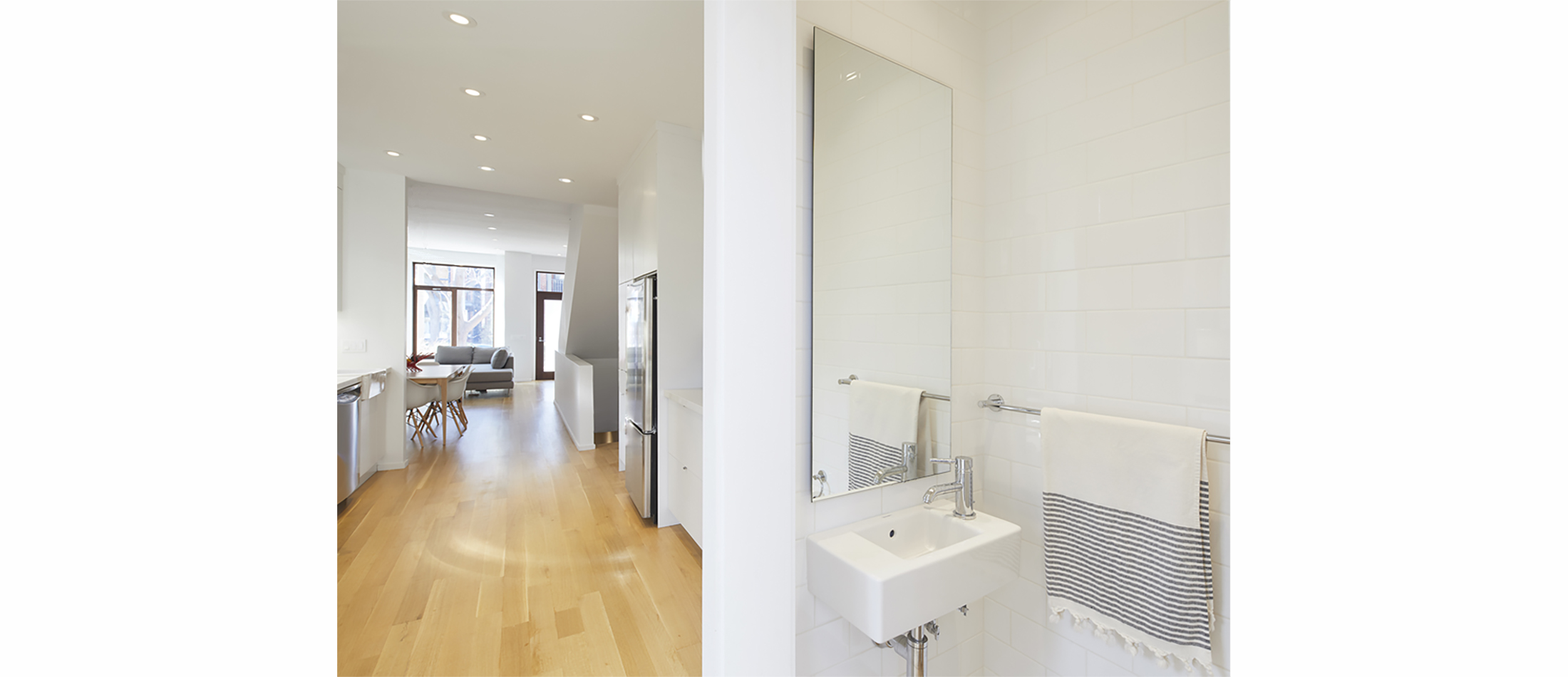
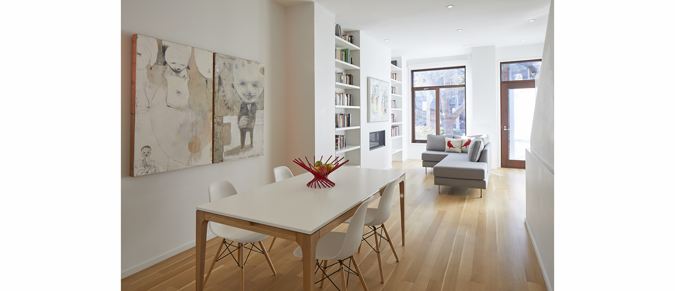
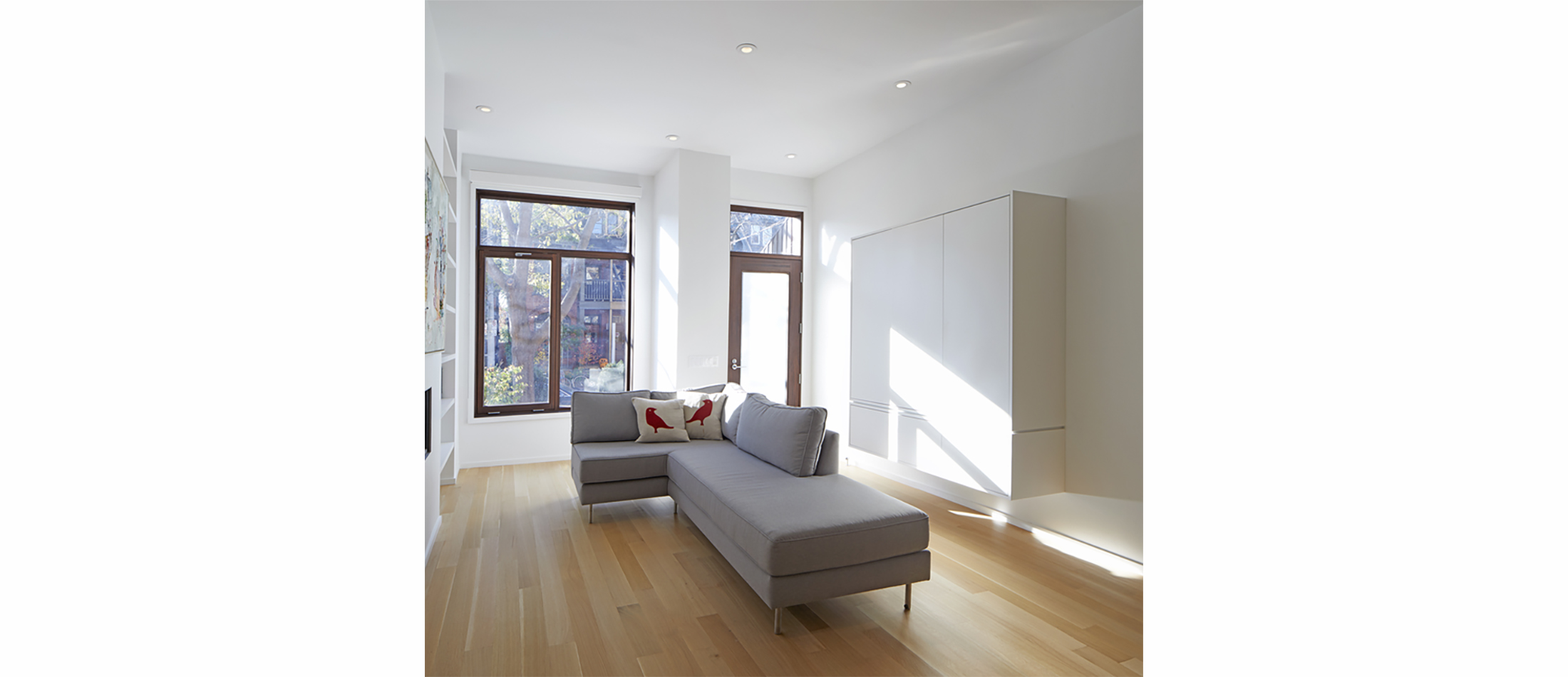
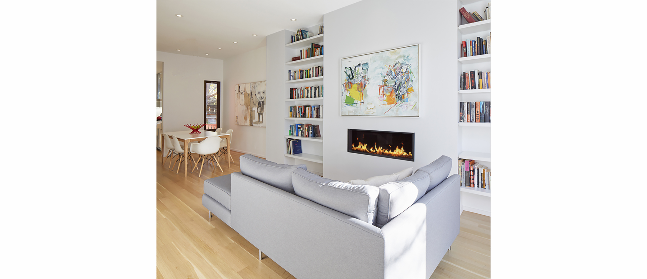
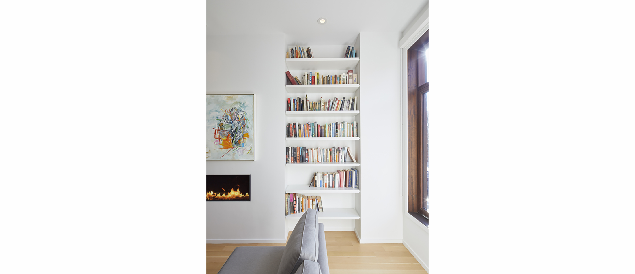
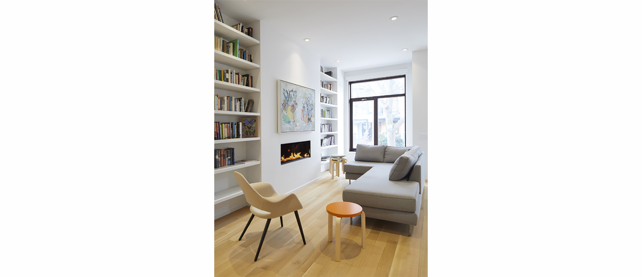
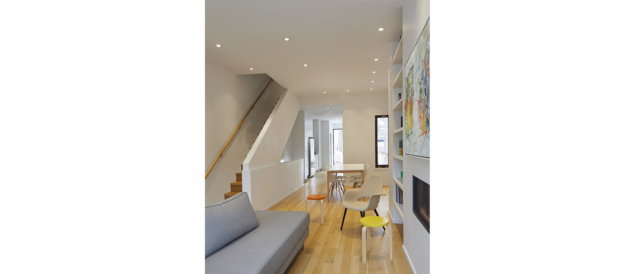
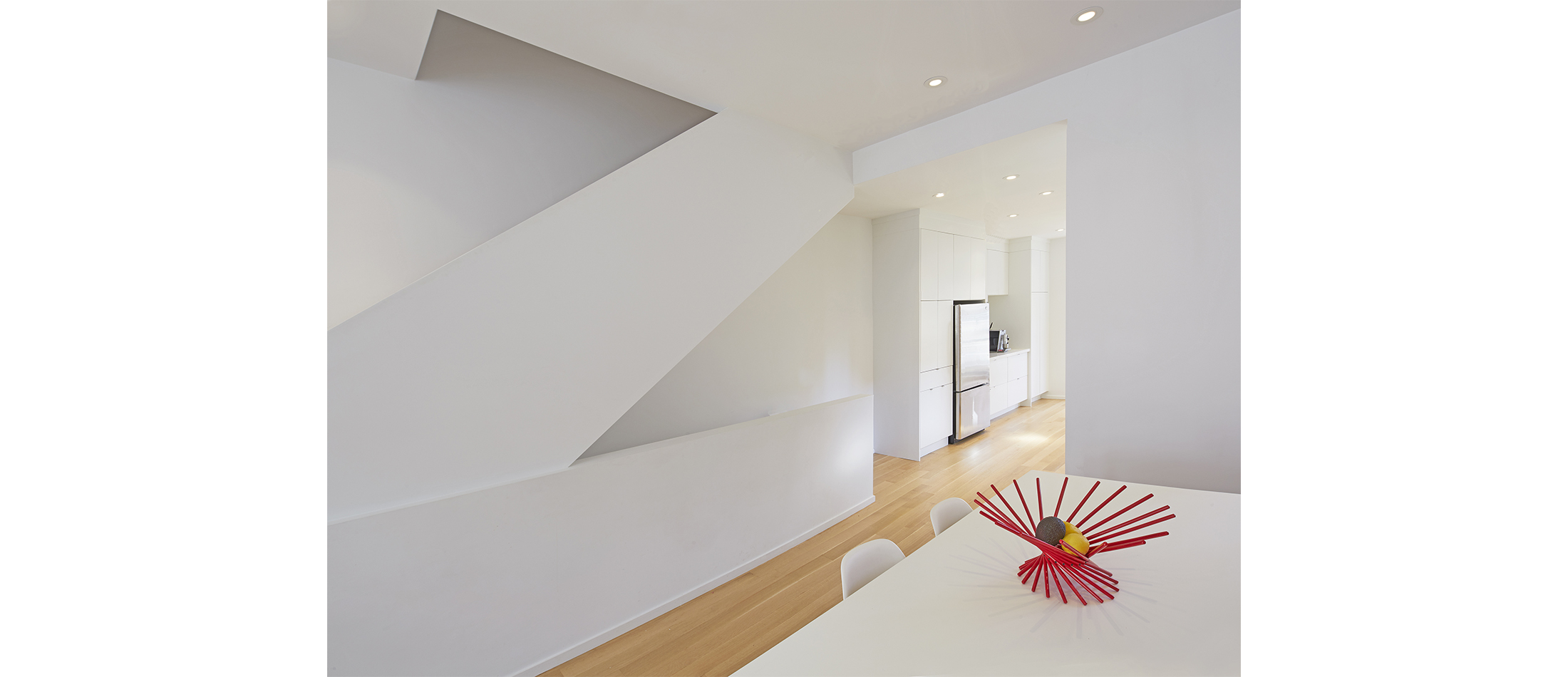
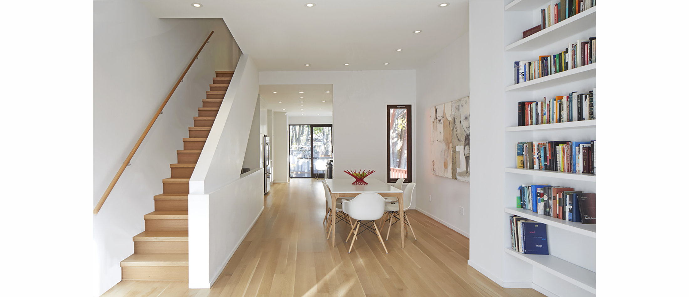
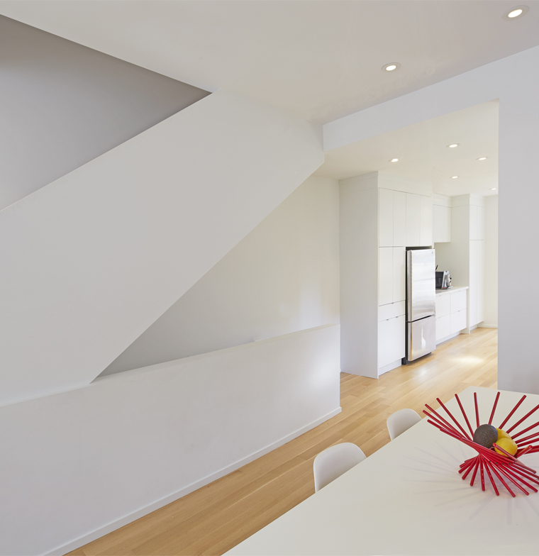
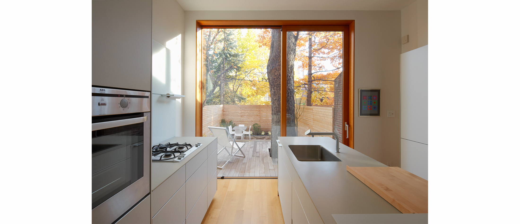
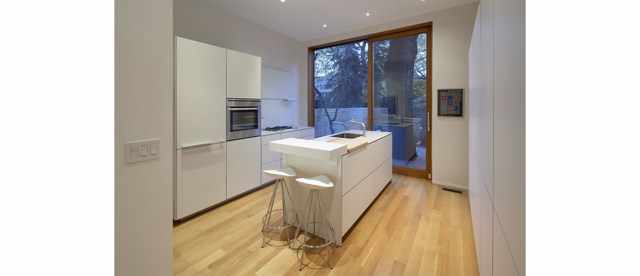
The first branch was to open the interior, unify common areas into an open plan, and raise the home’s roof forming a third story master suite. This allowed us to create a bright airy open space. A two story addition increased the square footage to include a new powder room and expand the back of the first floor to flow into the garden via sliding doors. This let light penetrate the formerly dark kitchen area.
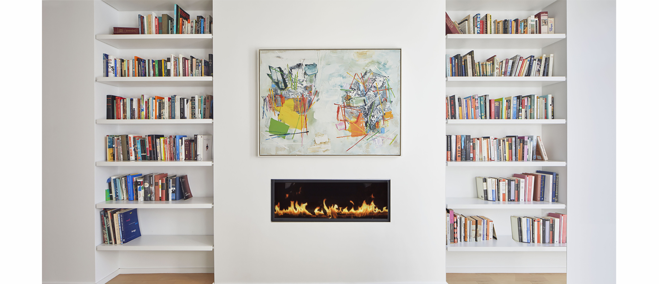
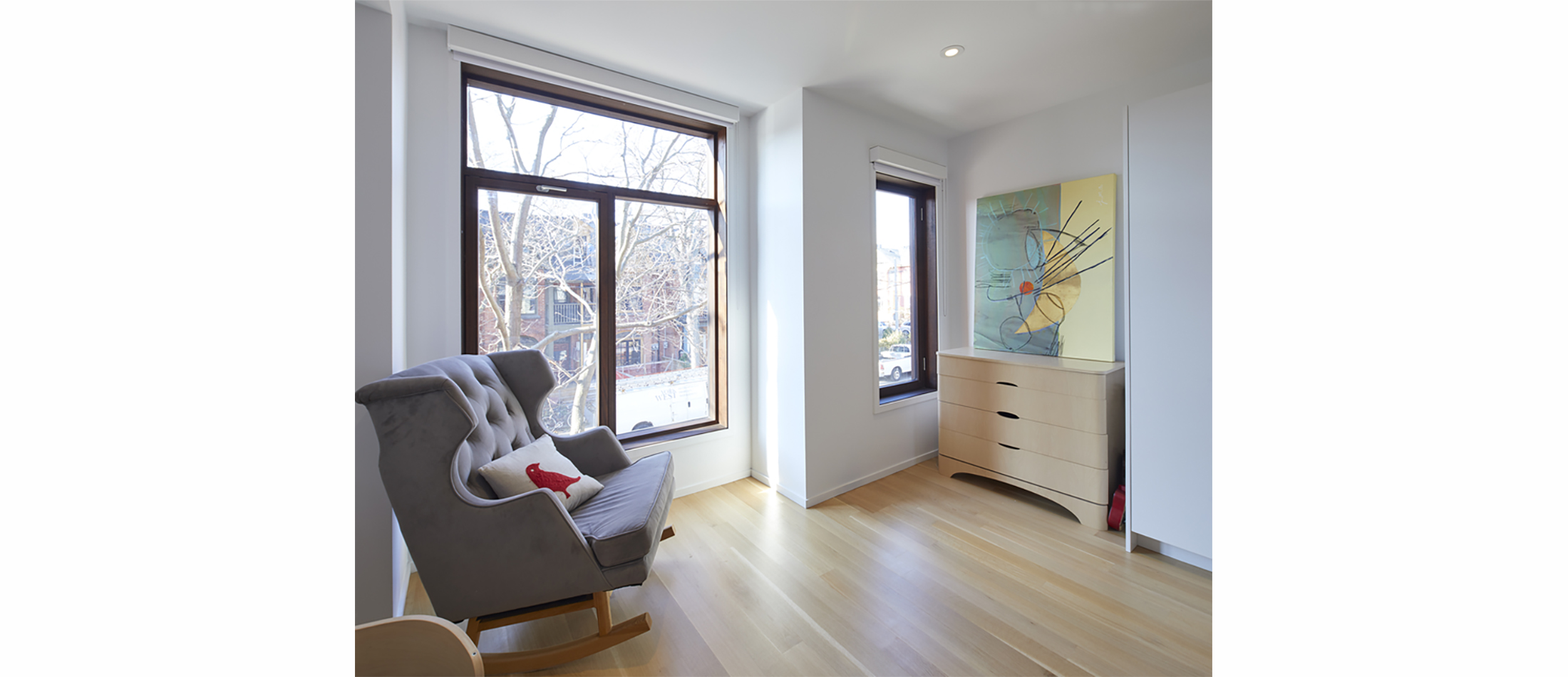
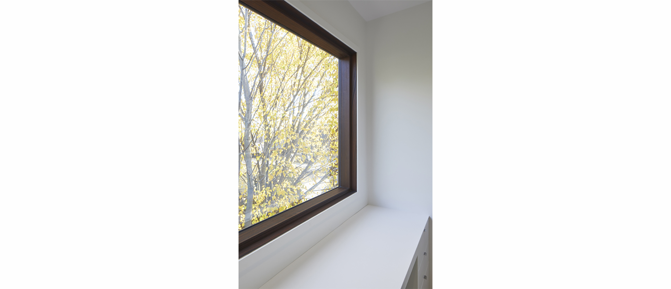
Minimalist detailing replaced deteriorated neo-traditional wainscoting, crown molding and baseboards. Doors and windows, previously diminished by framing and mullions, were replaced with large expanses of glass, maximizing light penetration.
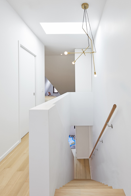
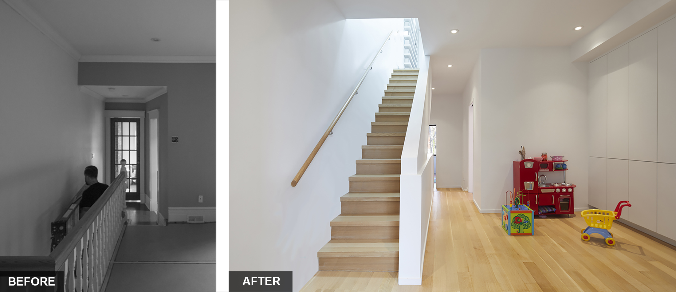
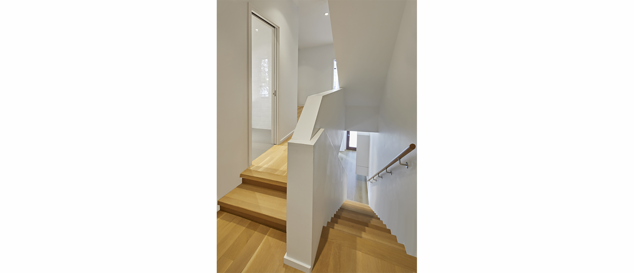
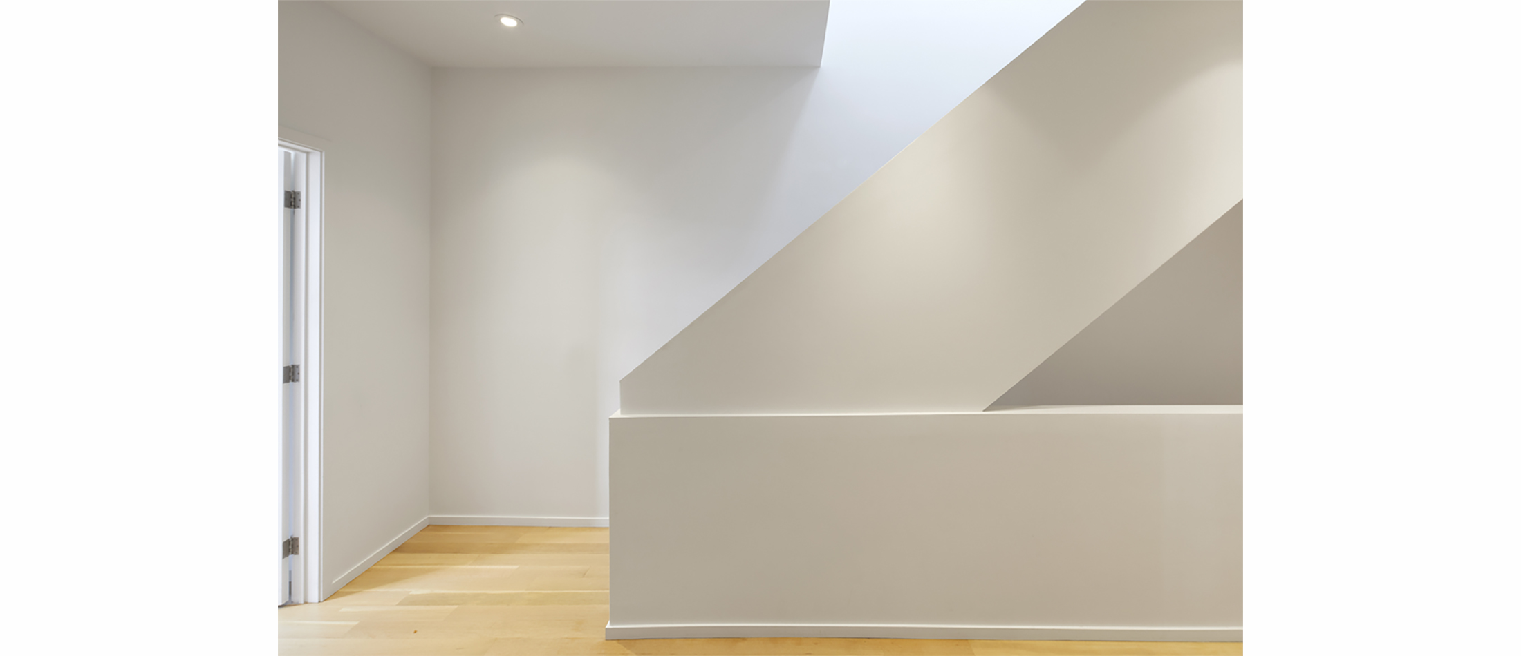
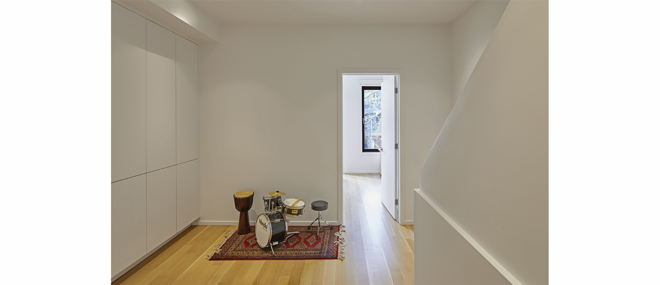
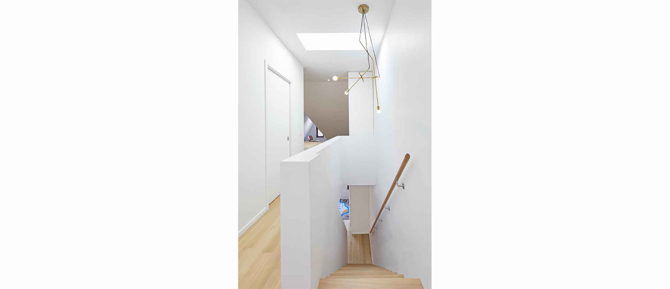
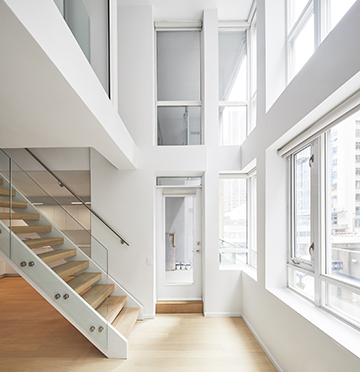
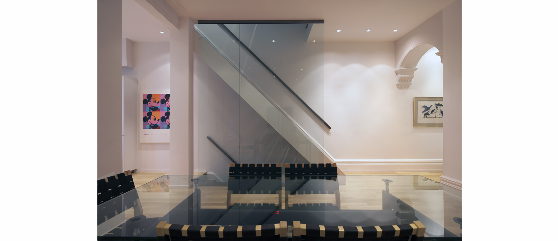
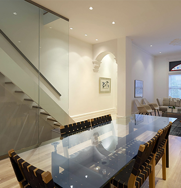
A newly designed contemporary staircase became a sculptural element and unifying device for all three levels.
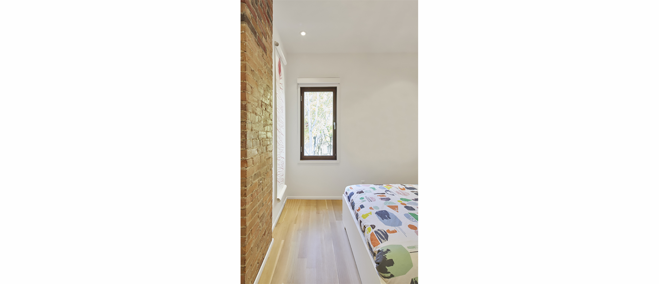
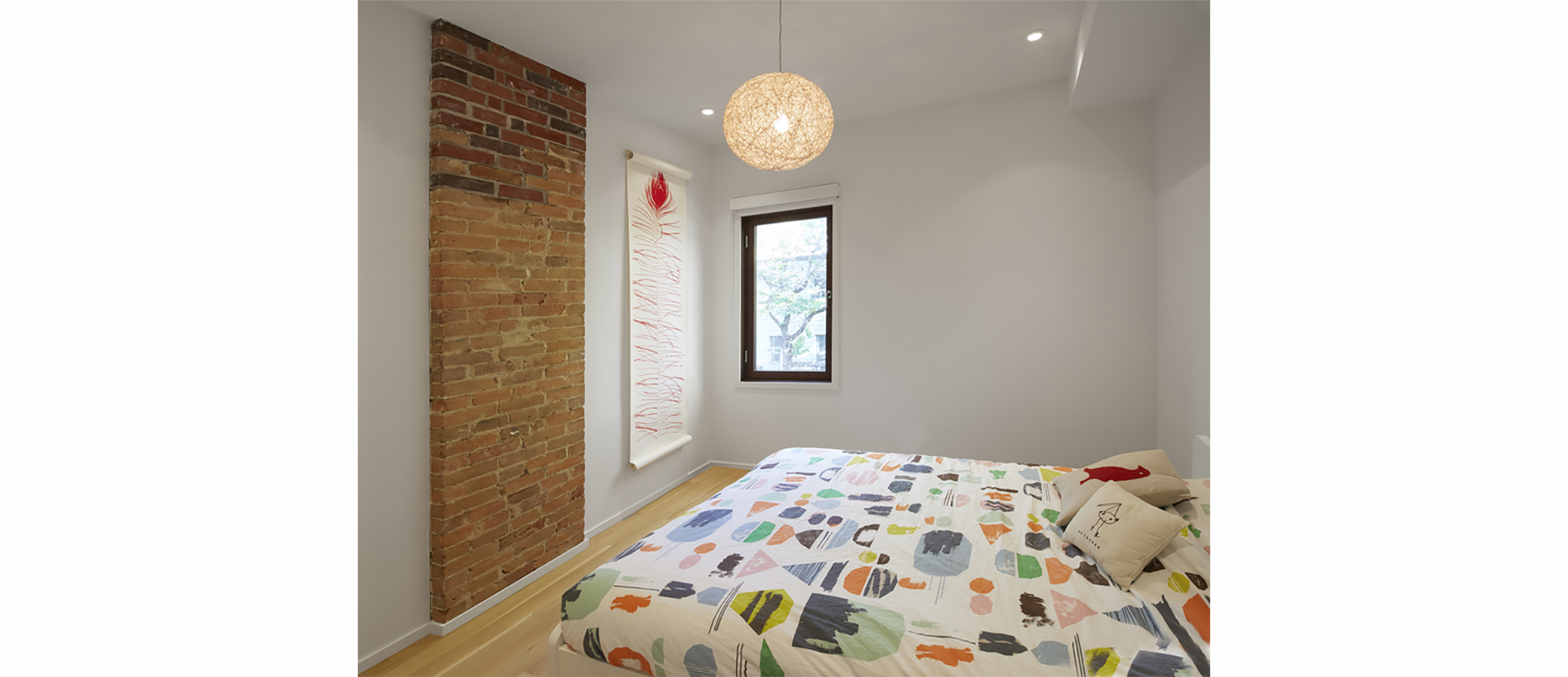
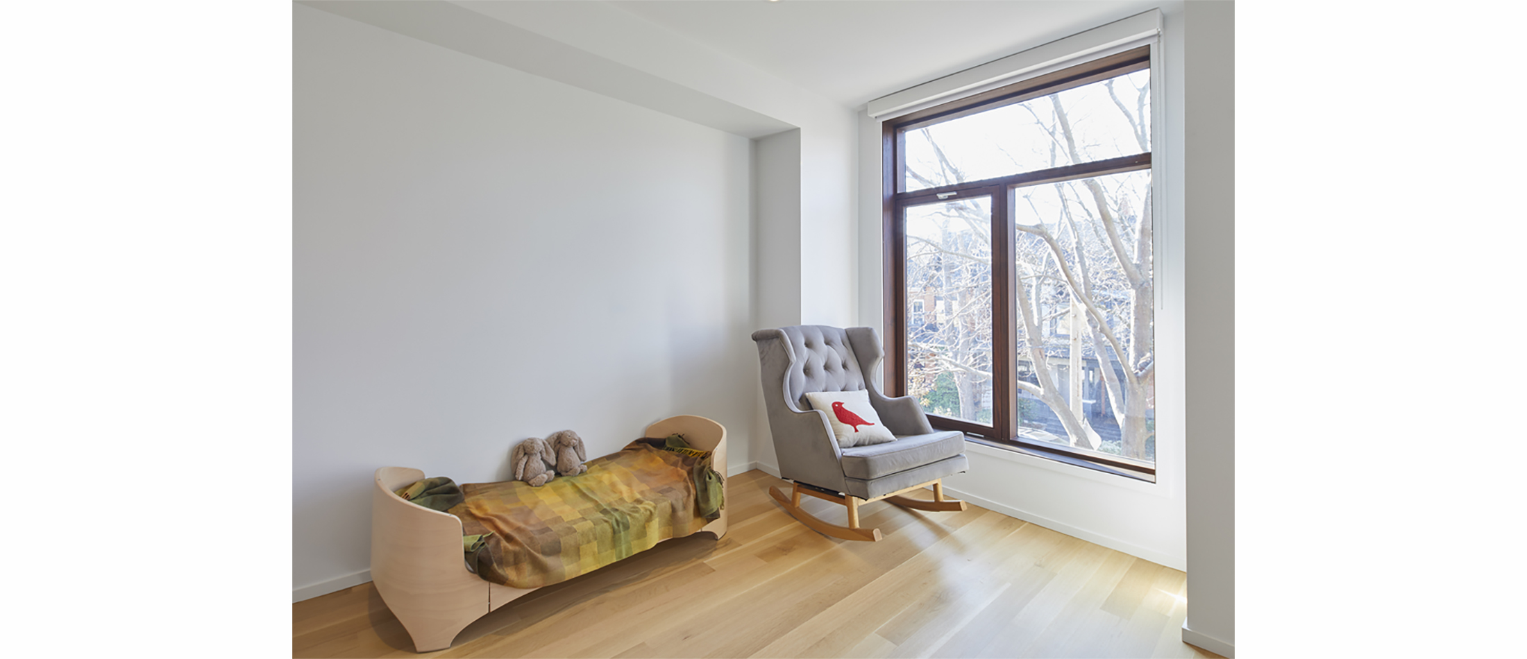
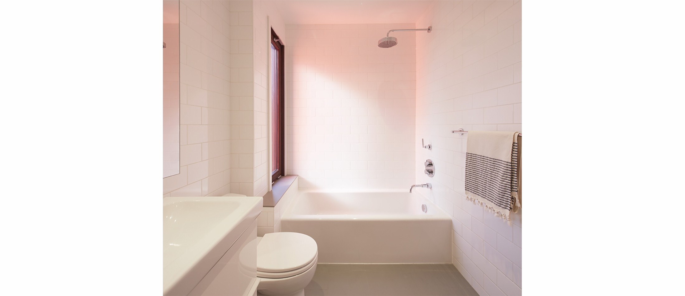
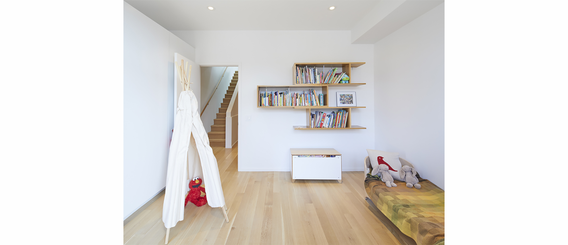
The second floor bathroom was moved to allow more open space for a play area. One of the children’s bedrooms was expanded onto the roof of the addition.
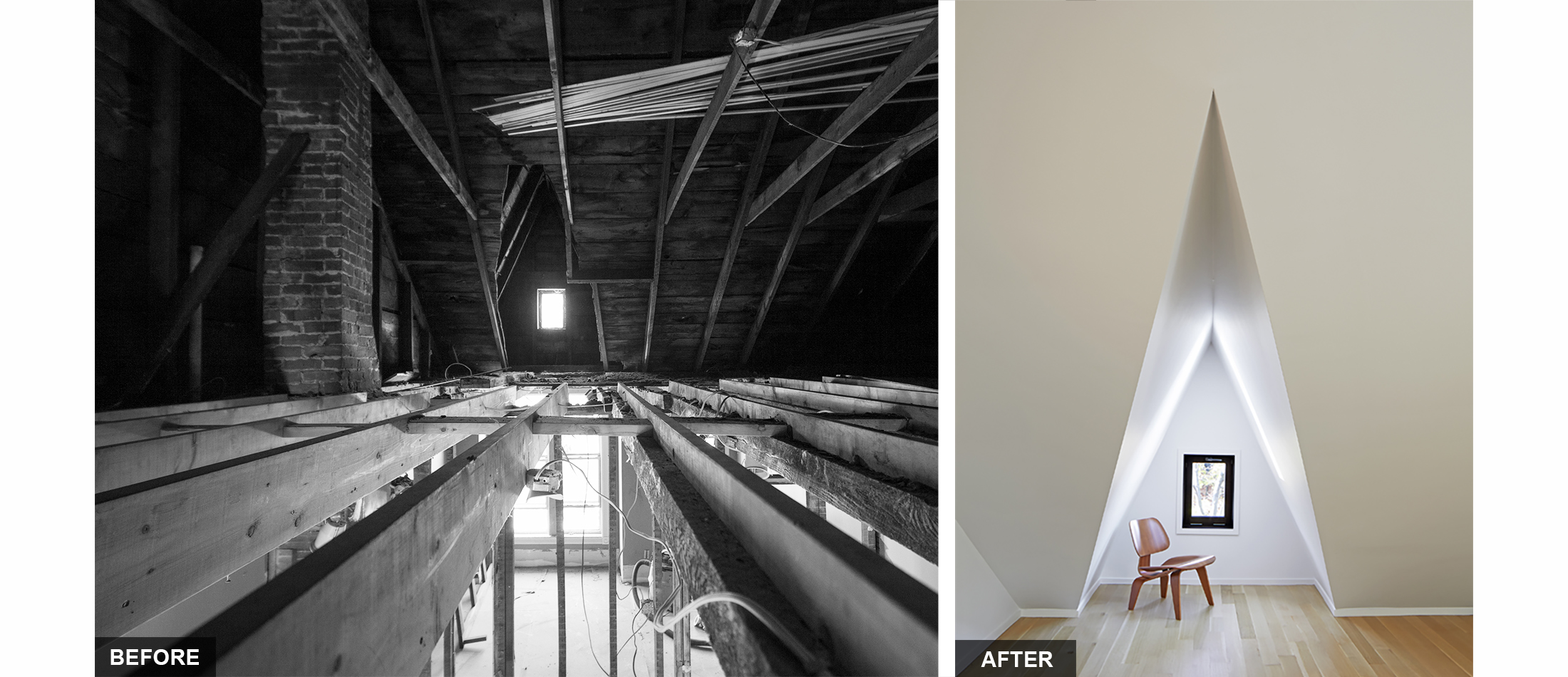
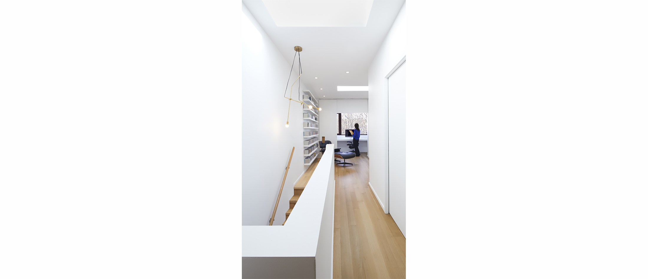
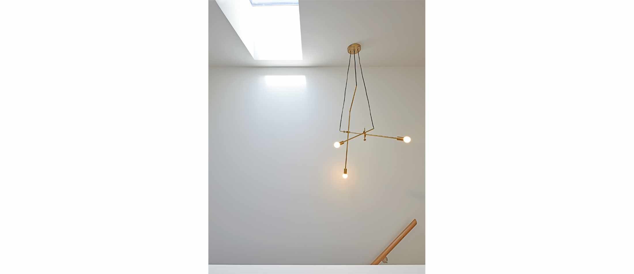
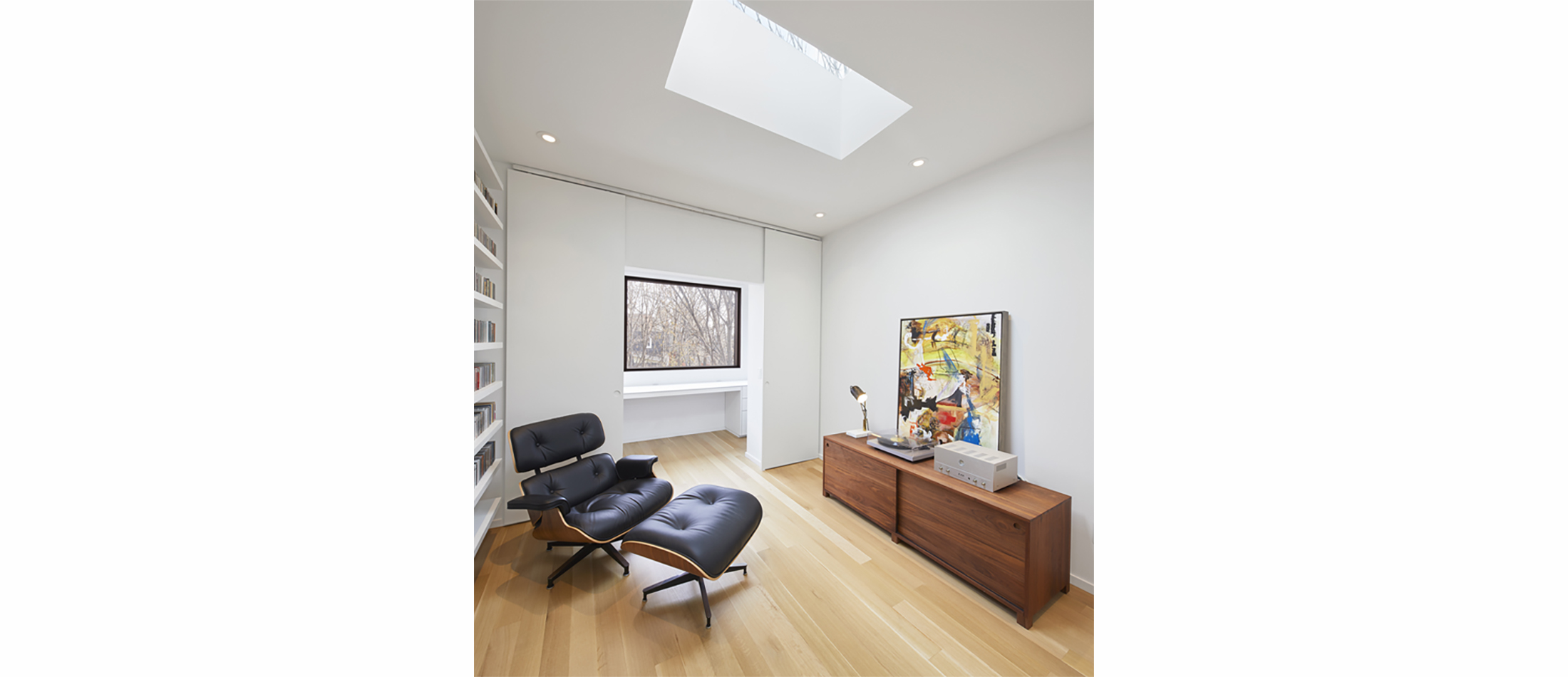
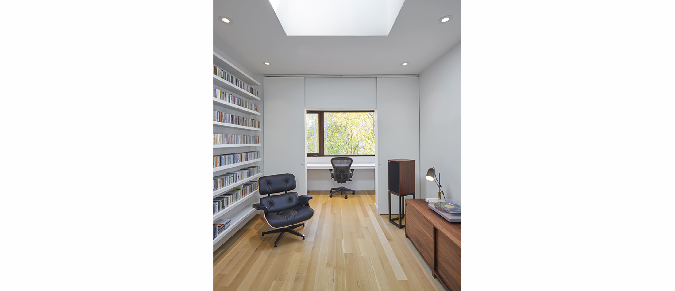
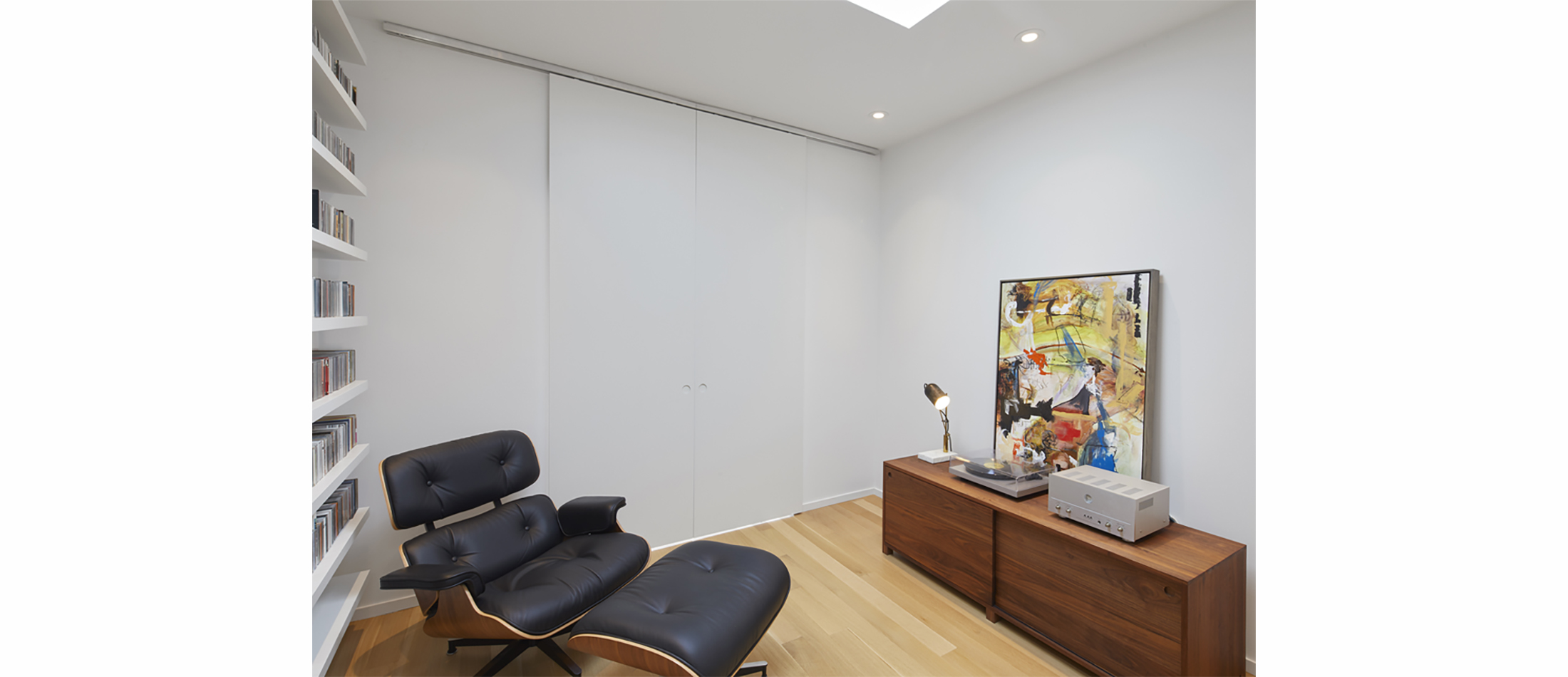
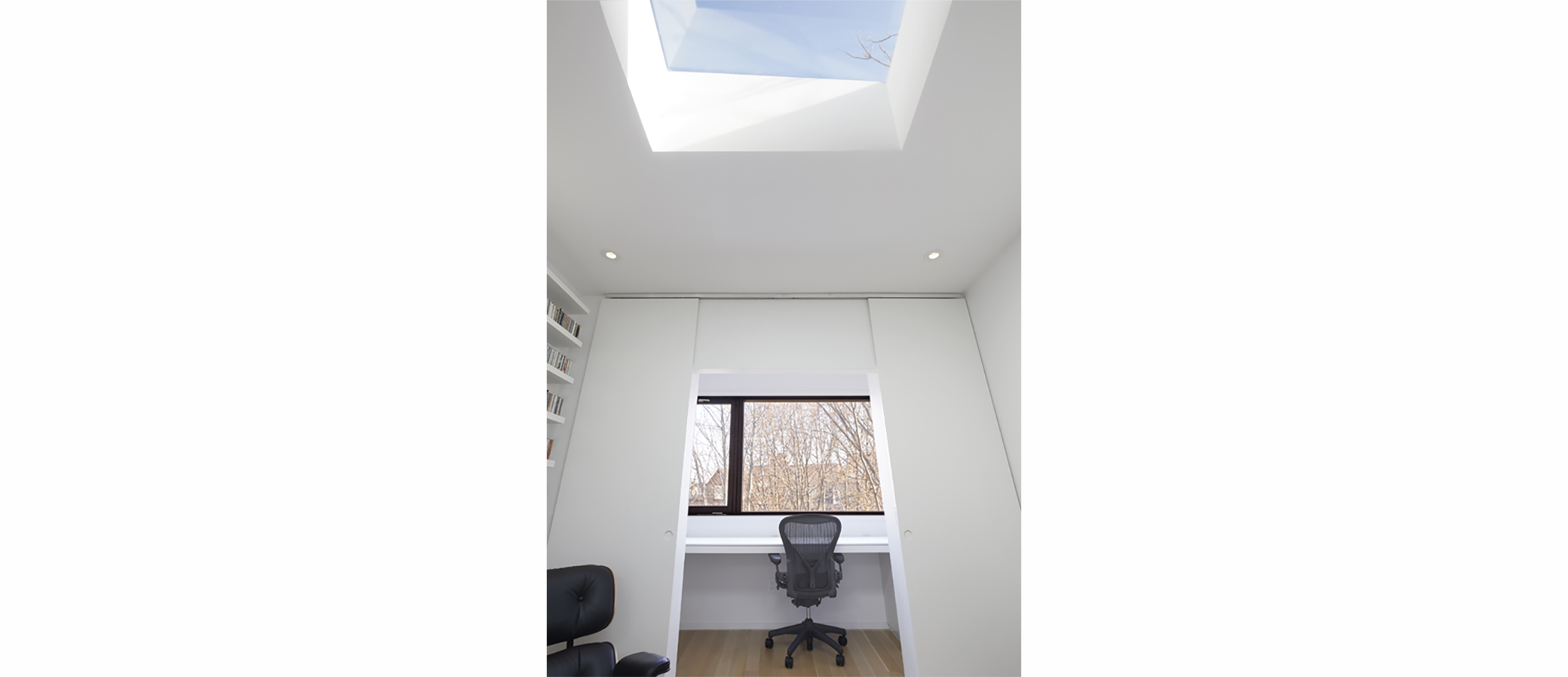
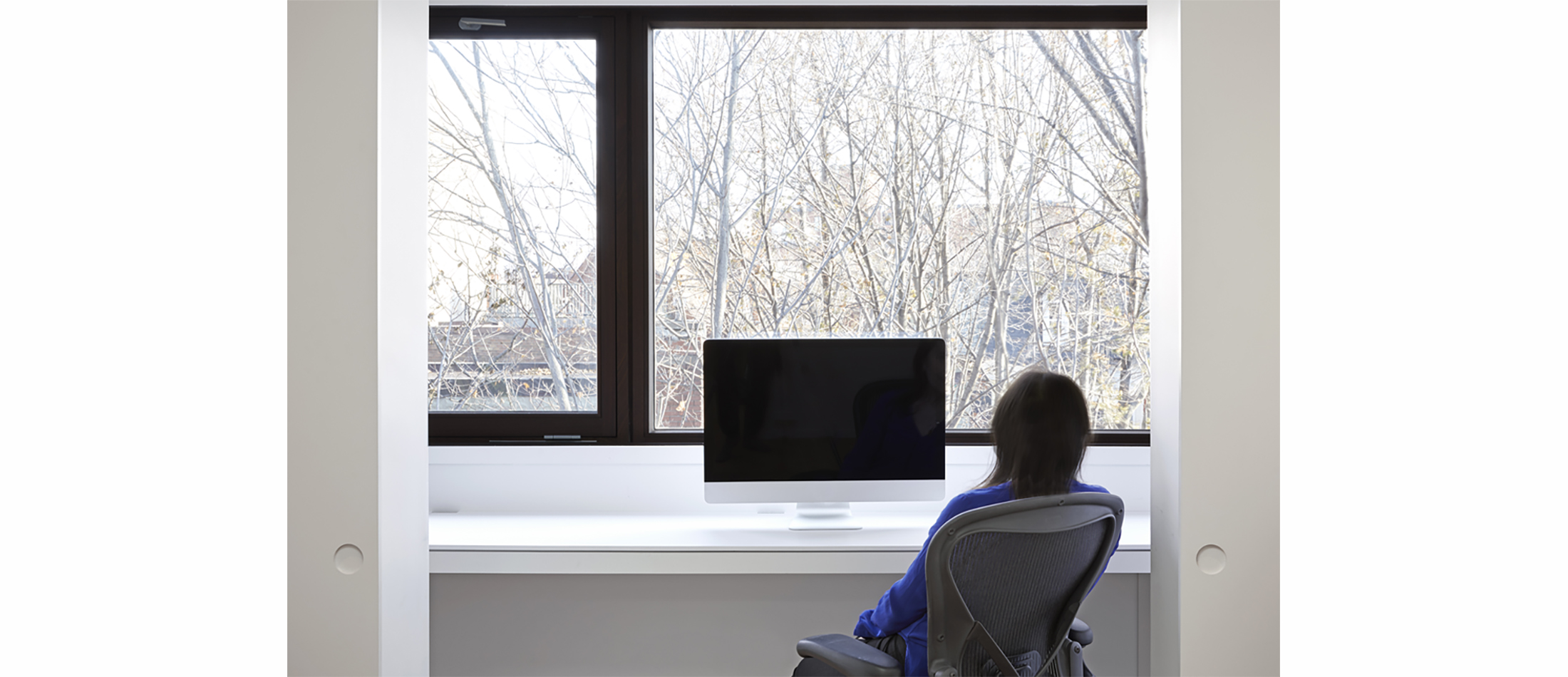
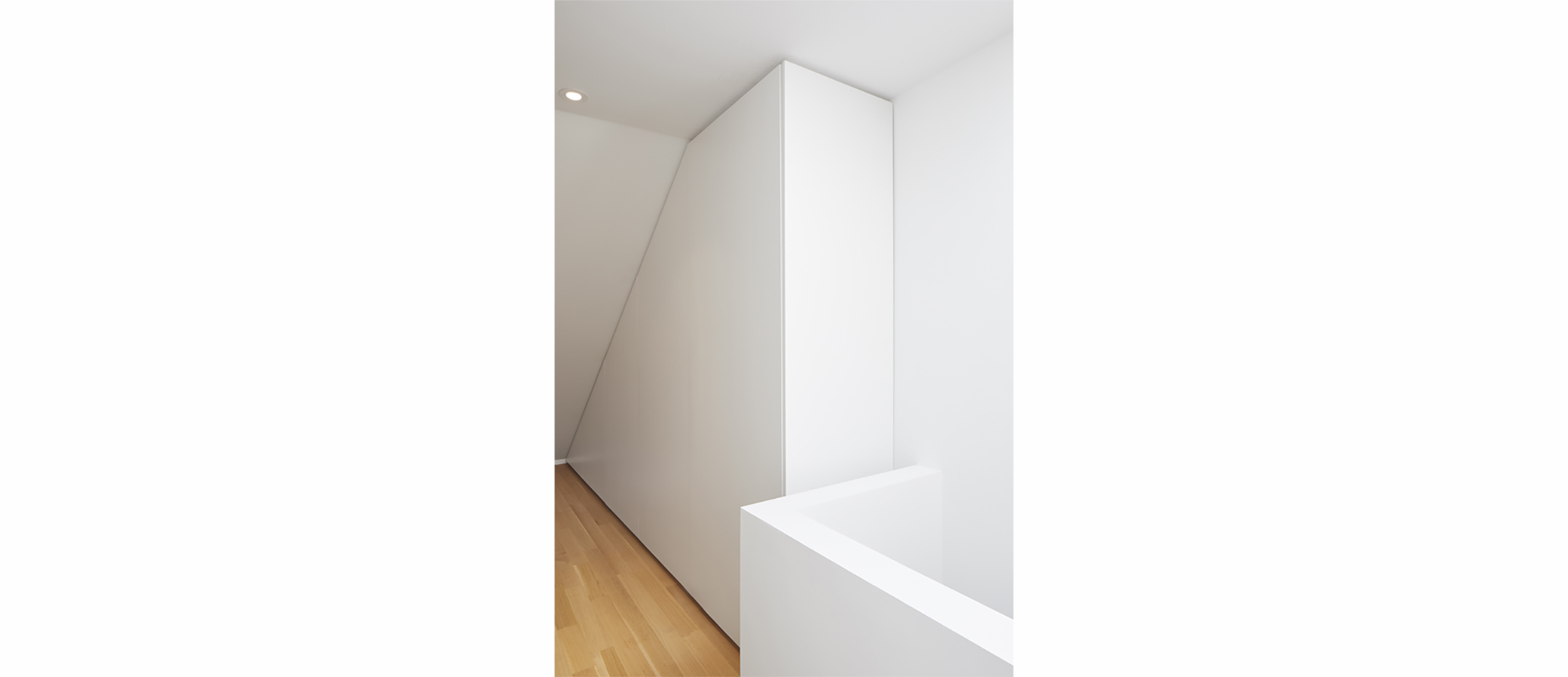
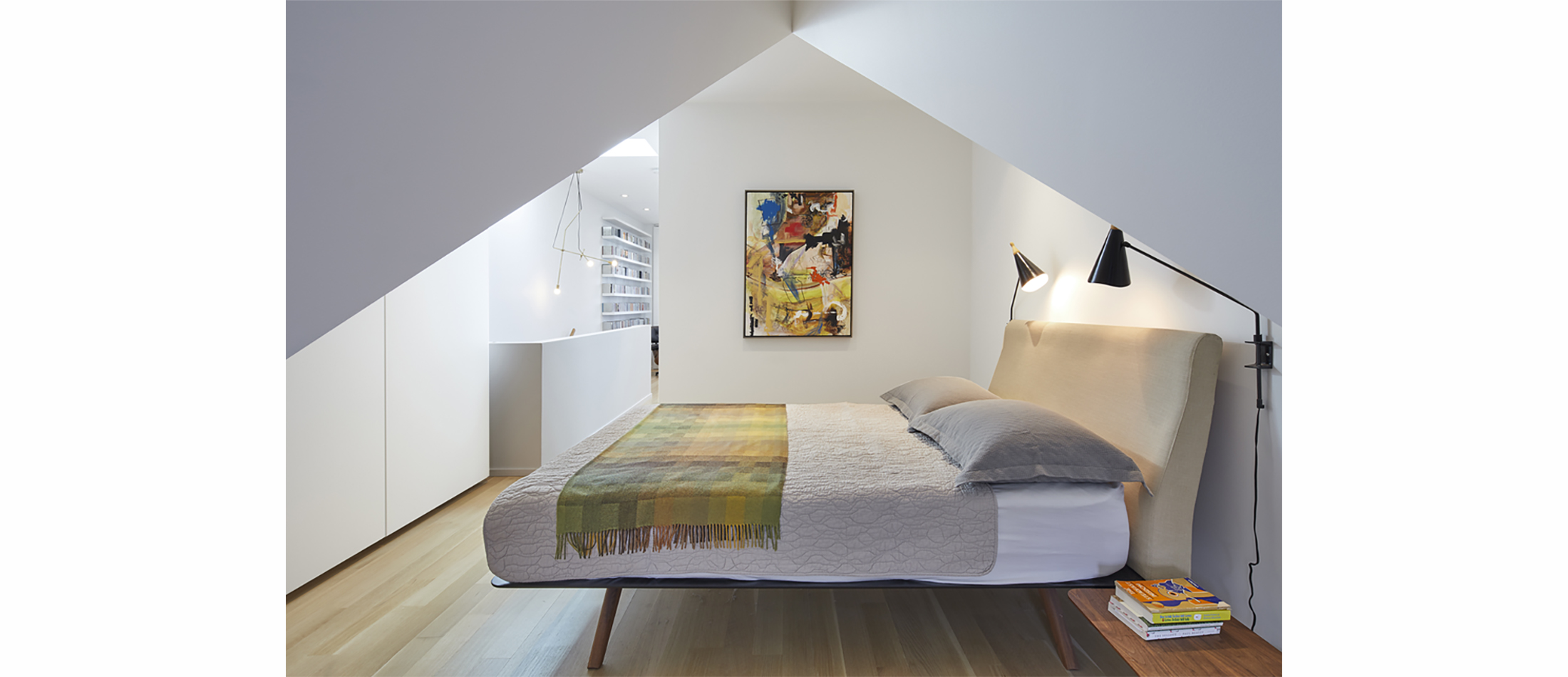
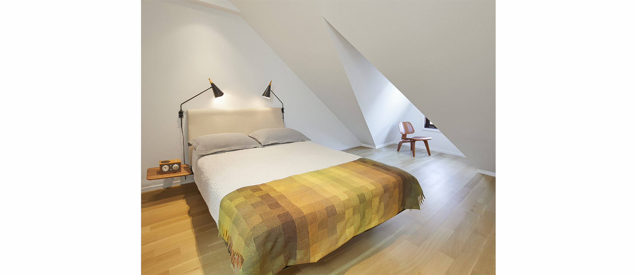
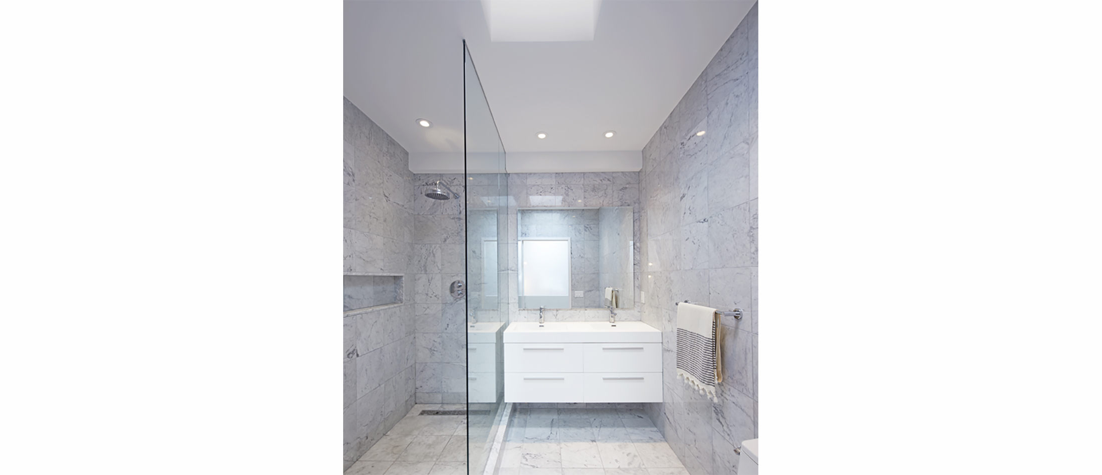
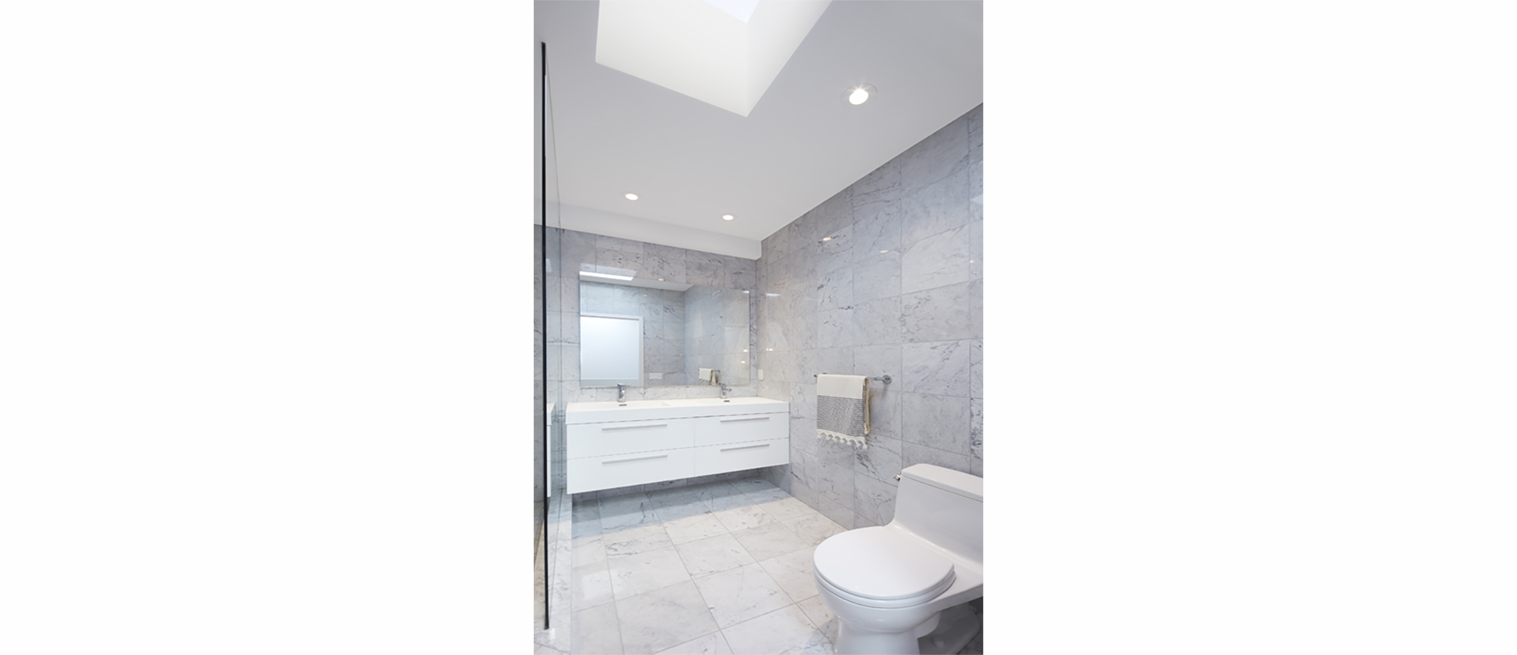
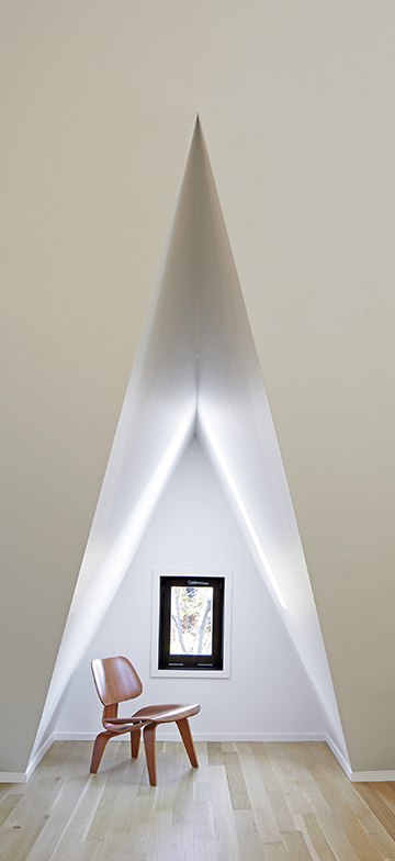
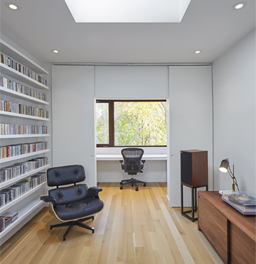
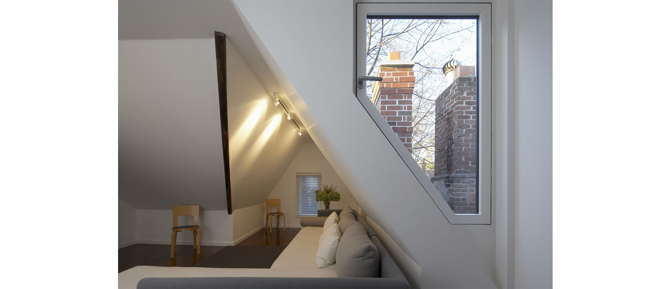
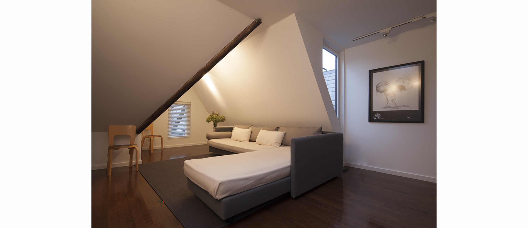
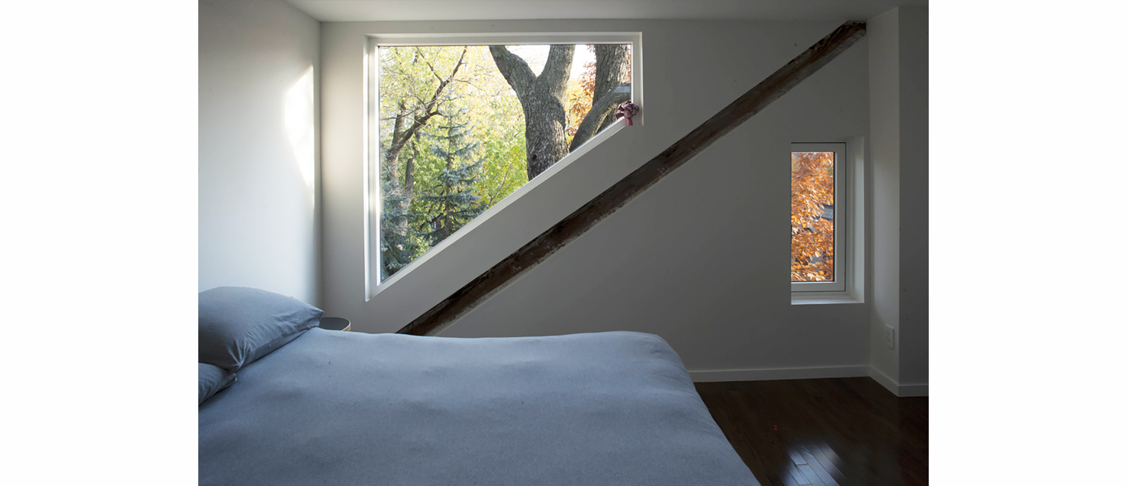
The program requested by the clients for the master suite was complex and challenging for such a small space. Both husband and wife were university professors commuting to their jobs out of the city and wanted individual workspaces away from the children. Elias + created two small study areas at the back of the suite facing the back garden separated by barn doors. Maintaining the original roof geometry created dramatic sculptural spaces in the master bedroom at the front of the home. A master bathroom separated sleep and workspaces. This resulted in a series of rooms unified by a hall which sculpturally folded into the staircase. Numerous skylights further enhanced the bright and airy living space.
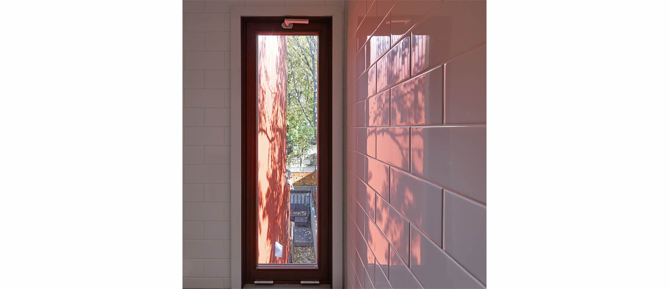
The second branch connects the inside to the outside bringing the natural elements visually closer to the family’s living spaces. Rooms were focused towards particular views of nature.
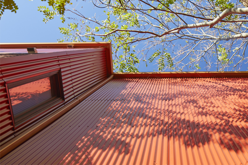
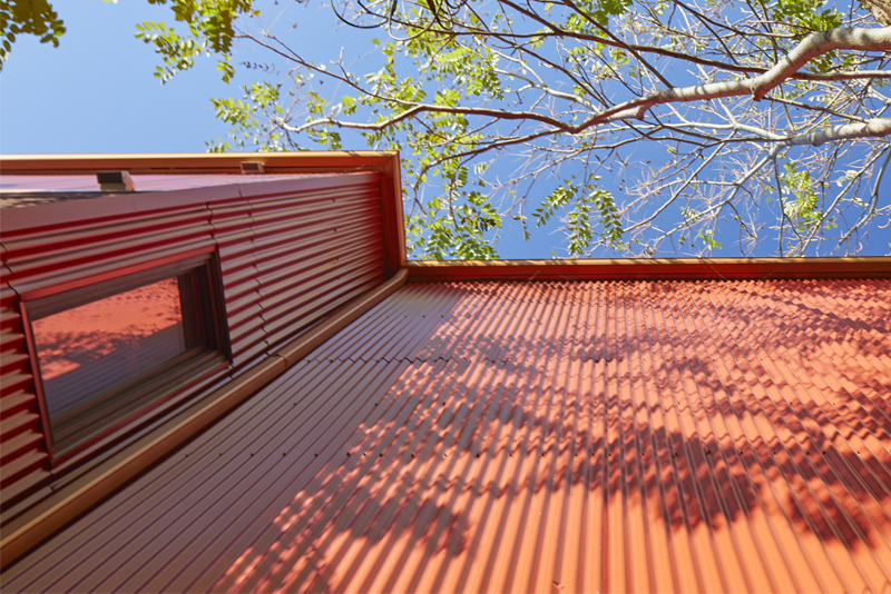
The third branch seamlessly melded the historic and contemporary design elements and maintained street character. The scale of the windows and doors were kept. The raised third floor conserved the original roof pitch geometry of adjacent gables. Due to the limited budget, red corrugated metal, which matched the red Victorian brick, was used to clad the addition and allow contemporary interior changes to blend with the exterior. The existing brick on the front of the house (to be repaired and restored later) was kept intact in an effort to maintain the character of the Victorian streetscape.


+ Interiors
A Victorian Semi Gets a Lift
+ RAISE THE ROOF BEAMS
Elias + was approached by a young couple who needed more living space for their growing family. Buying a larger home was out of the question given the increased cost of Toronto real estate. It made more financial sense to renovate the home they had been in for seven years.
In order to do this we had a three-branched strategy.
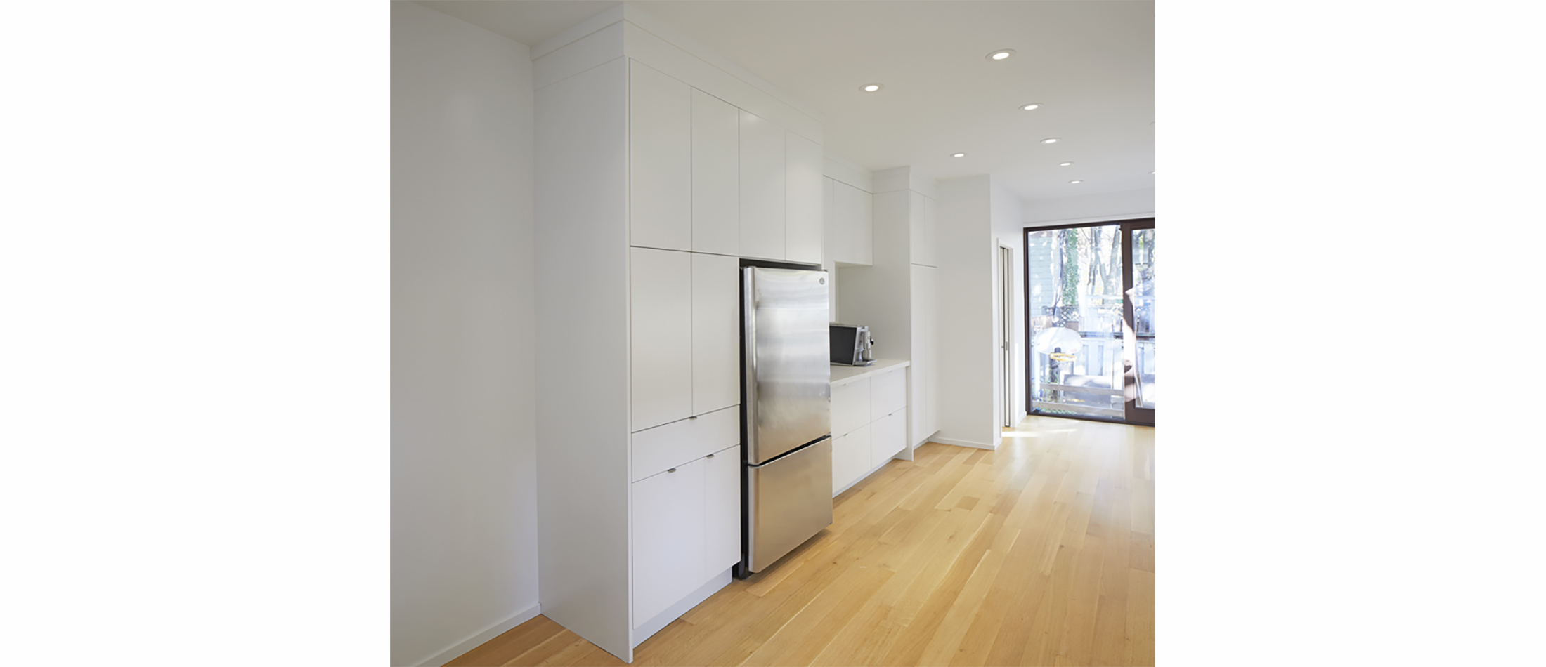
The first branch was to open the interior, unify common areas into an open plan, and raise the home’s roof forming a third story master suite. This allowed us to create a bright airy open space. A two story addition increased the square footage to include a new powder room and expand the back of the first floor to flow into the garden via sliding doors. This let light penetrate the formerly dark kitchen area.
Minimalist detailing replaced deteriorated neo-traditional wainscoting, crown molding and baseboards. Doors and windows, previously diminished by framing and mullions, were replaced with large expanses of glass, maximizing light penetration.
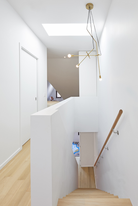
A newly designed contemporary staircase became a sculptural element and unifying device for all three levels.
The second floor bathroom was moved to allow more open space for a play area. One of the children’s bedrooms was expanded onto the roof of the addition.
The program requested by the clients for the master suite was complex and challenging for such a small space. Both husband and wife were university professors commuting to their jobs out of the city and wanted individual workspaces away from the children. Elias + created two small study areas at the back of the suite facing the back garden separated by barn doors. Maintaining the original roof geometry created dramatic sculptural spaces in the master bedroom at the front of the home. A master bathroom separated sleep and workspaces. This resulted in a series of rooms unified by a hall which sculpturally folded into the staircase. Numerous skylights further enhanced the bright and airy living space.
The second branch connects the inside to the outside bringing the natural elements visually closer to the family’s living spaces. Rooms were focused towards particular views of nature.
The third branch seamlessly melded the historic and contemporary design elements and maintained street character. The scale of the windows and doors were kept. The raised third floor conserved the original roof pitch geometry of adjacent gables. Due to the limited budget, red corrugated metal, which matched the red Victorian brick, was used to clad the addition and allow contemporary interior changes to blend with the exterior. The existing brick on the front of the house (to be repaired and restored later) was kept intact in an effort to maintain the character of the Victorian streetscape.
+ Interiors
1890’s Annex House
+ THE CHALLENGES
+ Interiors
1890’s Annex House
+ THE CHALLENGES
+ Interiors
1890’s Annex House
+ MODERN INTERVENTION
The Toronto Annex is one of the few designated historical districts in the city. This house constructed in 1890, is an example of well -crafted Victorian exterior architecture. Although the original floor plan was intact, there was very little of the interior detailing left. A typical semi–detached Victorian floor plan is long and narrow. It usually consists of a series of small rooms back to back with little exposure to natural light. The stairs are efficiently placed at the side of the main entrance and follow the 4 floors from basement to the top of the residence.
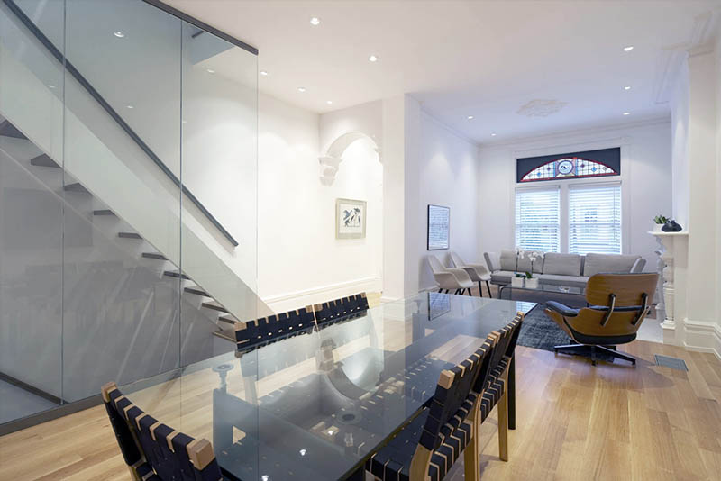
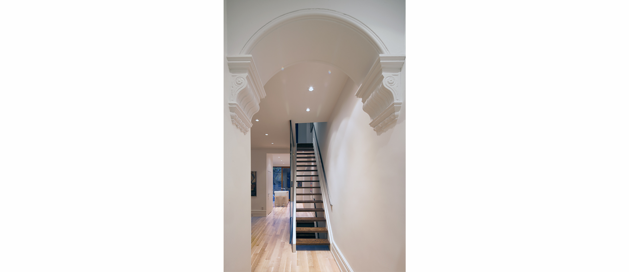
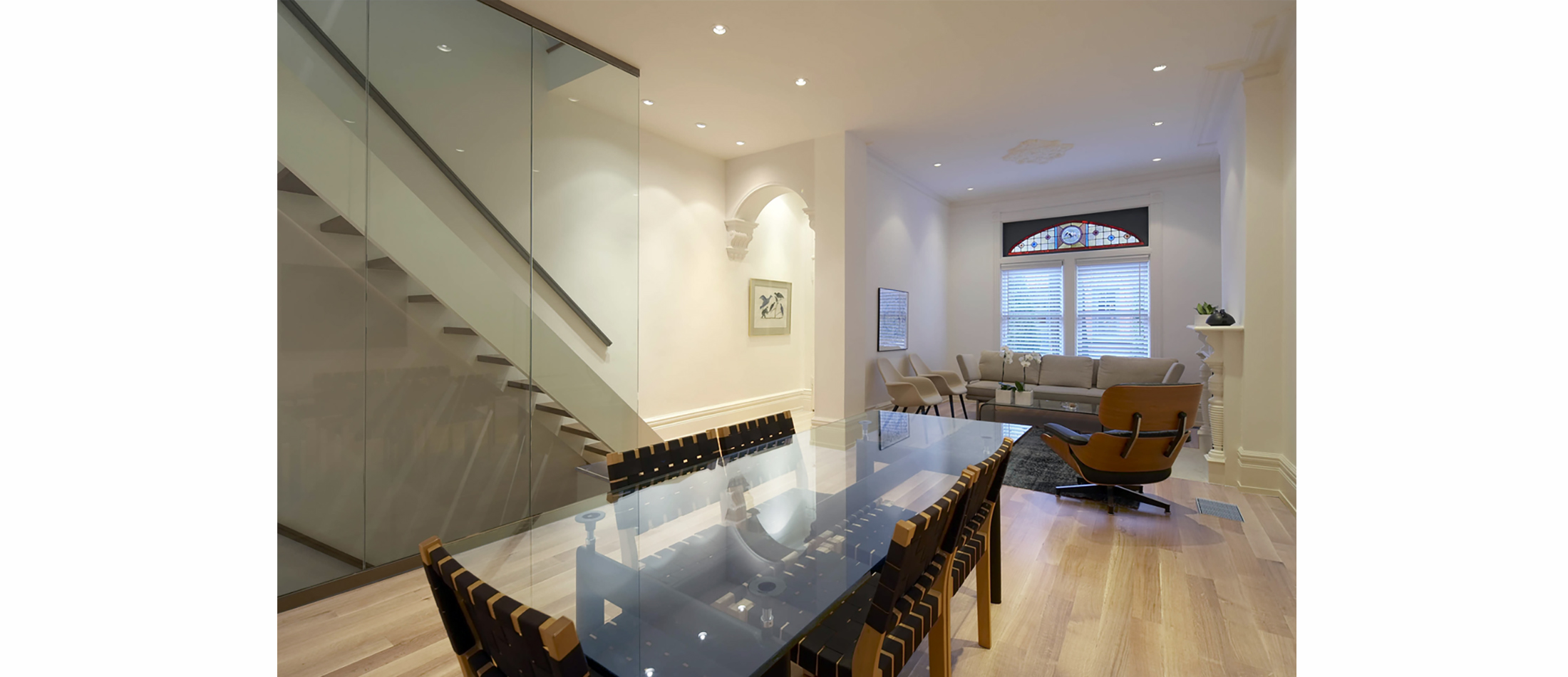
A strategy was developed to transform this generic Victorian house plan to accommodate a contemporary lifestyle and more light. The original stairs were kept as a single straight run; but replaced with wooden oak open risers. The back portion of the roof was raised and skylights inserted. Two major structural walls were removed. Both were replaced with hidden ceiling beams so as to maximize the height and open width of the plan and fully utilize the 4 m. across .Thin glass walls replaced the old stairwell walls and the central glass wall penetrated the 3 floors of the house creating an airy continuous material flow through the house. This flooded the interior space with natural light and spaciousness.
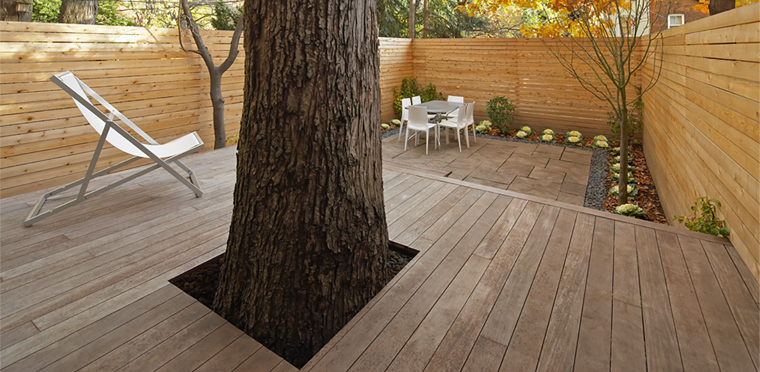
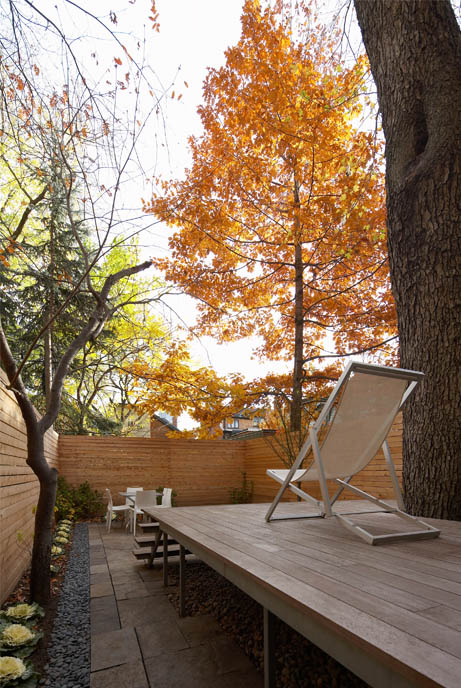
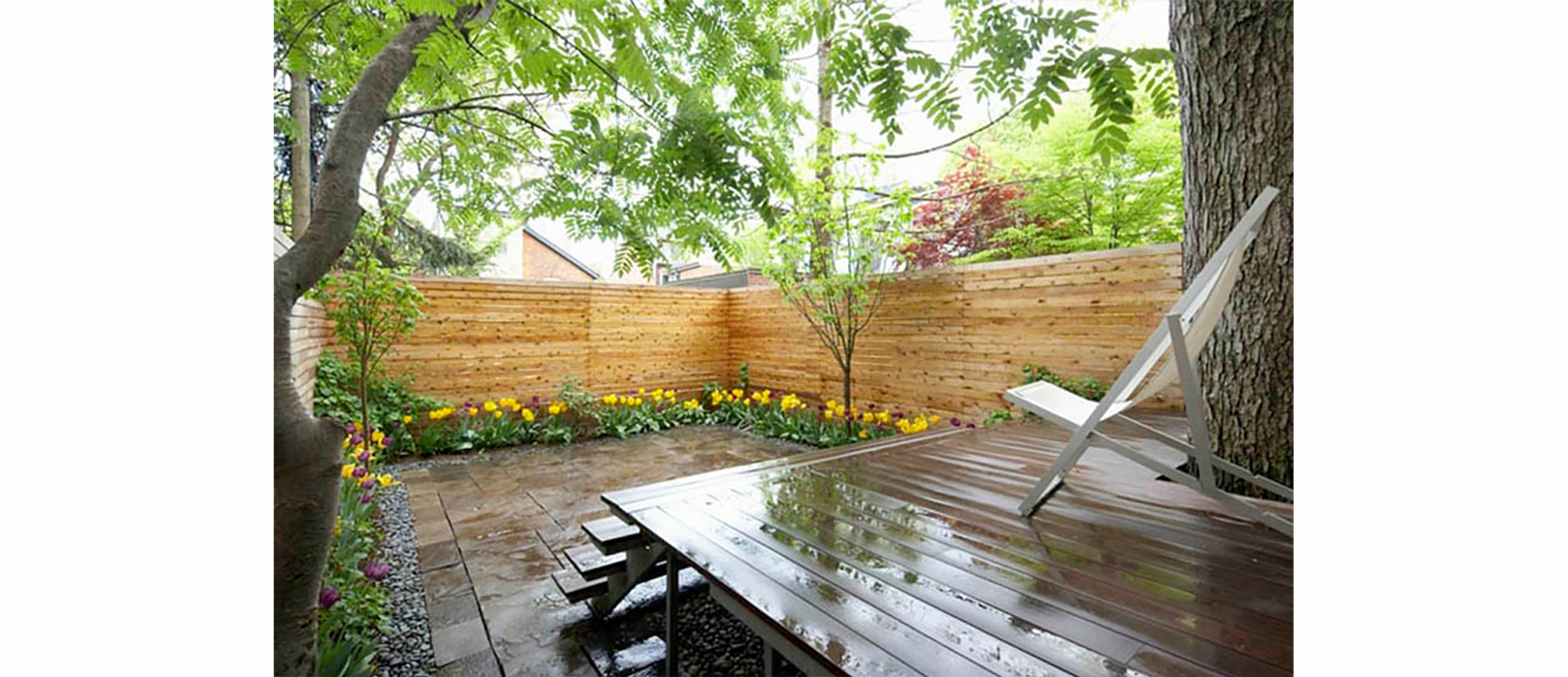
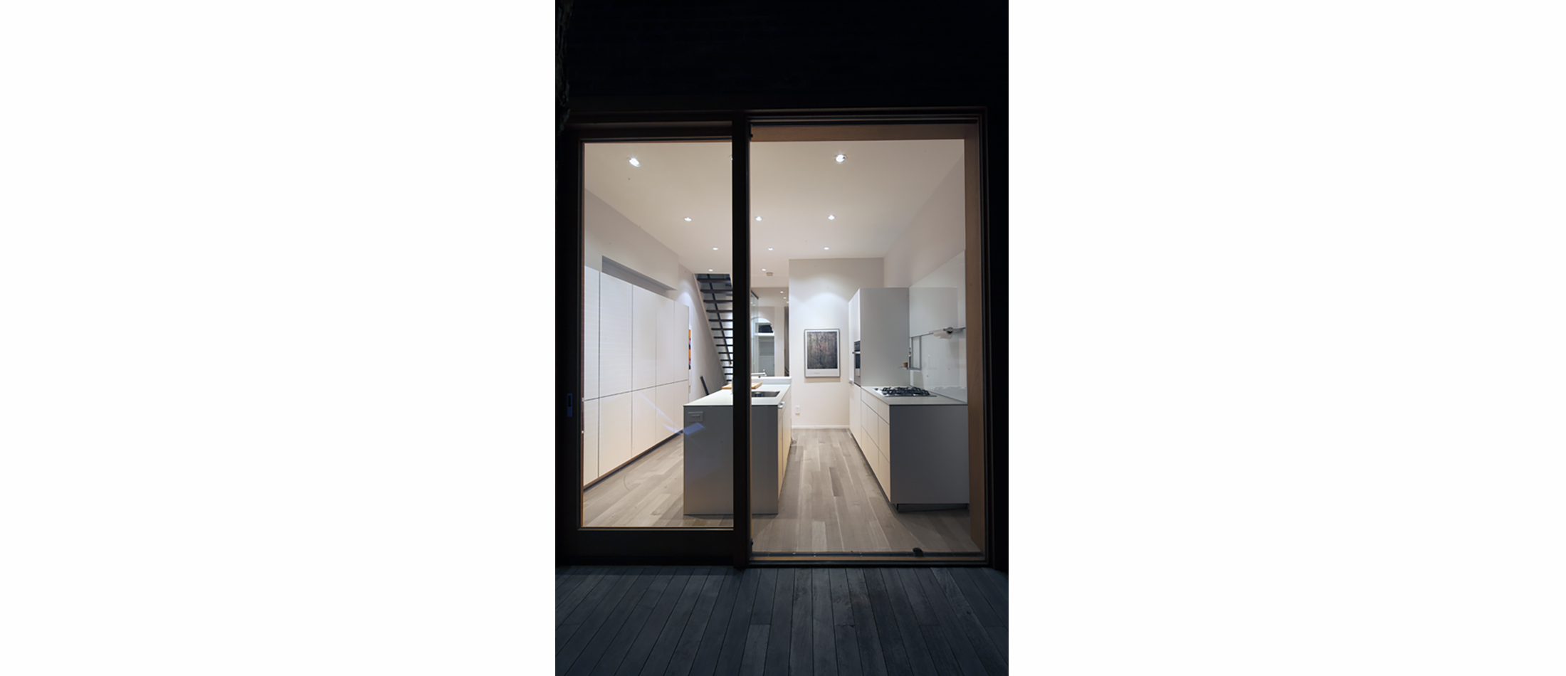
The south facing glass wall of the kitchen was designed to absorb passive solar energy. A large maple tree in the middle of the back deck was maintained for the sculptural effect of the massive trunk, and as a shade umbrella for the home during the hot summer months. This created a stronger connection between inside and outside and was reinforced through the ipe deck which maintained the continuous flow of the wooden kitchen floor into the back garden.
An “exacting minimalist approach to detail” was taken. A Bulthaup kitchen, custom cabinetry throughout the house and cold rolled steel handrails repeated this design principle and reinforce the modernist architectural continuity.
Memory traces of Victorian life were retained in the few Victorian architectural details left untouched by past renovations; an exposed rafter of the former third floor roof; stain glass windows, an arched entry vestibule, a whimsical living room fireplace and plaster medallions in the ceiling.

+ Interiors
1890’s Annex House
+ THE CHALLENGES
+ Institutional
Ryerson University Pedestrian Walkway


+ GOULD/VICTORIA ST. REVITALIZATION
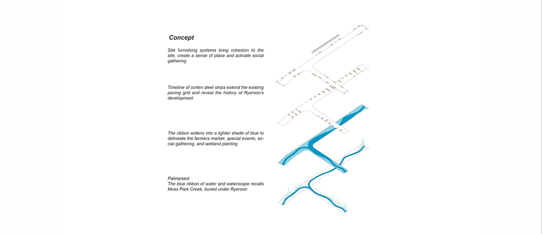
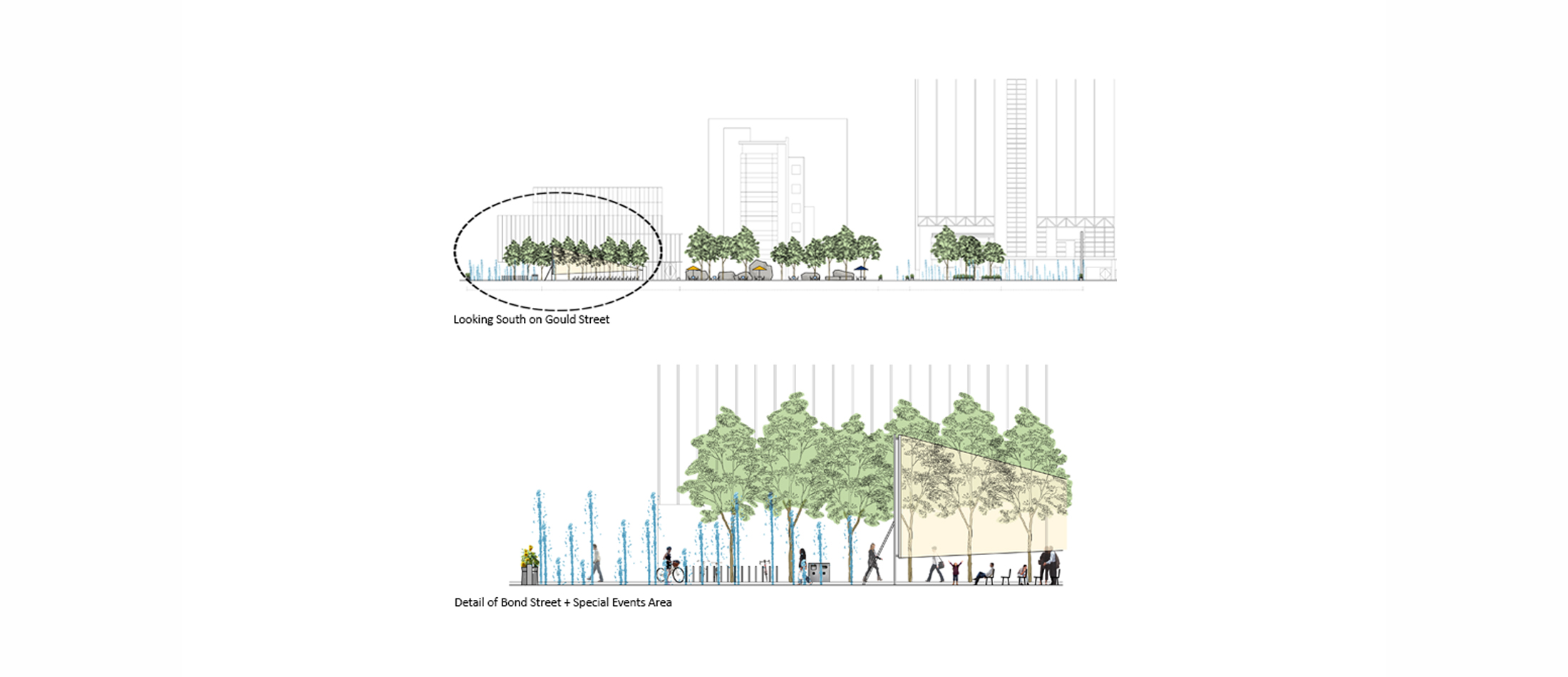
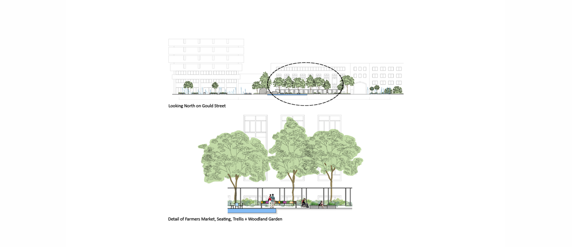
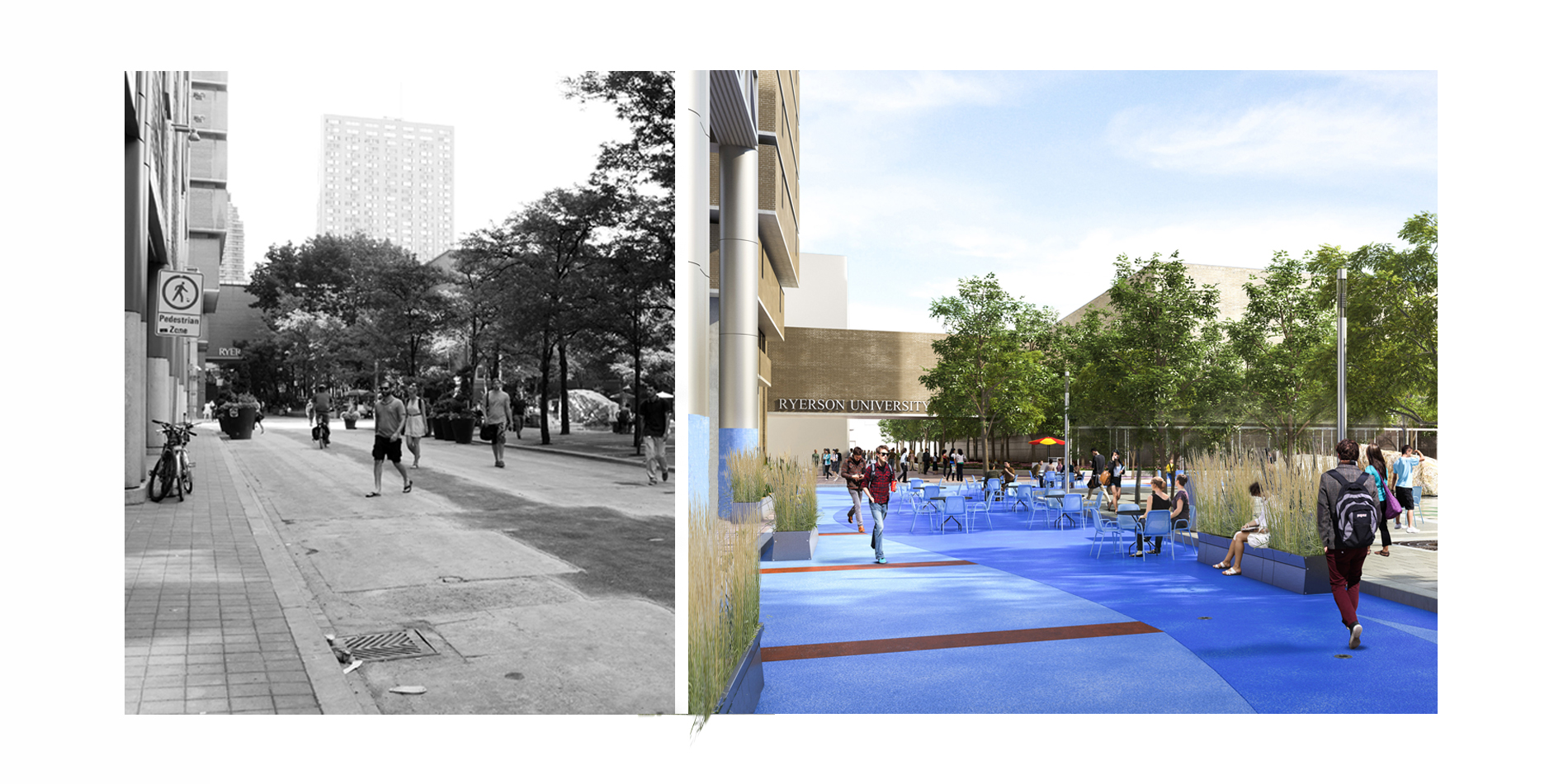
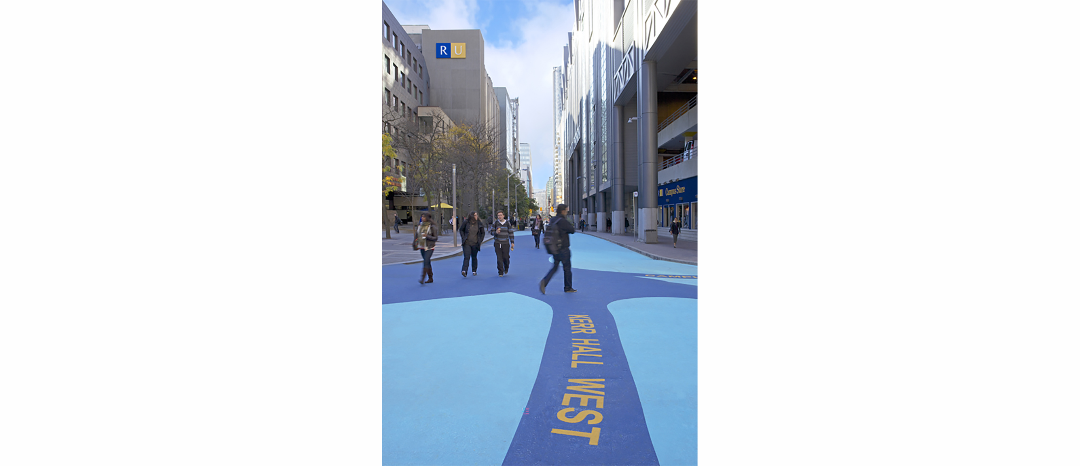
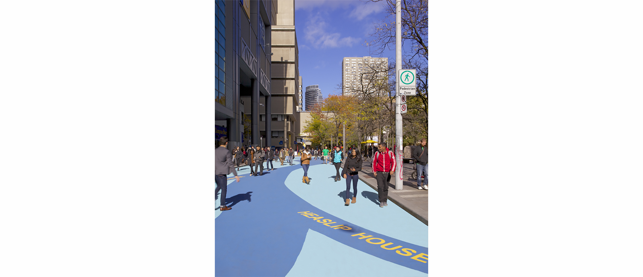
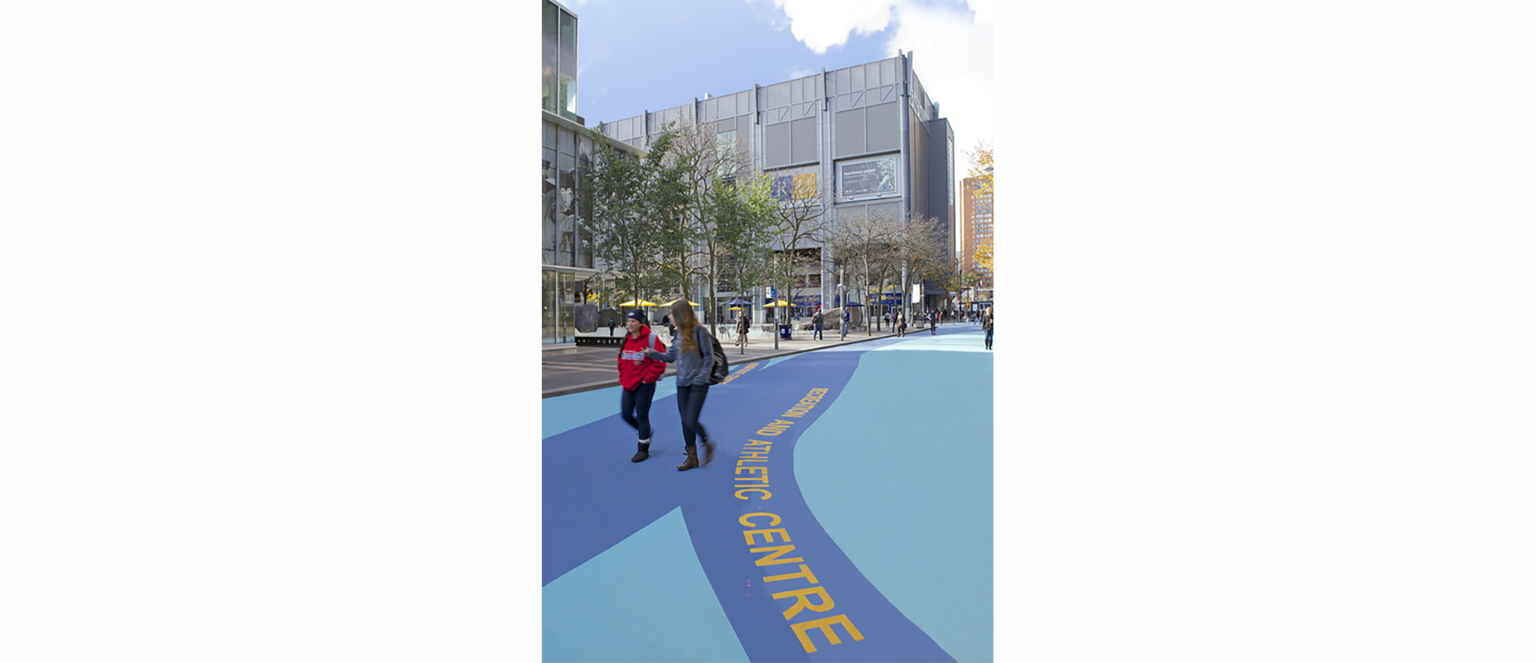
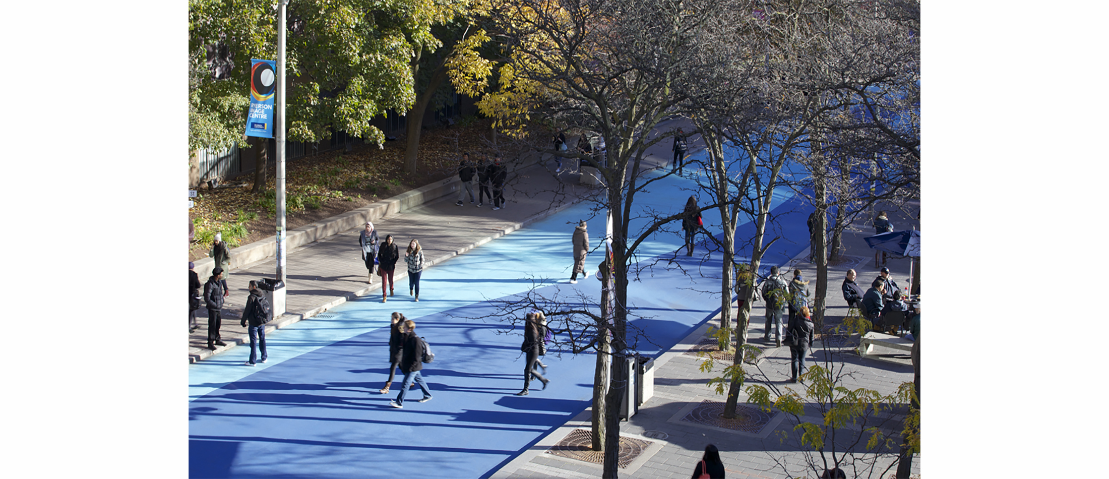
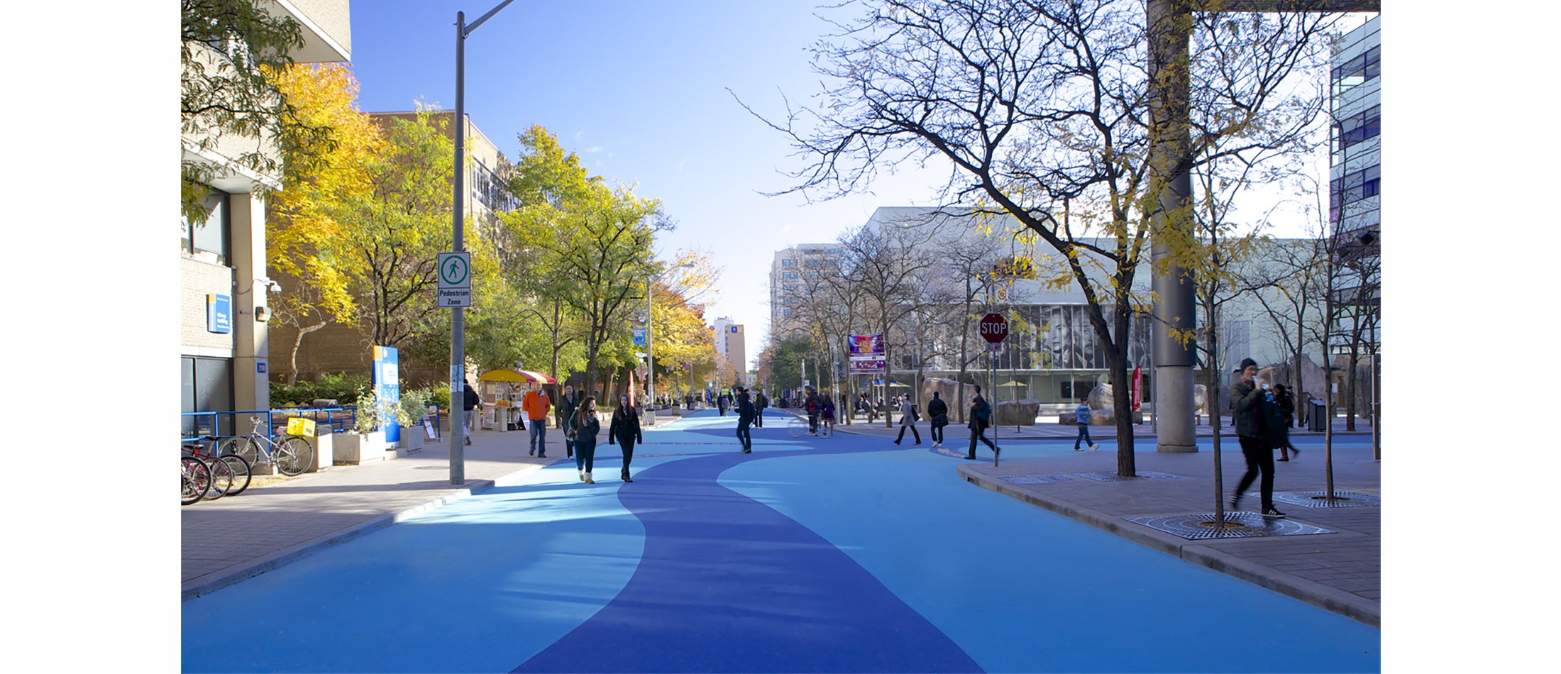
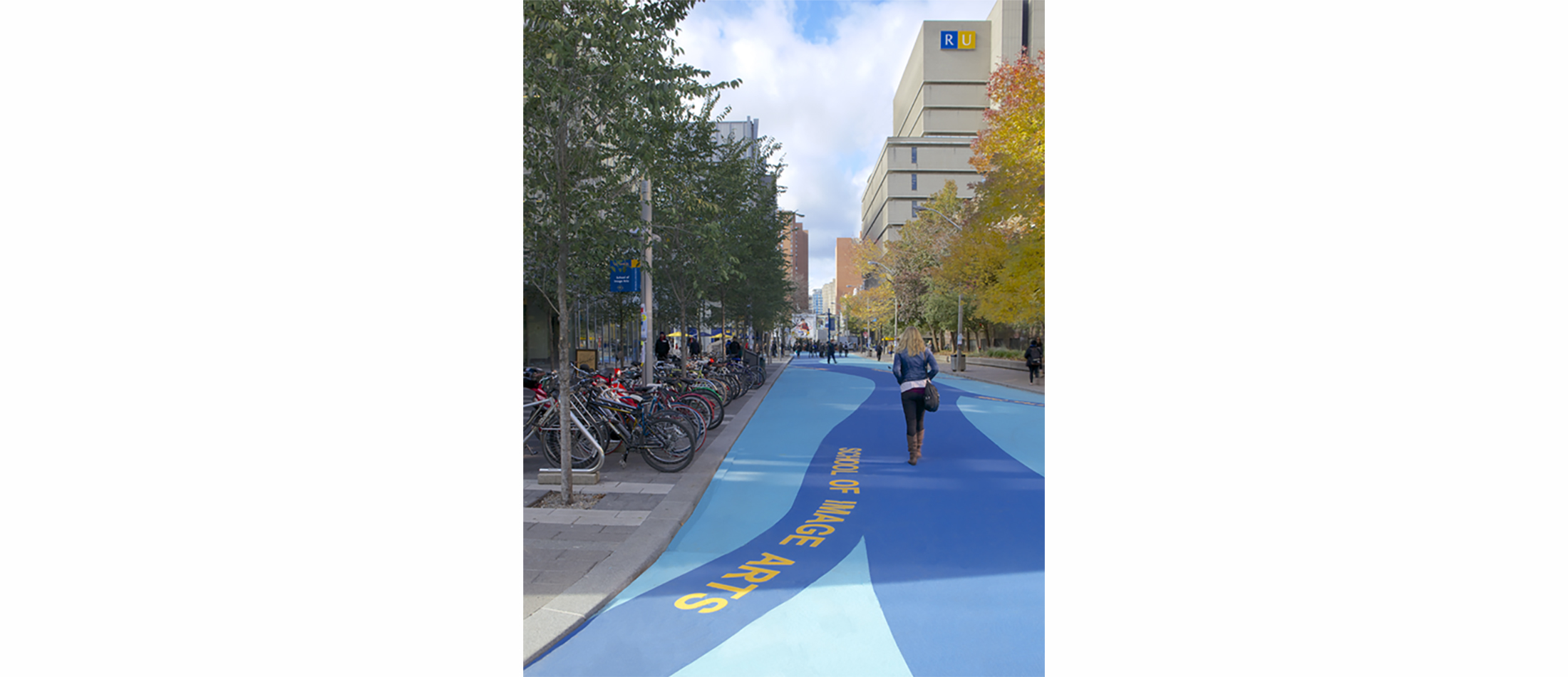
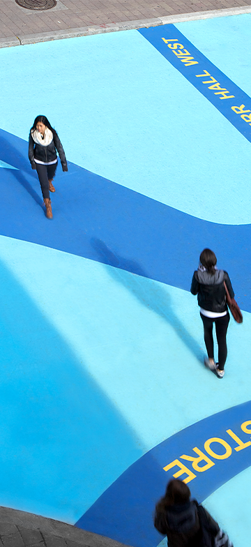
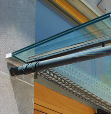
Concept Central to the concept are two elements, which relate to the evolution of the site. The ribbon of water and the timeline. The ribbon of water, is a palimpsest – an abstract painted portrait of Moss Park Creek, which once flowed through the site. It is painted on the existing asphalt through bold use of form and colour, in various shades of Ryerson blue. It flows along Gould and Victoria Streets, accommodating circulation, programmatic elements (eg. seasonal farmers market), and wayfinding. The timeline is a morphological history of Ryerson University. It is delineated through continually rusting brown corten steel strips which extend the existing grid of the paving around “Lake Devo”. Each corten strip is marked with a significant date of Ryerson’s evolution. Spatial Organization: The ribbon of water promotes circulation and wayfinding, as it widens into three shades of Ryerson blue to accommodate, where necessary, the various functions of the site. Places for gathering and conversation, café seating and event space are delineated in dark blue. A medium blue outlines the temporary farmers market. The light blue represents the banks of Moss Park Creek, and contains wetland planting that once flourished along the water’s edge. The light blue also contains benches which activate areas for social interaction. The corten strips, an extension of the existing grid, organize the placement of bike racks, benches, planters and recycling/waste receptacles, spaced throughout to foster social interaction and ease of access. Gateways, Site Access, City Visibility, Viewpoints and Waterscapes: Key to the success of the space is the visibility and ease of access from the surrounding city. Three series of waterscapes are visible gateways into Ryerson from Yonge, Church and Dundas Streets and rise up at the entry points as water columns and mist, between steel planters and for a short distance along the ribbon of water. The columns rise up to varying heights. They terminate viewpoints from within the campus at the end of each street, and highlight the city beyond. The ribbon of water serves pragmatic purposes in addition to expressing the creek. It helps students with wayfinding as a bold market, and visually extends the Ryerson campus into the city, inviting the public in, with its captivity and boldly coloured surface form. The flexibility of this form, with its corten strips, allows easy expansion from Ryerson boundaries into the City itself.



+ Institutional
Ryerson University Pedestrian Walkway
+ GOULD/VICTORIA ST. REVITALIZATION
Concept Central to the concept are two elements, which relate to the evolution of the site. The ribbon of water and the timeline. The ribbon of water, is a palimpsest – an abstract painted portrait of Moss Park Creek, which once flowed through the site. It is painted on the existing asphalt through bold use of form and colour, in various shades of Ryerson blue. It flows along Gould and Victoria Streets, accommodating circulation, programmatic elements (eg. seasonal farmers market), and wayfinding. The timeline is a morphological history of Ryerson University. It is delineated through continually rusting brown corten steel strips which extend the existing grid of the paving around “Lake Devo”. Each corten strip is marked with a significant date of Ryerson’s evolution. Spatial Organization: The ribbon of water promotes circulation and wayfinding, as it widens into three shades of Ryerson blue to accommodate, where necessary, the various functions of the site. Places for gathering and conversation, café seating and event space are delineated in dark blue. A medium blue outlines the temporary farmers market. The light blue represents the banks of Moss Park Creek, and contains wetland planting that once flourished along the water’s edge. The light blue also contains benches which activate areas for social interaction. The corten strips, an extension of the existing grid, organize the placement of bike racks, benches, planters and recycling/waste receptacles, spaced throughout to foster social interaction and ease of access. Gateways, Site Access, City Visibility, Viewpoints and Waterscapes: Key to the success of the space is the visibility and ease of access from the surrounding city. Three series of waterscapes are visible gateways into Ryerson from Yonge, Church and Dundas Streets and rise up at the entry points as water columns and mist, between steel planters and for a short distance along the ribbon of water. The columns rise up to varying heights. They terminate viewpoints from within the campus at the end of each street, and highlight the city beyond. The ribbon of water serves pragmatic purposes in addition to expressing the creek. It helps students with wayfinding as a bold market, and visually extends the Ryerson campus into the city, inviting the public in, with its captivity and boldly coloured surface form. The flexibility of this form, with its corten strips, allows easy expansion from Ryerson boundaries into the City itself.


+ Institutional
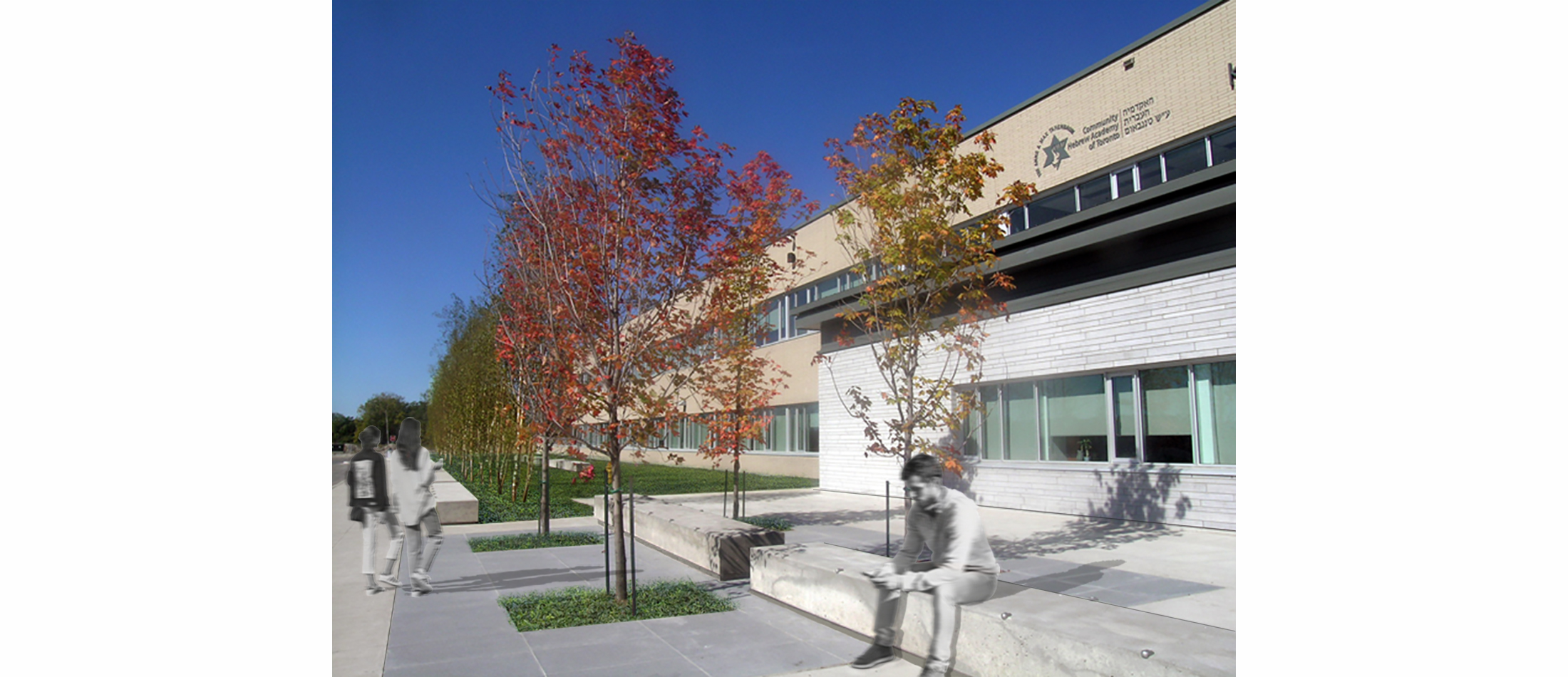
TanenbaumCHAT Kimel Education Centre
+ A PLAZA OF NATIVE TREES
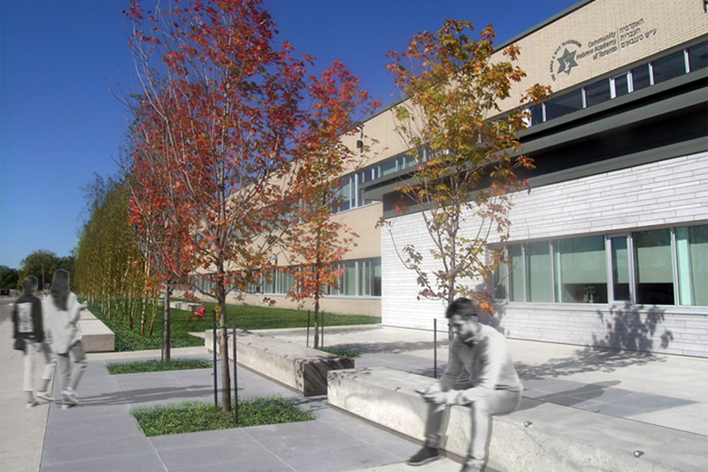
The TanenbaumCHAT Kimel Education Centre is an example of the design principles defined in the Joseph and Wolf Lebovic Master Plan.
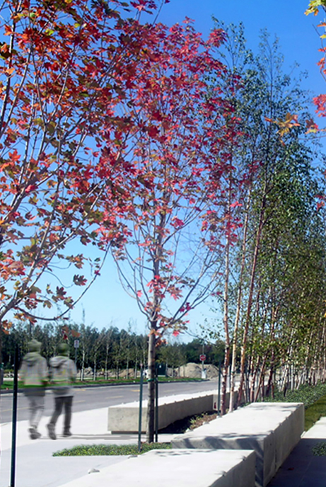
The masterplan for this 80-hectare site was developed as the first phase in the staged development of a large Jewish community campus. The plan includes several schools, senior centers, and synagogues, all situated near the sensitive Oak Ridges Moraine. Urban design elements are used to create a sense of INDEGINOUS PLACEKEEPING through the fusion of typologies that represent the REGIONAL HISTORY OF HUMAN SETTLEMENT. The AGRIGCULTURAL GRID AND LINEAR HEDGEROWS are incorporated as spatial organization devices. The planting strategy reflects multiple land uses over time: wind-protective hedgerows of lilac, poplar aspen, and red maple represent the agricultural use of the early pioneers. Bosques of sugar maple represent the traditional maple syrup harvesting of the Mississauga tribe.
Award – City of Vaughan, Urban Design Awards, Award of Merit (2008)

+ Institutional
Thomas L Wells Public School
+ TWO COURTYARDS
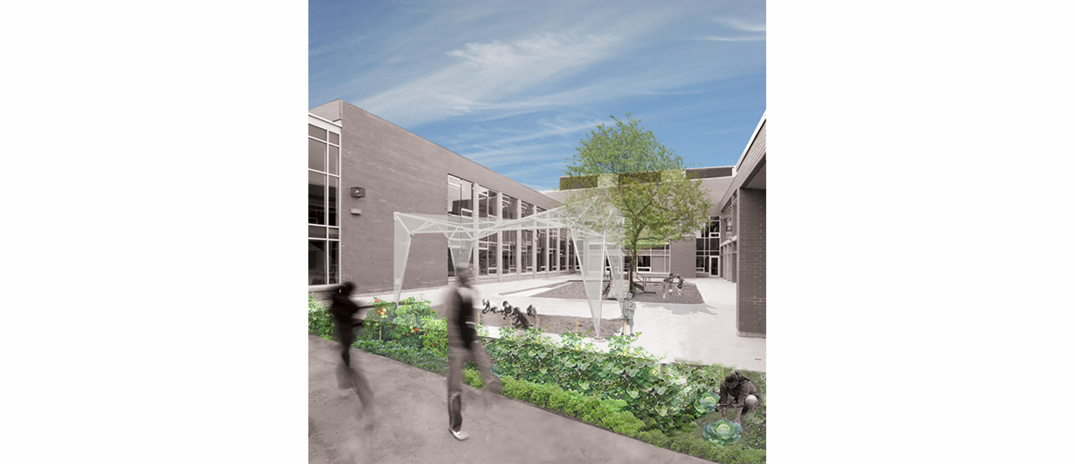
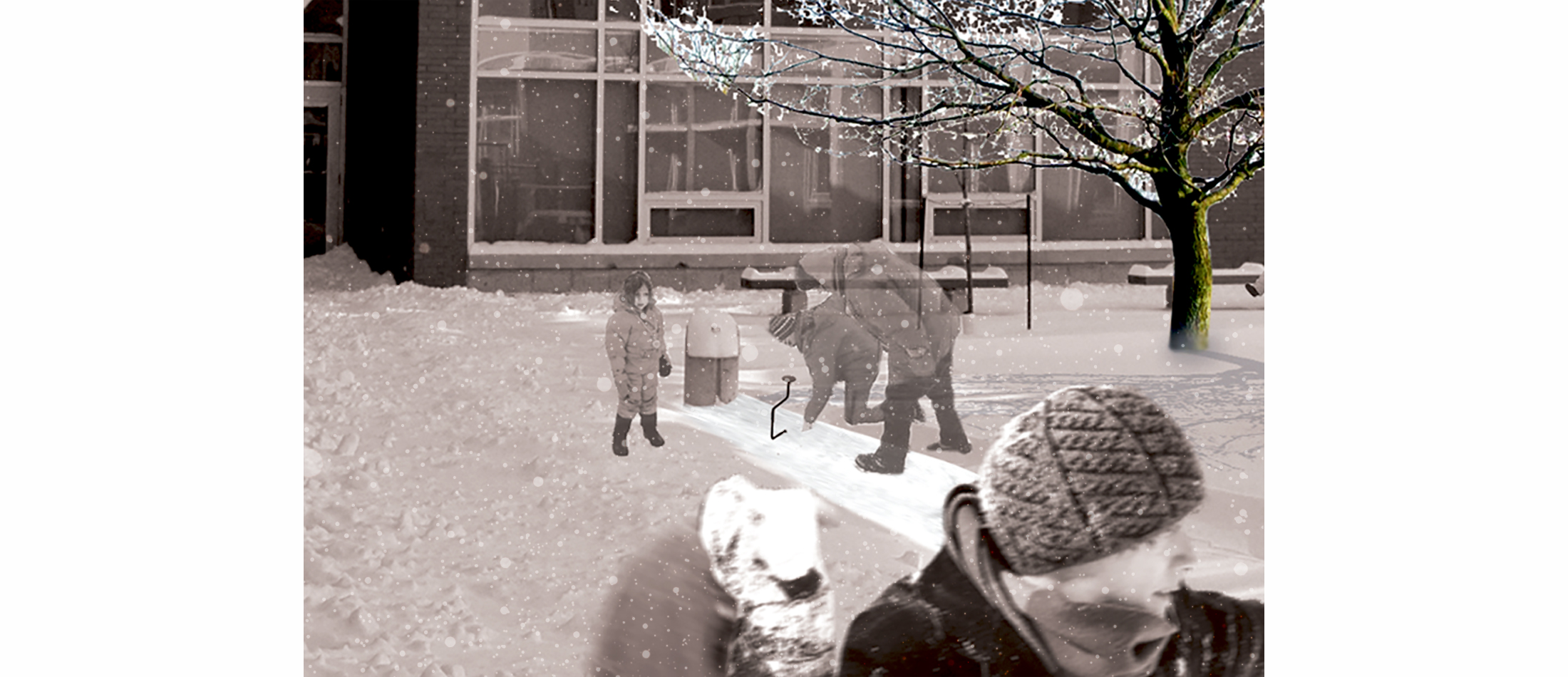
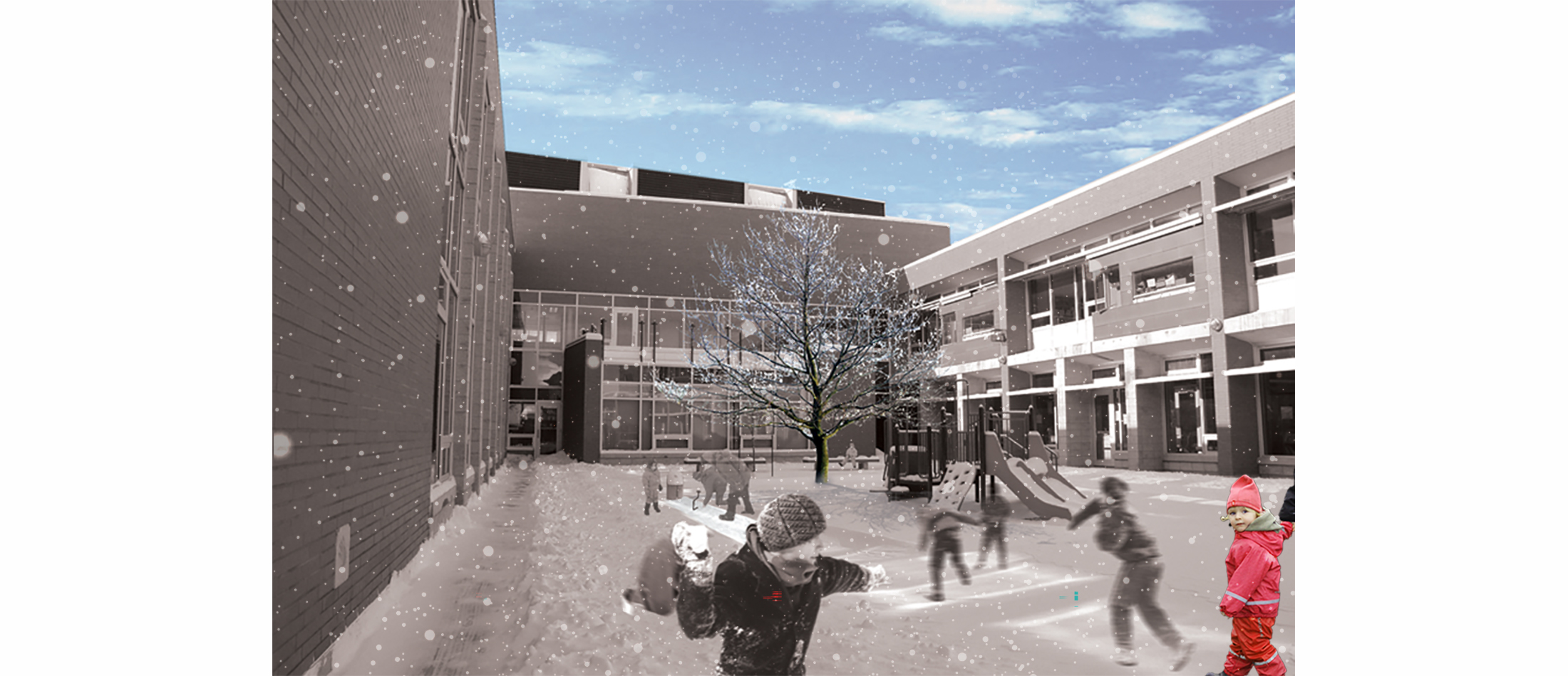
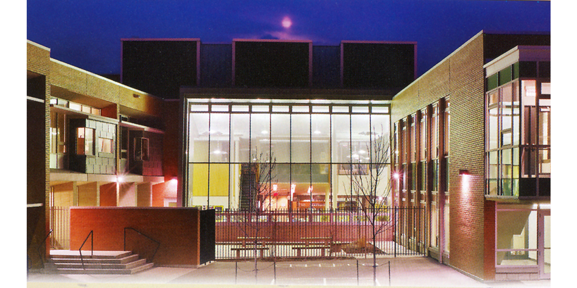
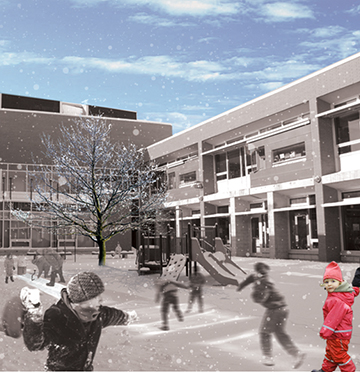
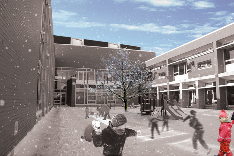
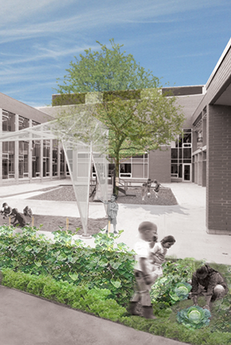
This is the first prototypical green school for the Toronto District School Board. In conjunction with R.V. Anderson, the firm devised a new sustainable environmental approach to groundwater recharge for the courtyards, path systems, playing fields, and parking lots. This method is applicable to all urban conditions where excessive run off is an issue. This was done through the use of groundwater infiltration zones that manifests itself in design features and encourages co-operative maintenance, and planting of gardens by the students. Simultaneously the students learn about the water cycle and conservation.
“An admirable design that creates a rich variety of interior and exterior spaces for children and a public focus for a new community. This project breaks free of the traditional finishes and systems that have been mandated up to now by the Toronto District School Board and sets a new model for environmentally responsible design by school boards.”
Canadian Architect
Awards – AIA Award of Excellence (2008), Award of Excellence, Toronto Architecture and Urban Design Awards (2007), LEED Canada NC-1.0 Silver (2006), Award of Excellence, Canadian Architect (2005)