+ Residential
Landscape Portrait: The Green Screen Meadow

+
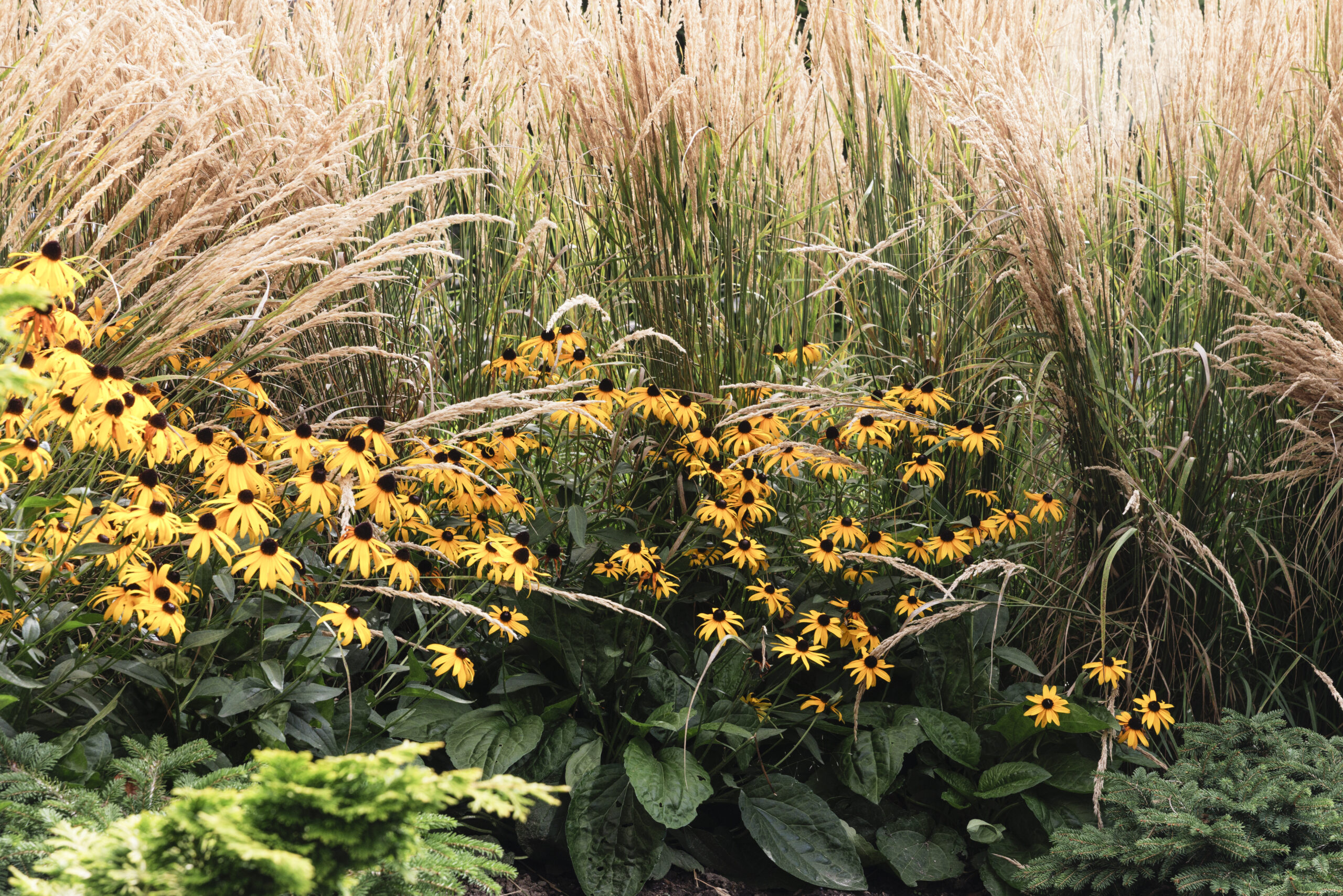
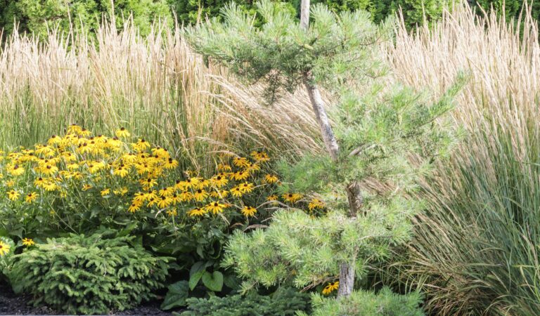
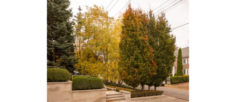
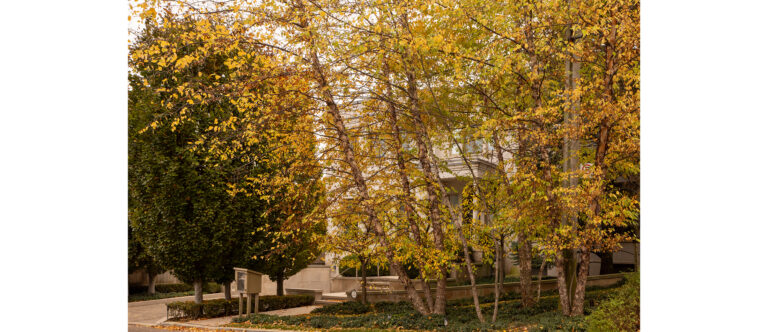
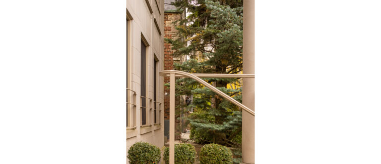
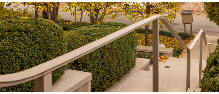
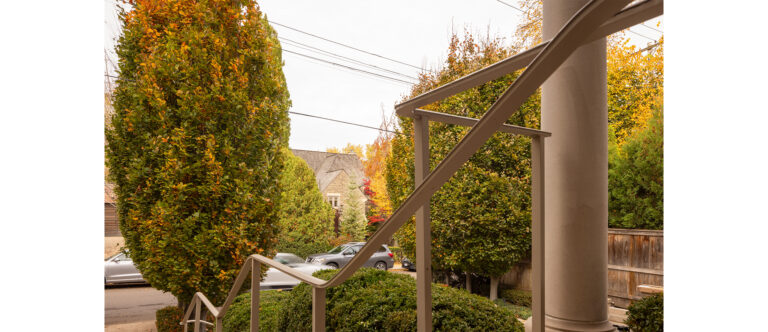
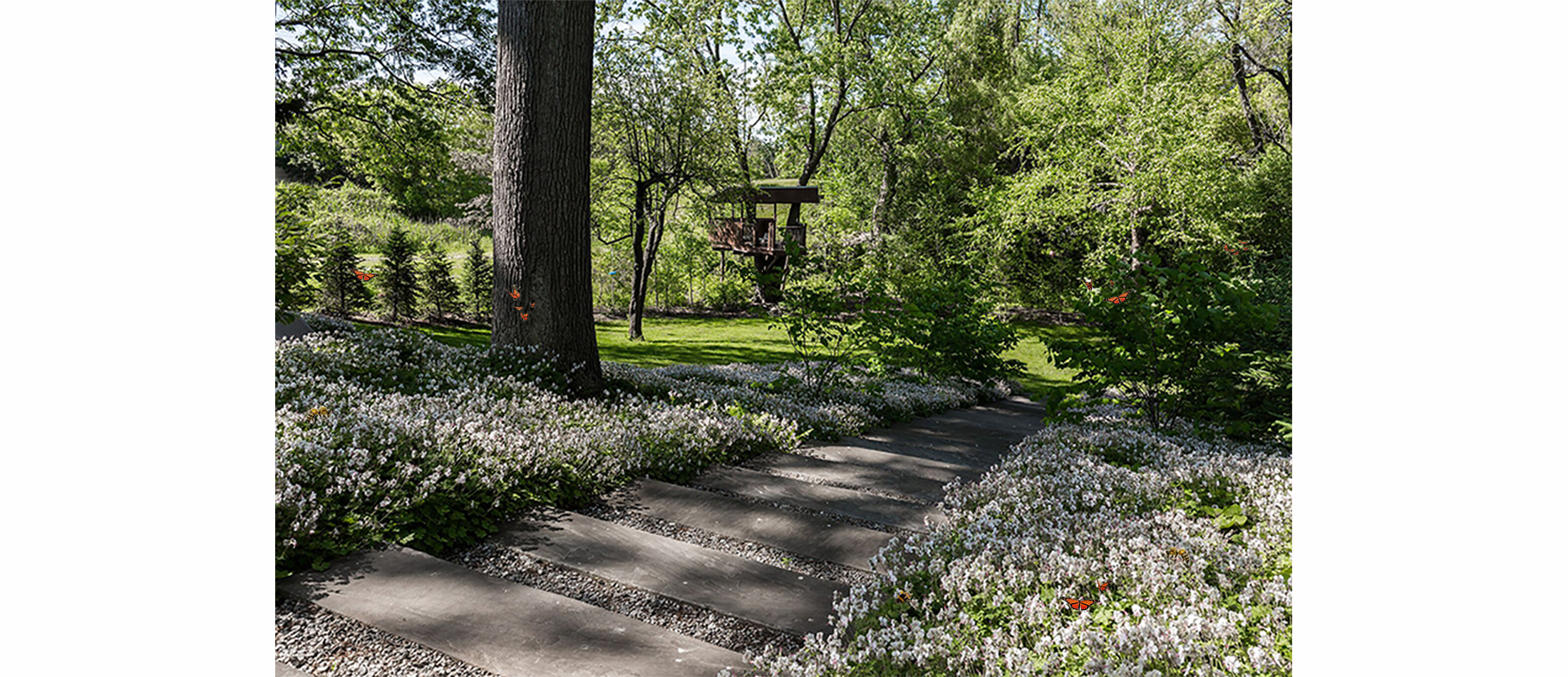
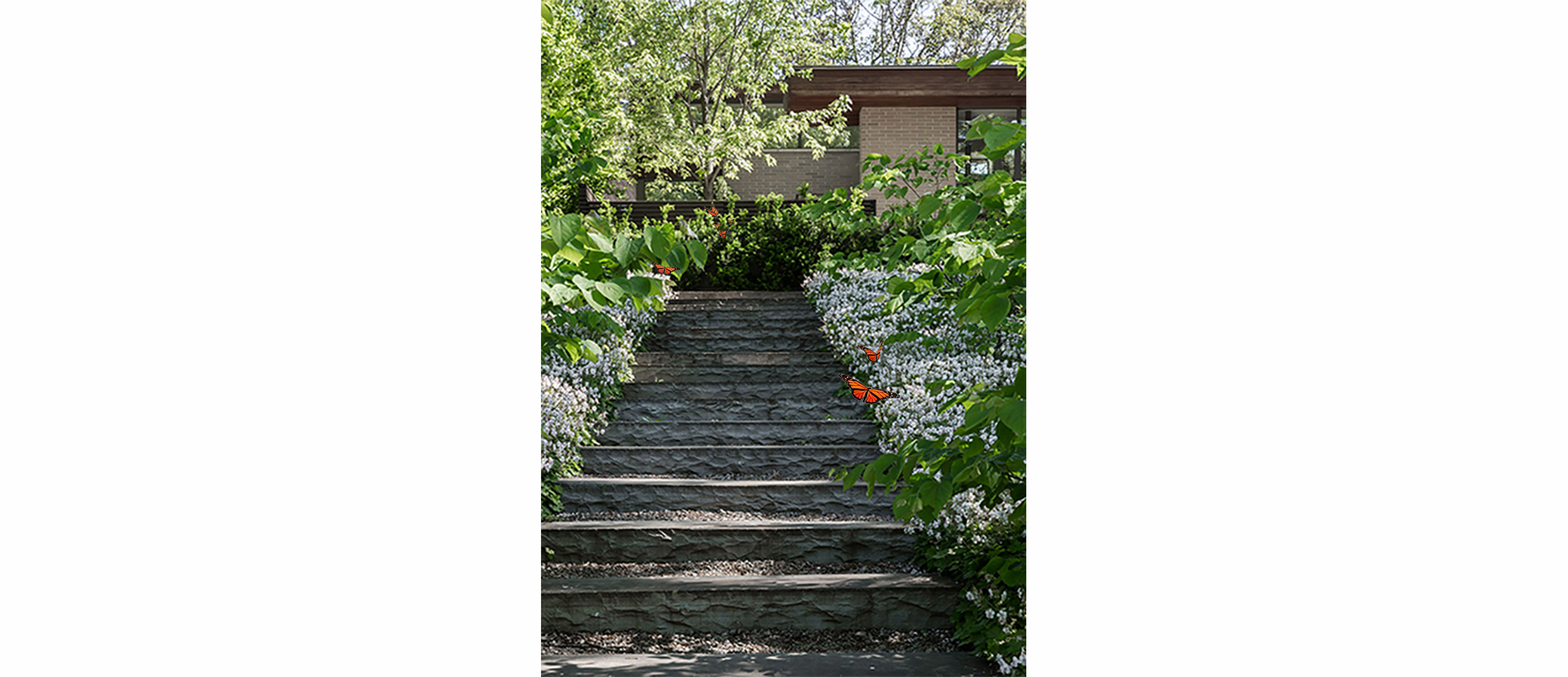
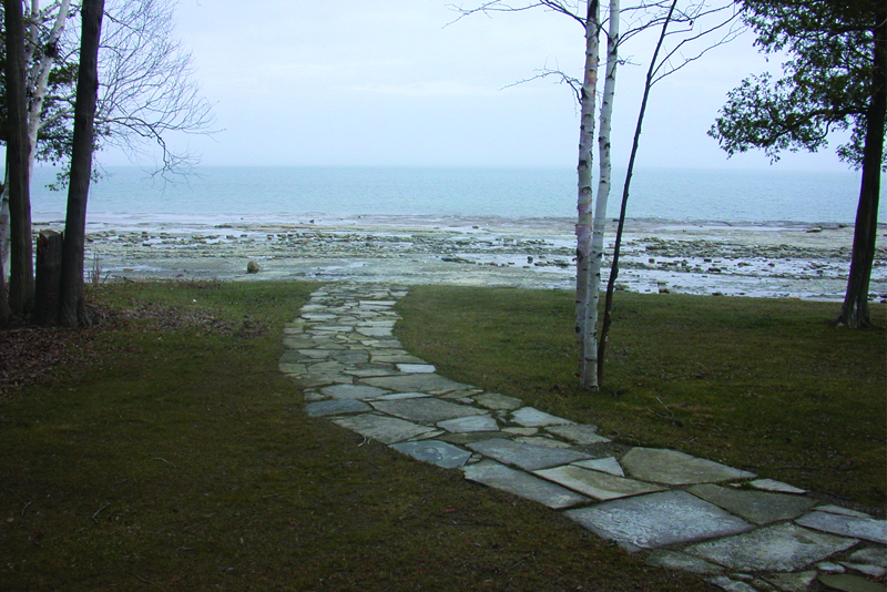
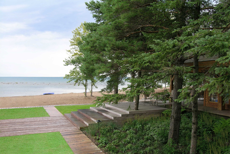
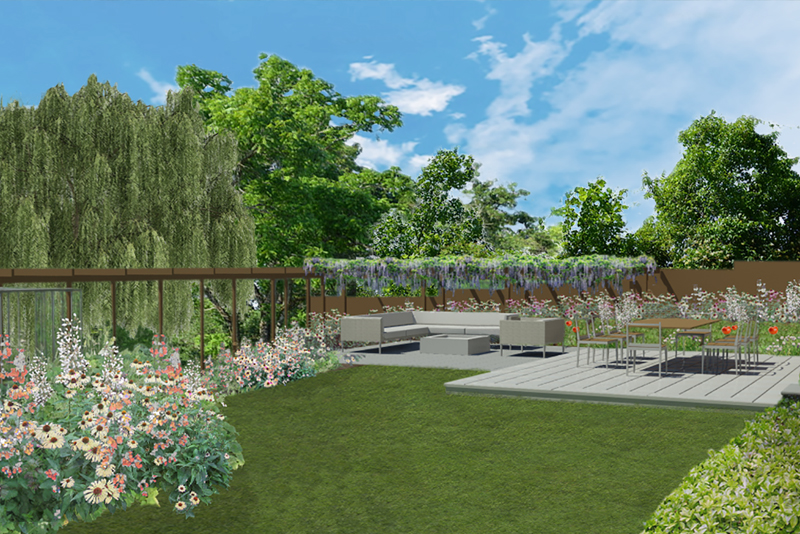
THE GREEN SCREEN MEADOW
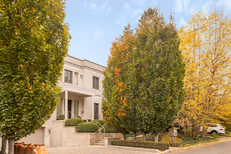
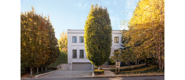
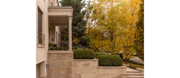
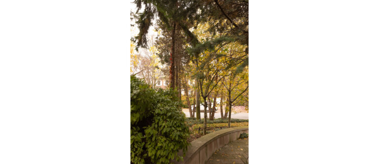
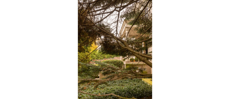
A layered planting screen—from beech hedge to meadow—buffers traffic and noise. The hedge shields the garden from the street; beyond it, a meadow stretches to the living room window, framed like a 17th-century painting. Varied plant heights and forms create depth, transforming a compact space into a park-like view.
CINEMATIC DESIGN IN MOTION
Inspired by cinematic principles, the garden breathes, evolves, and reconnects the community with nature.
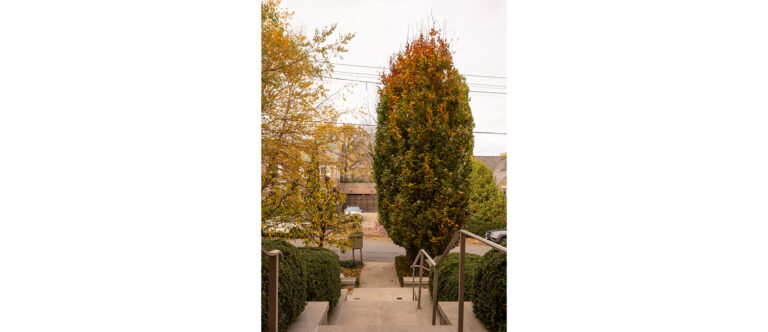
THE ECO MACHINE
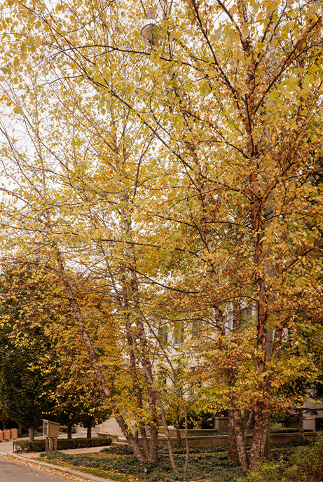
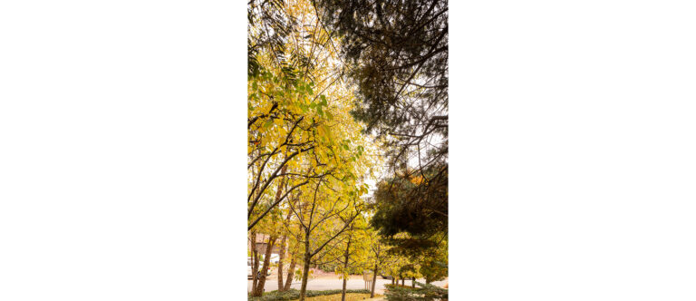
Succession meadows store more carbon than forests, enhancing biodiversity and climate resilience.
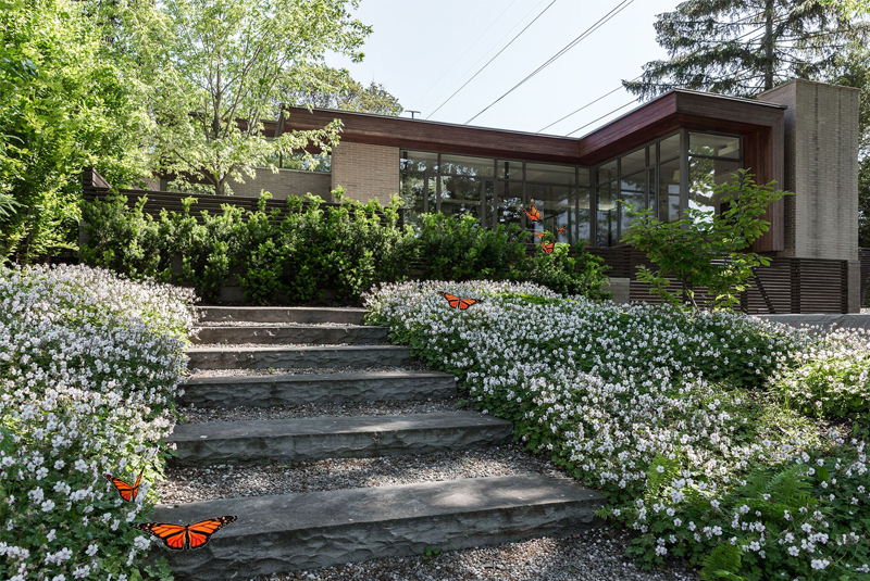
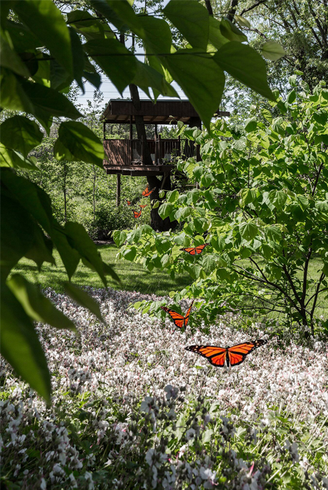
LIFE IN EVERY METRE
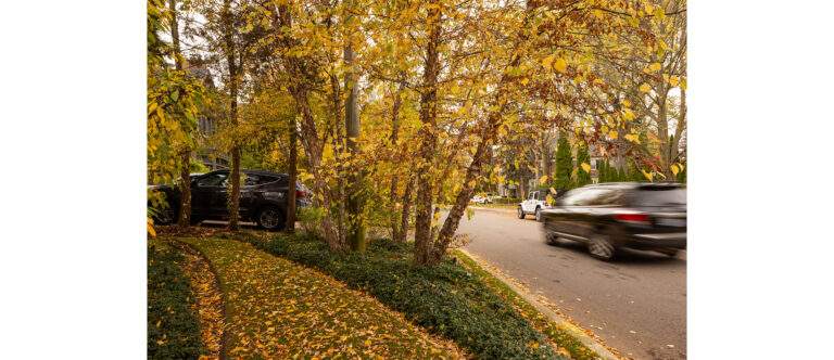
Unlike uniform lawns, this meadow bursts with life. Monarchs and pollinators animate the space, showcasing rich ecology in a small footprint.
From spring’s lush greens to winter’s quiet whites, each walk becomes a sensory journey.


- Related Projects
+ Residential
Woodlots on the Front Lawn
+


+ Residential
“Wild by Design”
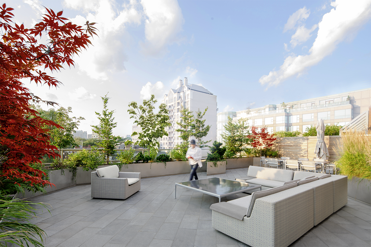

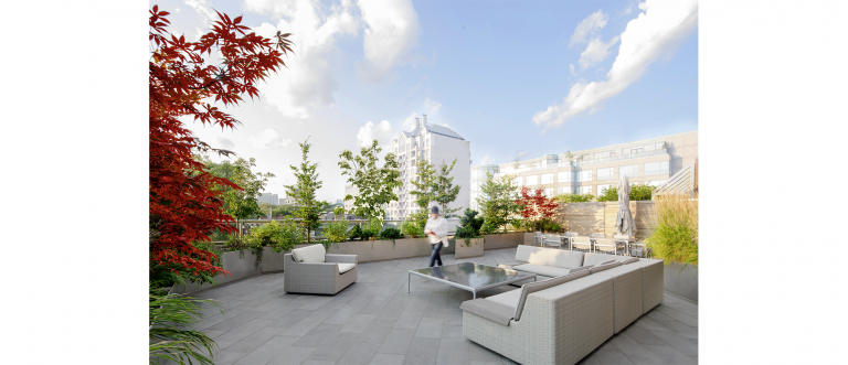
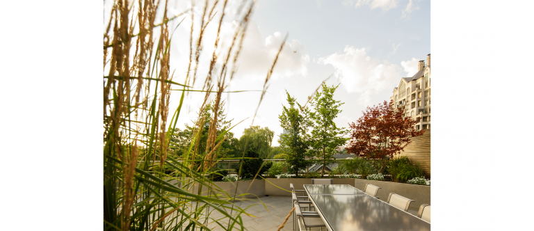
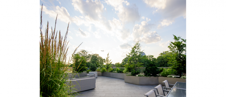
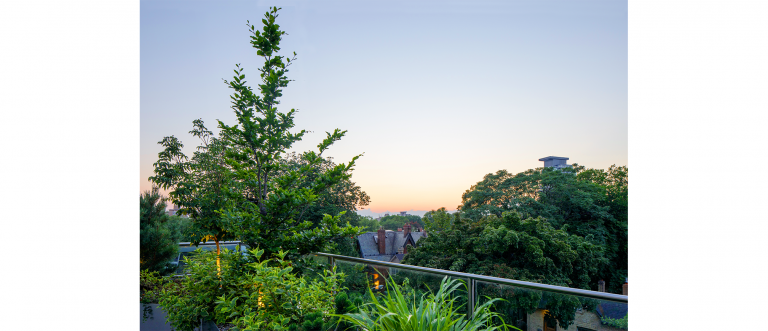
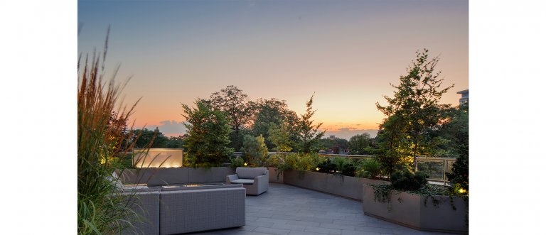
+ A BORROWED LANDSCAPE
Drawing upon the clients’ interest in Japanese landscapes, the ancient Japanese technique of Shakkei (or “Borrowed Landscape”) was applied to this contemporary garden terrace. Located within the tree-filled Annex of Toronto, distant views of the surrounding area were incorporated into the garden to become part of its design. The perimeter of the garden is lined with a wide variety of trees, whose structured placement frames and intensifies views of the Annex while simultaneously blending in with the landscape beyond. The diagonal stainless steel planters around the garden divide the 1200 square foot terrace into its programmatic functions such as entertaining, leisure, and cooking. They are filled with LiteTop® Growing Media, a specially blended mix of organic and mineral materials which helps the shrubs and perennials thrive and serve as a pollinator garden within the urban city.


+ Project Details
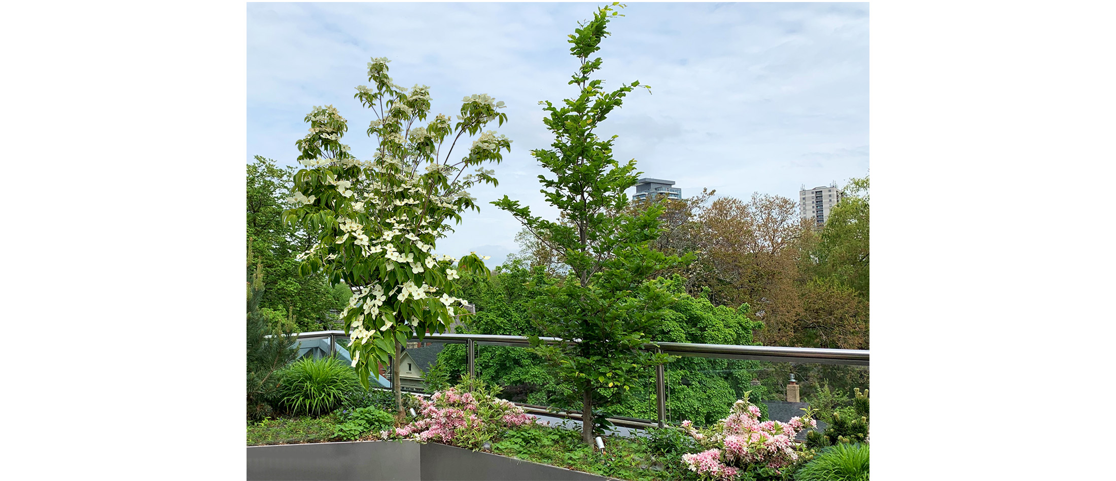
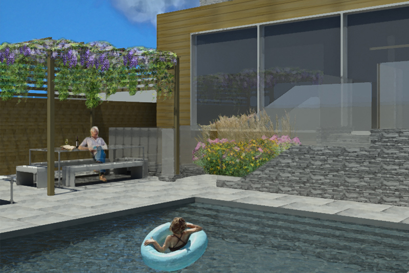
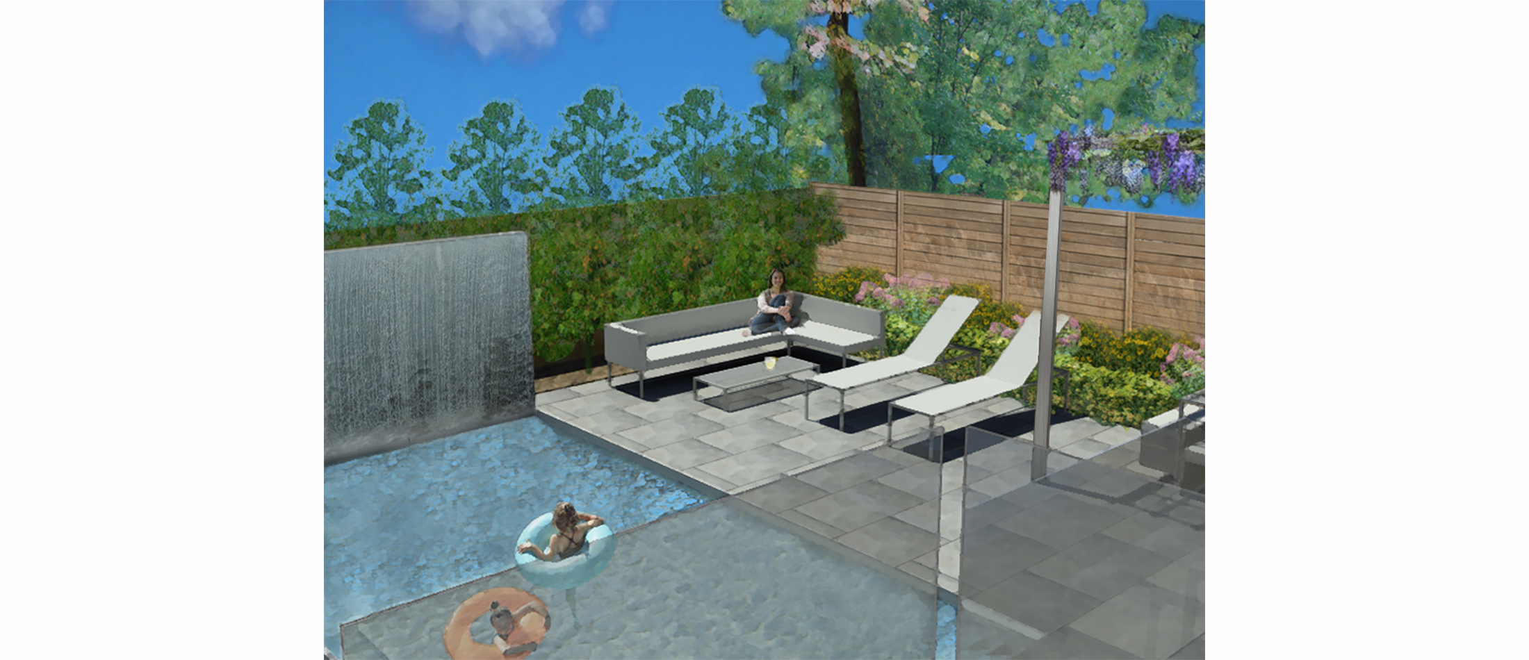
Pollinator Garden
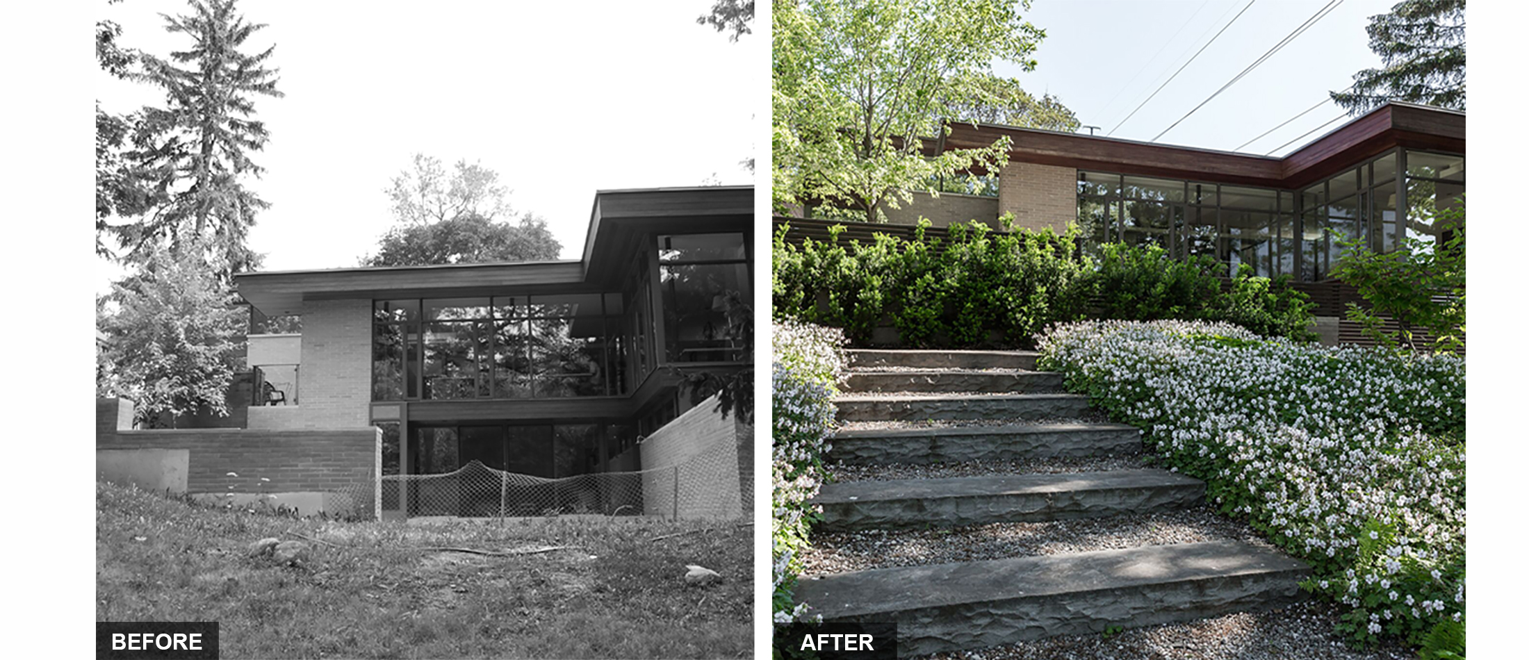
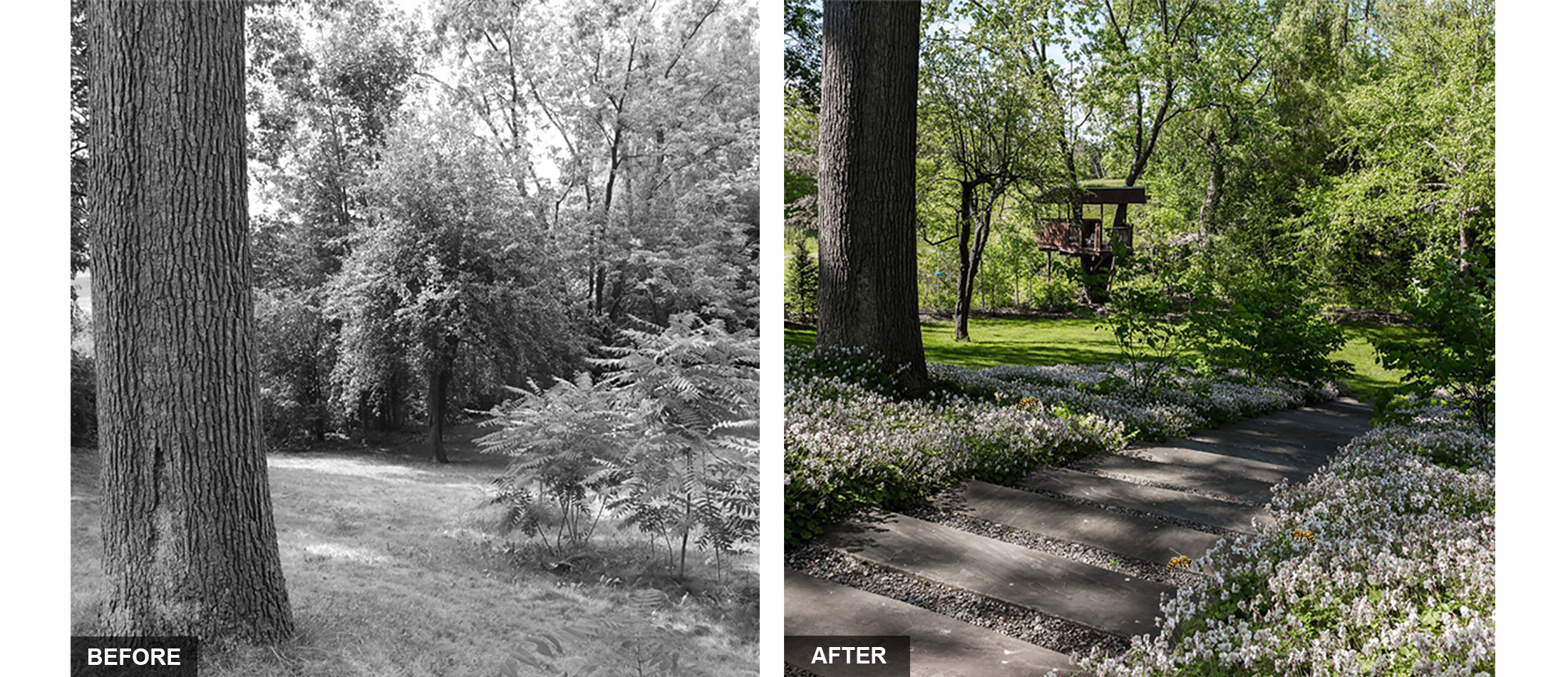
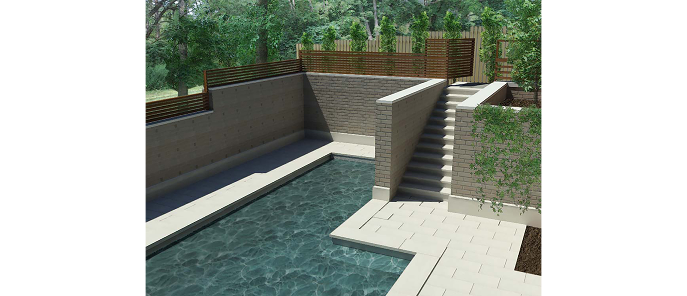
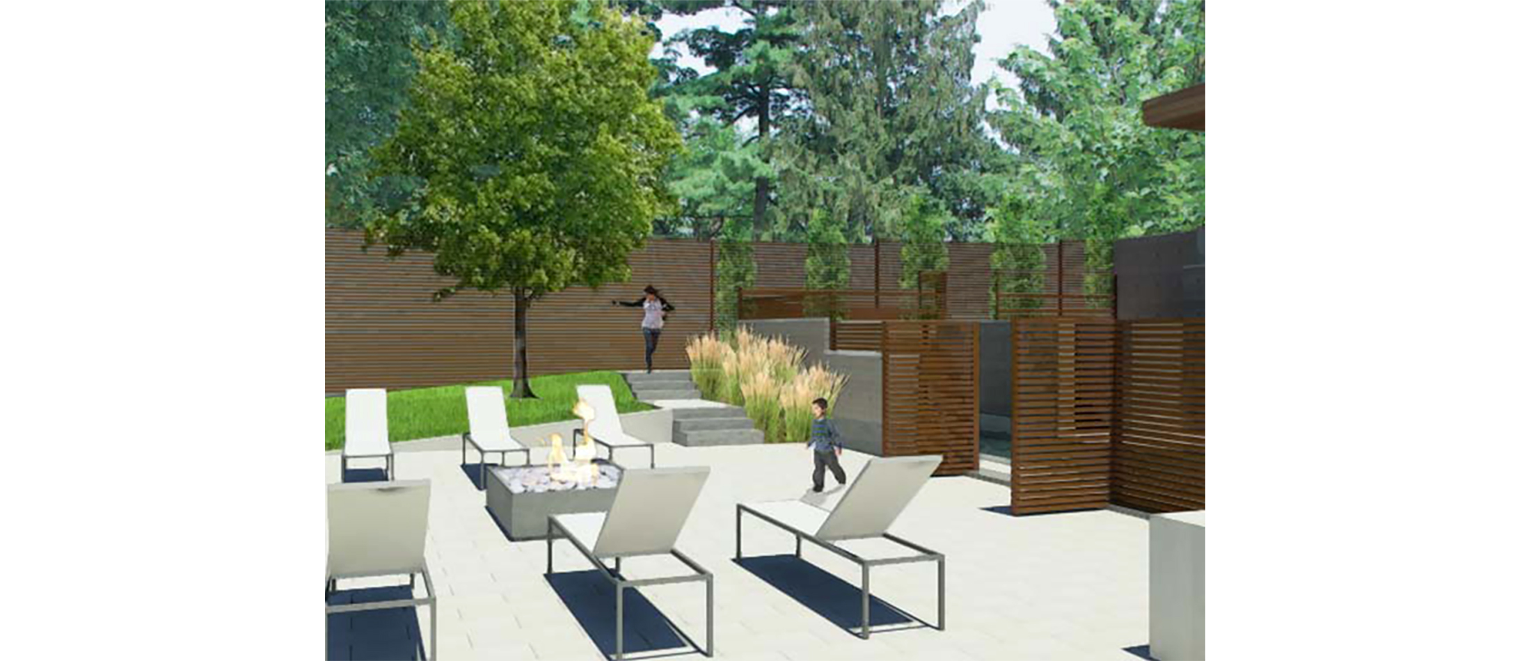
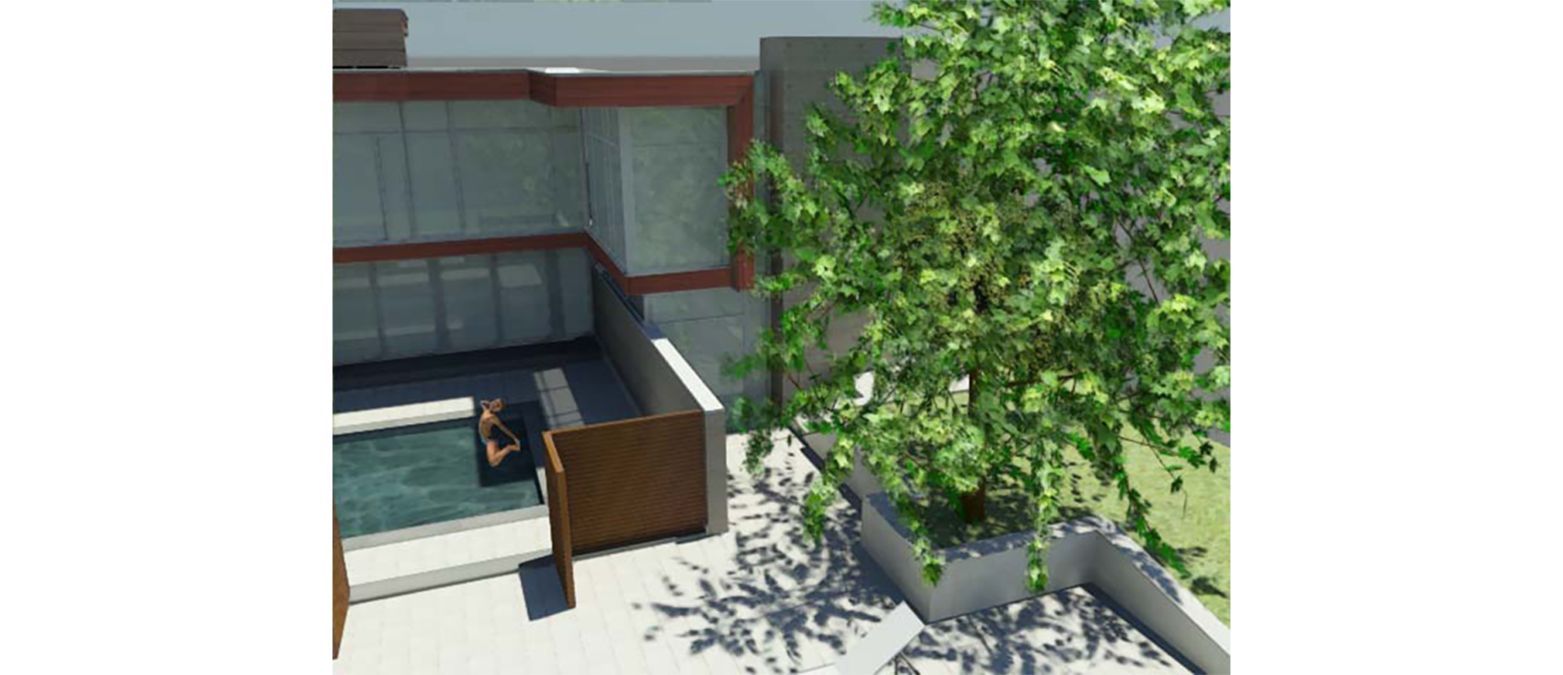
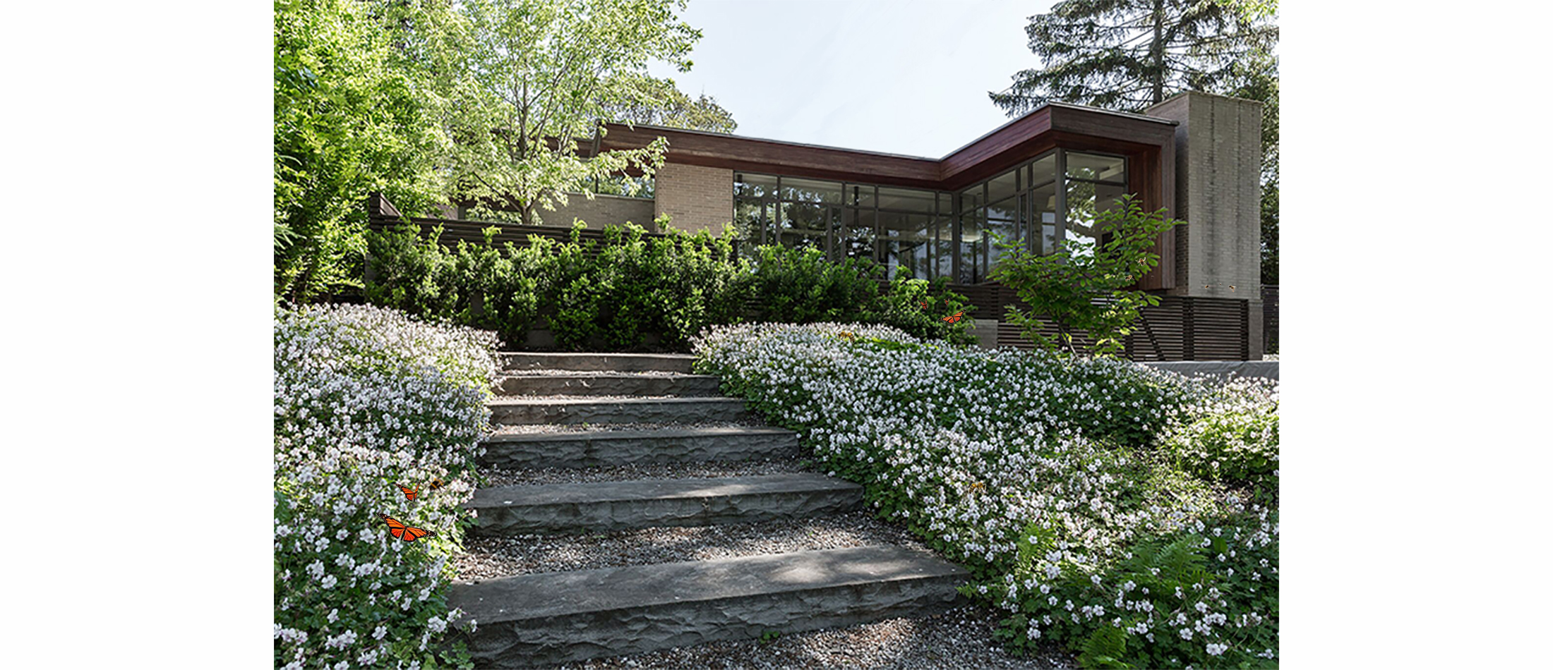
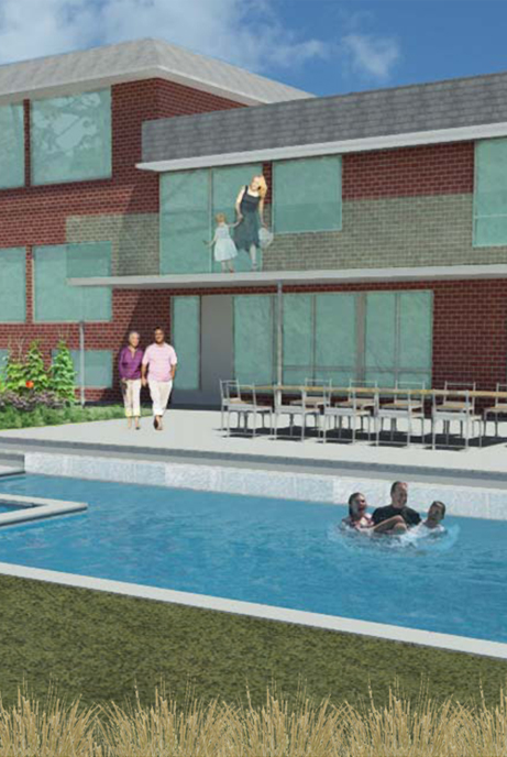
+ POLLINATOR GARDEN
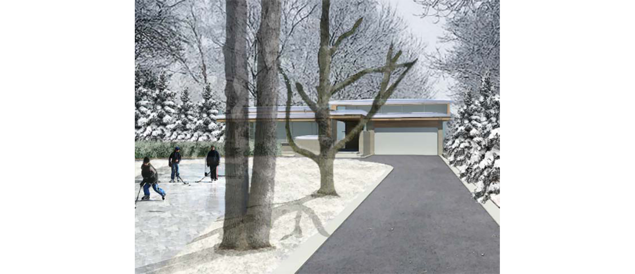
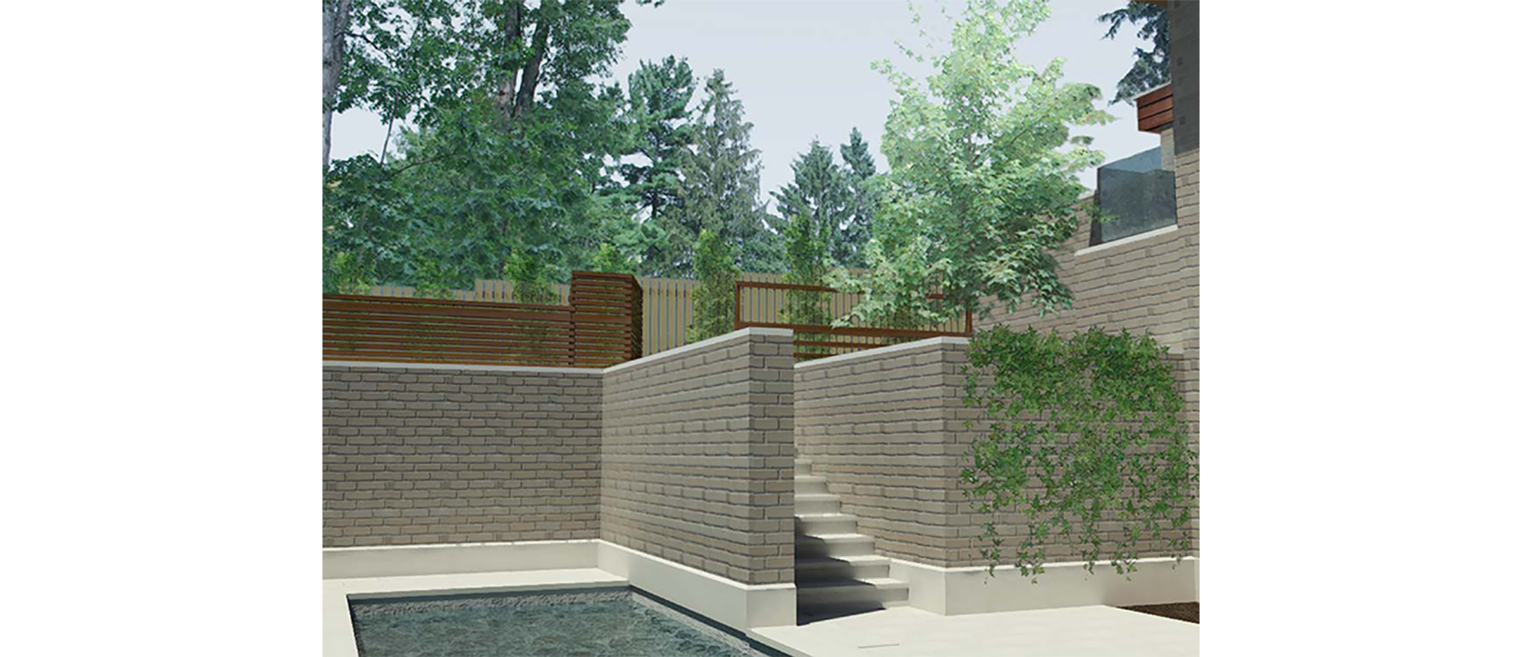
This midcentury inspired modernist home is situated on a large suburban lot. A master plan was designed to be developed over time.
Low maintenance, sustainability, and specific functional needs for their three active children were identified. The clients wanted a swimming pool, skating area, and large grassy play area for various sports. The steeply sloped site descended to a stream and woodlot. It was important that the children access all areas of the garden freely without any restrictions.
A limestone path system became the major connecting device for all the components of the garden. The pathway was set in concrete in the areas closest to the house. As it moved away from the house and driveway the stone was dry laid to minimize impact on the natural landscape, recharge rainfall into the groundwater system and visually fit into its context.
The front lawn became a flexible green space where the children could play in the summer and skate in the winter. The pool was located close to the house for ease of access and terraced into the slope. The path continued down the slope which was naturalized with flowering native groundcovers that created a pollinator carpet attracting hundreds of bees. Native woodland plants edged the woodlot at the bottom of the slope.
Evergreen hedges in the front lawn created a gateway entrance to the home and provided screening from the view and noise of the nearby arterial road.


+ Project Details
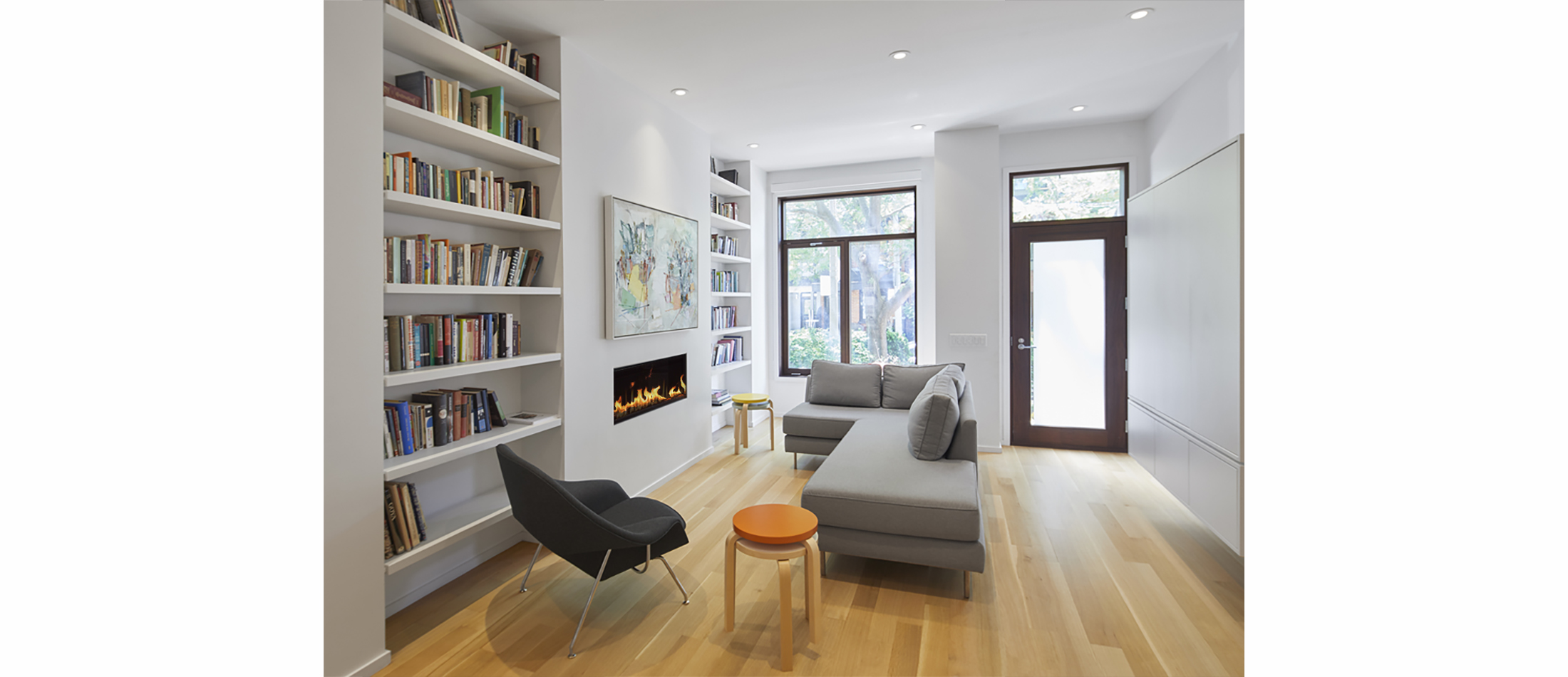
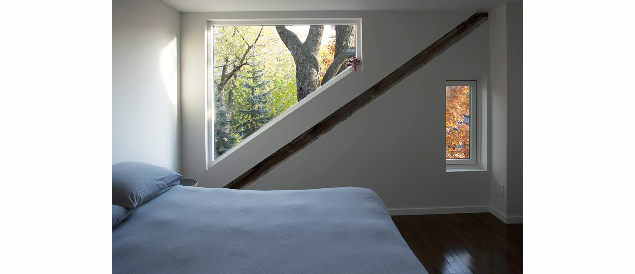
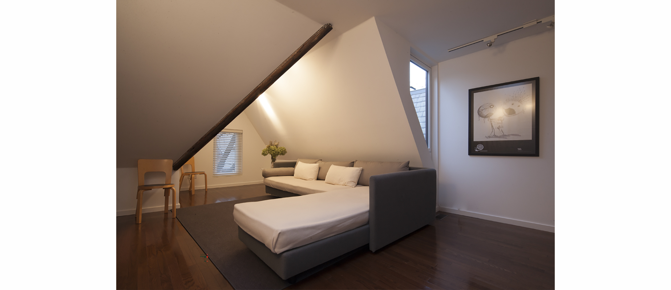
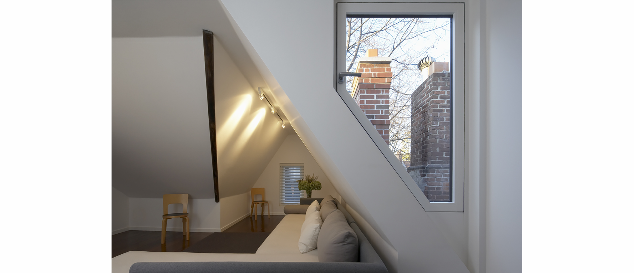
A TORONTO VICTORIAN SEMI GETS A LIFT
+ RAISE THE ROOF BEAMS
Elias + was approached by a young couple who needed more living space for their growing family. Buying a larger home was out of the question given the increased cost of Toronto real estate. It made more financial sense to renovate the home they had been in for seven years.
In order to do this we had a three-branched strategy.
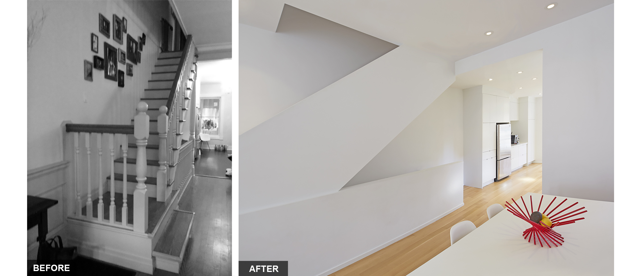
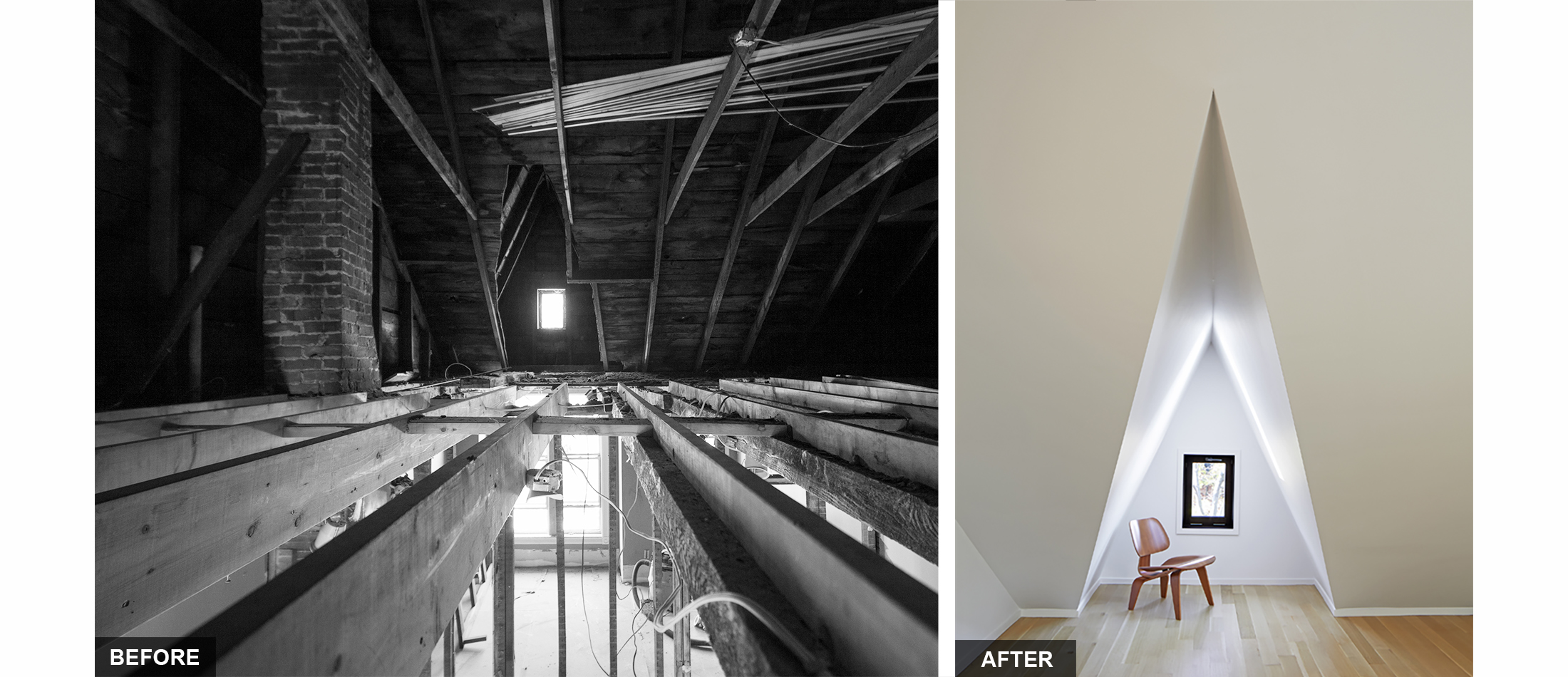
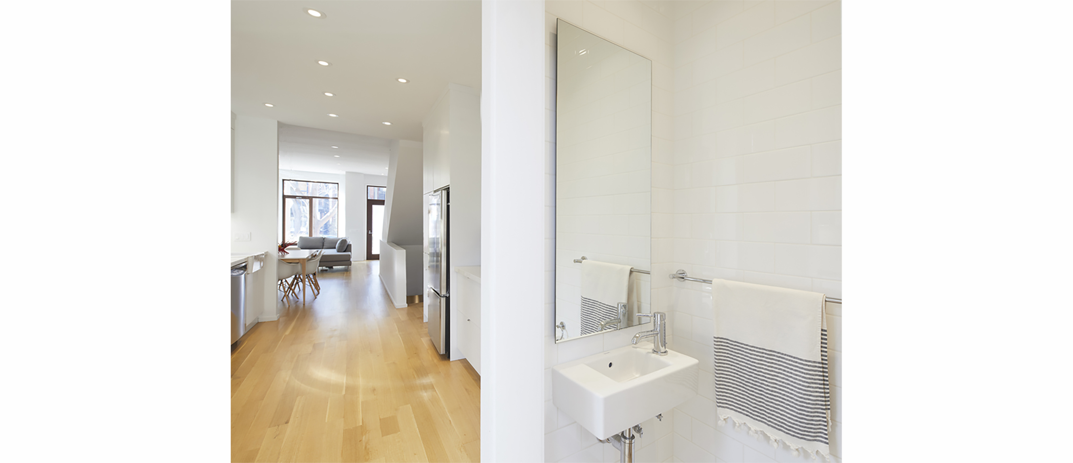
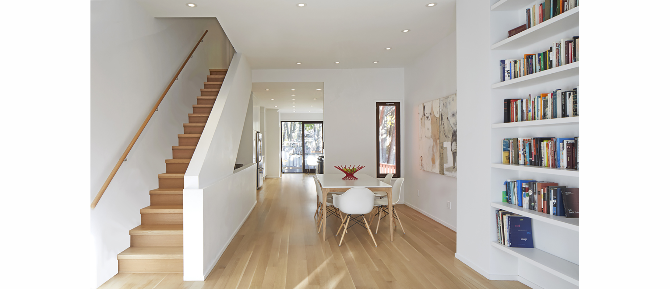
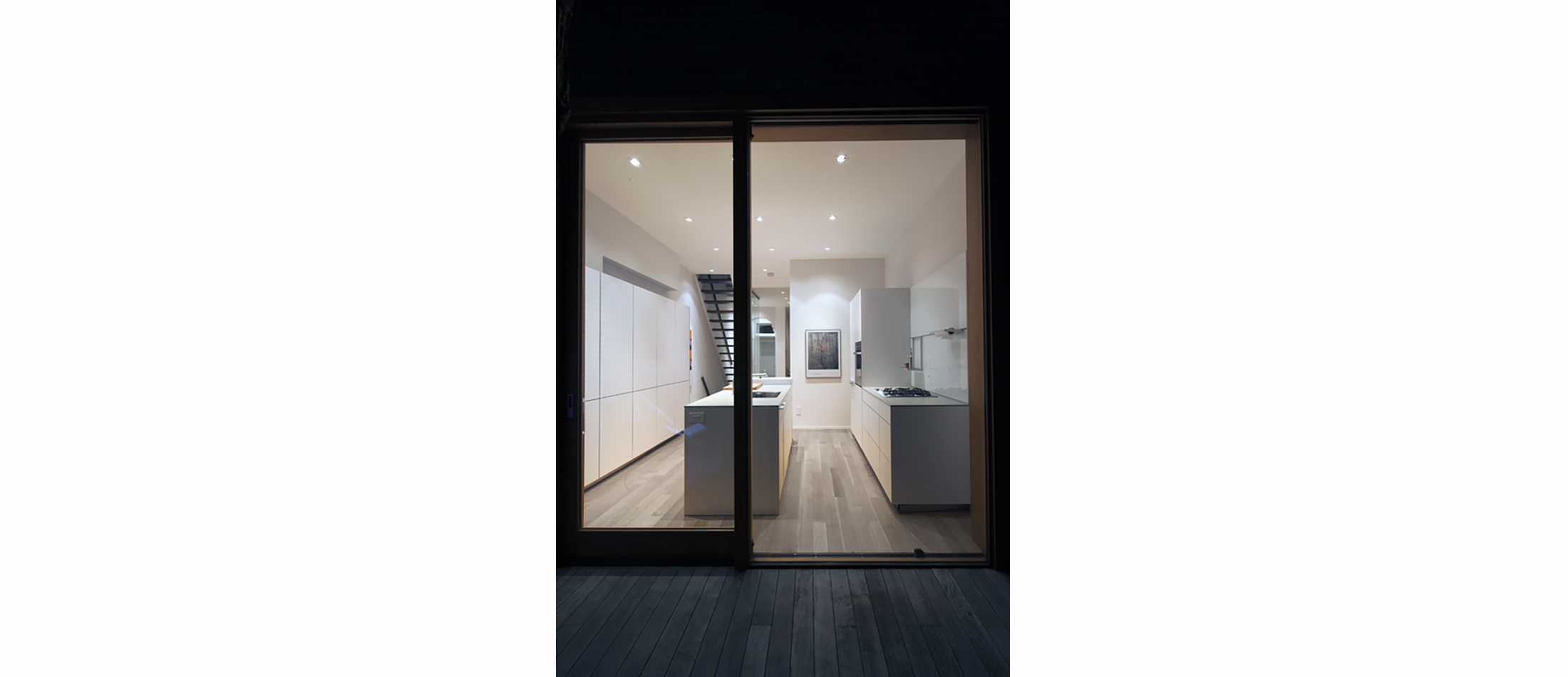
The first branch was to open the interior, unify common areas into an open plan, and raise the home’s roof forming a third story master suite. This allowed us to create a bright airy open space. A two story addition increased the square footage to include a new powder room and expand the back of the first floor to flow into the garden via sliding doors. This let light penetrate the formerly dark kitchen area.
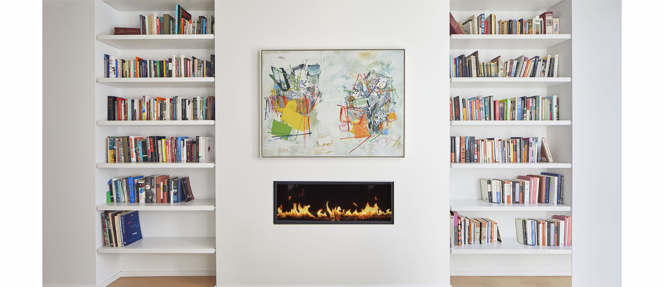
Minimalist detailing replaced deteriorated neo-traditional wainscoting, crown molding and baseboards. Doors and windows, previously diminished by framing and mullions, were replaced with large expanses of glass, maximizing light penetration.
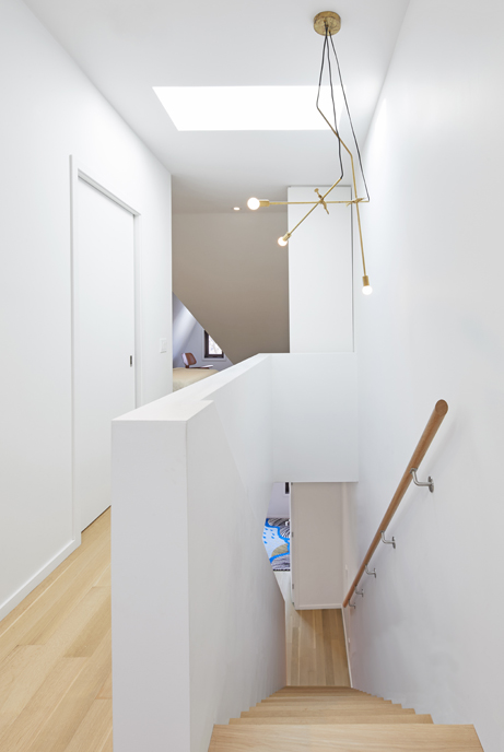
A newly designed contemporary staircase became a sculptural element and unifying device for all three levels.
The second floor bathroom was moved to allow more open space for a play area. One of the children’s bedrooms was expanded onto the roof of the addition.
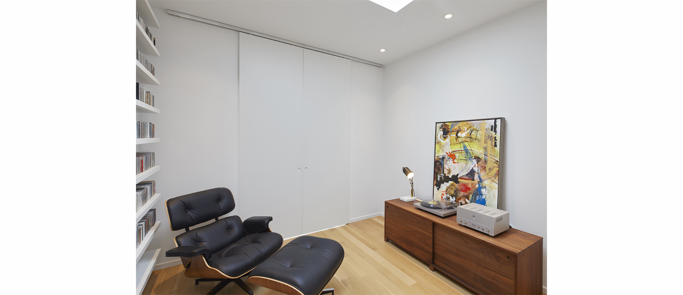
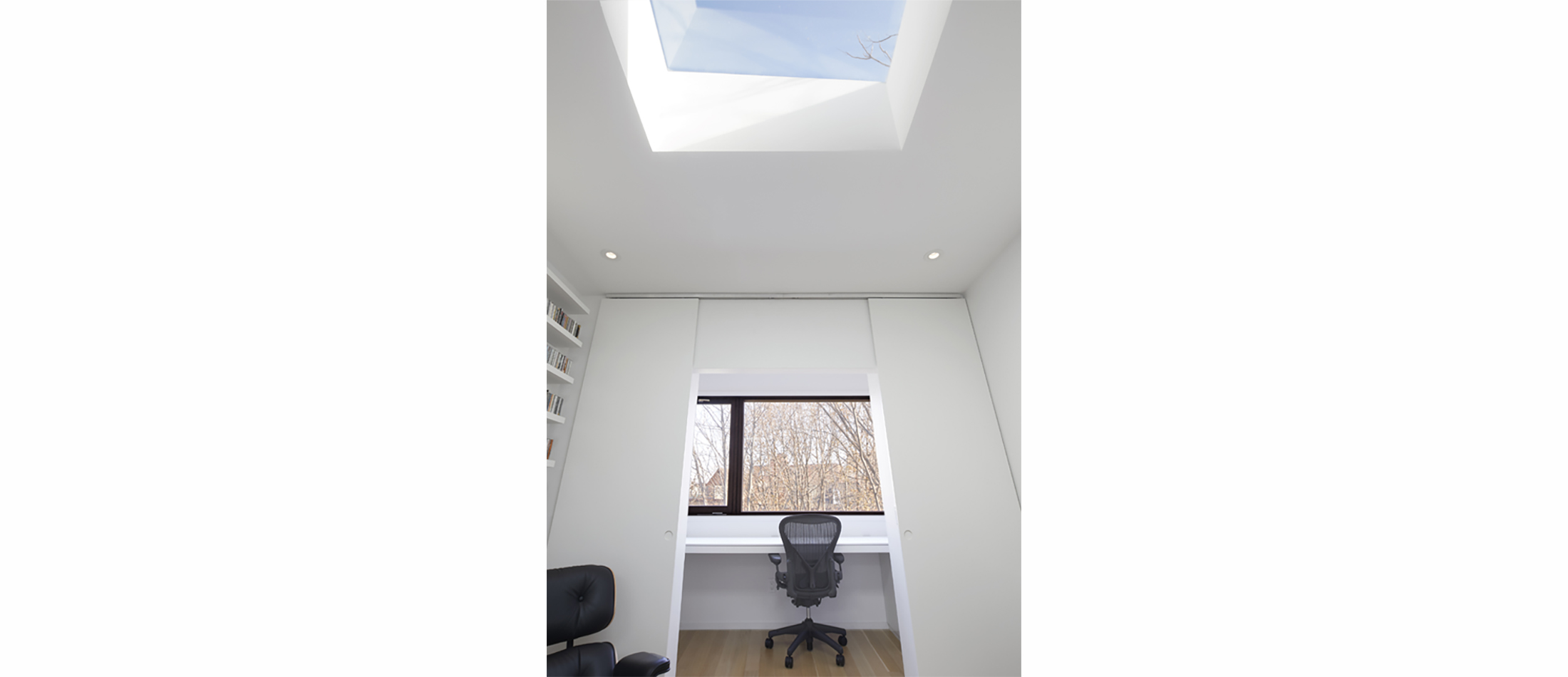
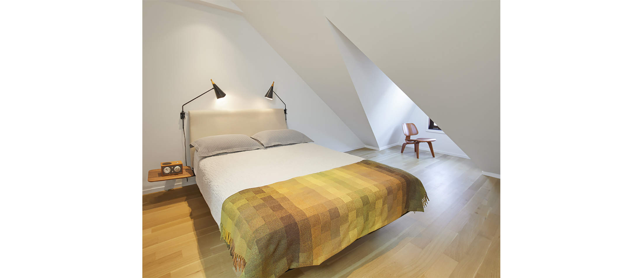
The program requested by the clients for the master suite was complex and challenging for such a small space. Both husband and wife were university professors commuting to their jobs out of the city and wanted individual workspaces away from the children. Elias + created two small study areas at the back of the suite facing the back garden separated by barn doors. Maintaining the original roof geometry created dramatic sculptural spaces in the master bedroom at the front of the home. A master bathroom separated sleep and workspaces. This resulted in a series of rooms unified by a hall which sculpturally folded into the staircase. Numerous skylights further enhanced the bright and airy living space.
The second branch connects the inside to the outside bringing the natural elements visually closer to the family’s living spaces. Rooms were focused towards particular views of nature.
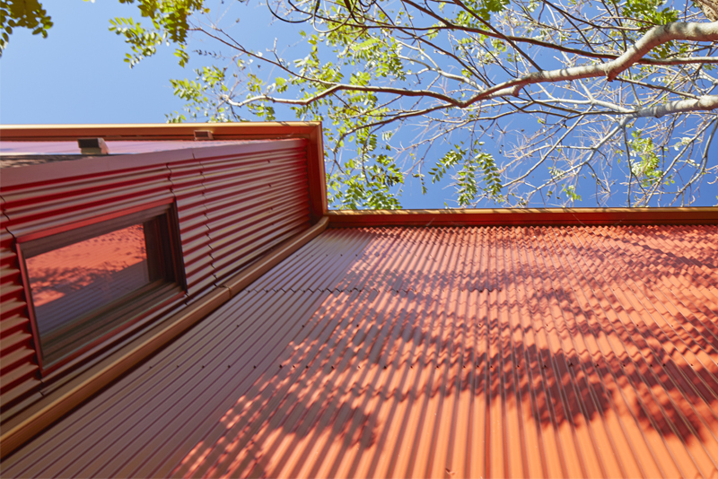
The third branch seamlessly melded the historic and contemporary design elements and maintained street character. The scale of the windows and doors were kept. The raised third floor conserved the original roof pitch geometry of adjacent gables. Due to the limited budget, red corrugated metal, which matched the red Victorian brick, was used to clad the addition and allow contemporary interior changes to blend with the exterior. The existing brick on the front of the house (to be repaired and restored later) was kept intact in an effort to maintain the character of the Victorian streetscape.


+ Project Details
WORKING TITLE
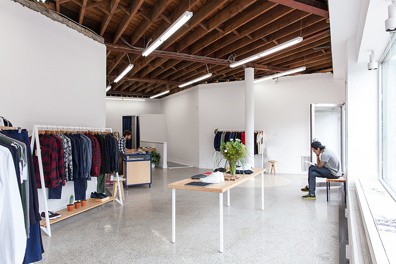
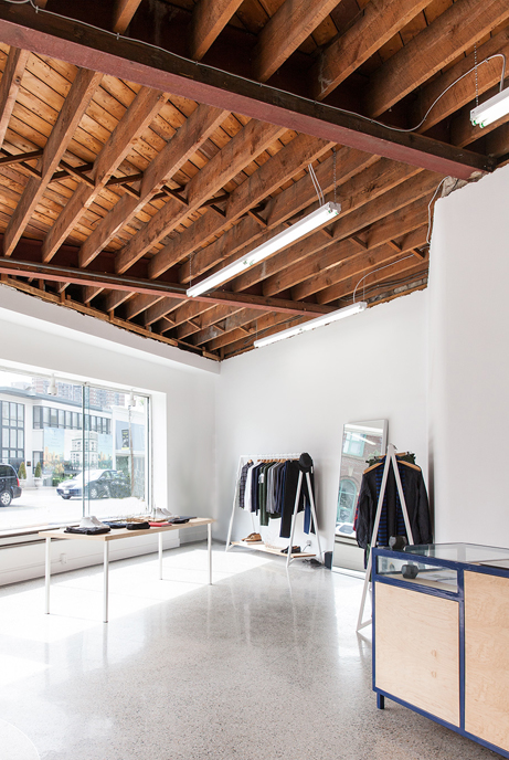
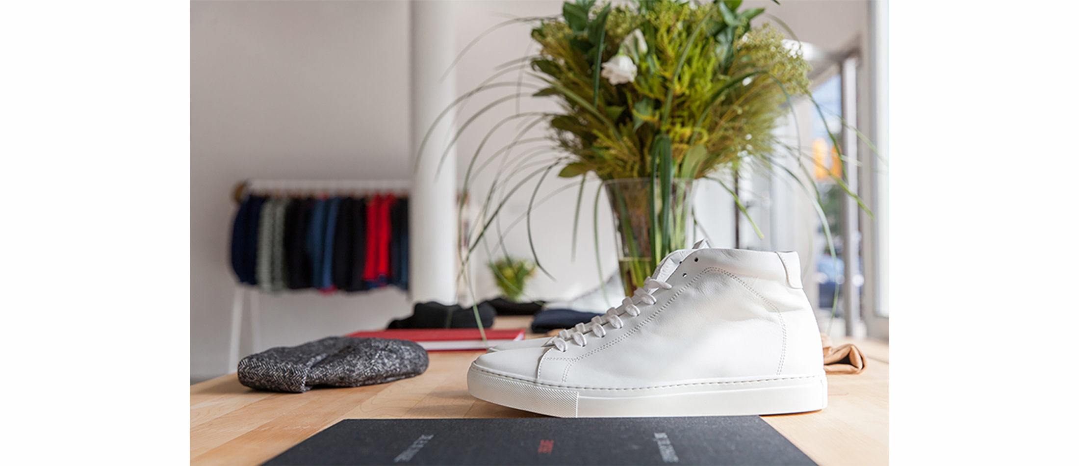
+ RETAIL IN EVOLUTION
The owners concept was bifold; a men’s clothing store and lower level art book store and gallery. The atmosphere they wanted to create was a reflection of their design sensibility; a minimal mix of avant-garde and classic modern design in men’s fashion and art. Our intent was to combine both these three elements in the interior.
We exposed and restored the existing classic modern terrazzo flooring. In contrast, to create an avant-garde atmosphere, we exposed the raw structure of the wood ceiling and added industrial lighting. All fixtures for clothing, display shelving and tables, were minimally detailed to highlight the products and carry through the owners aesthetic of minimal fashion into the interior architecture.

+ Project Details
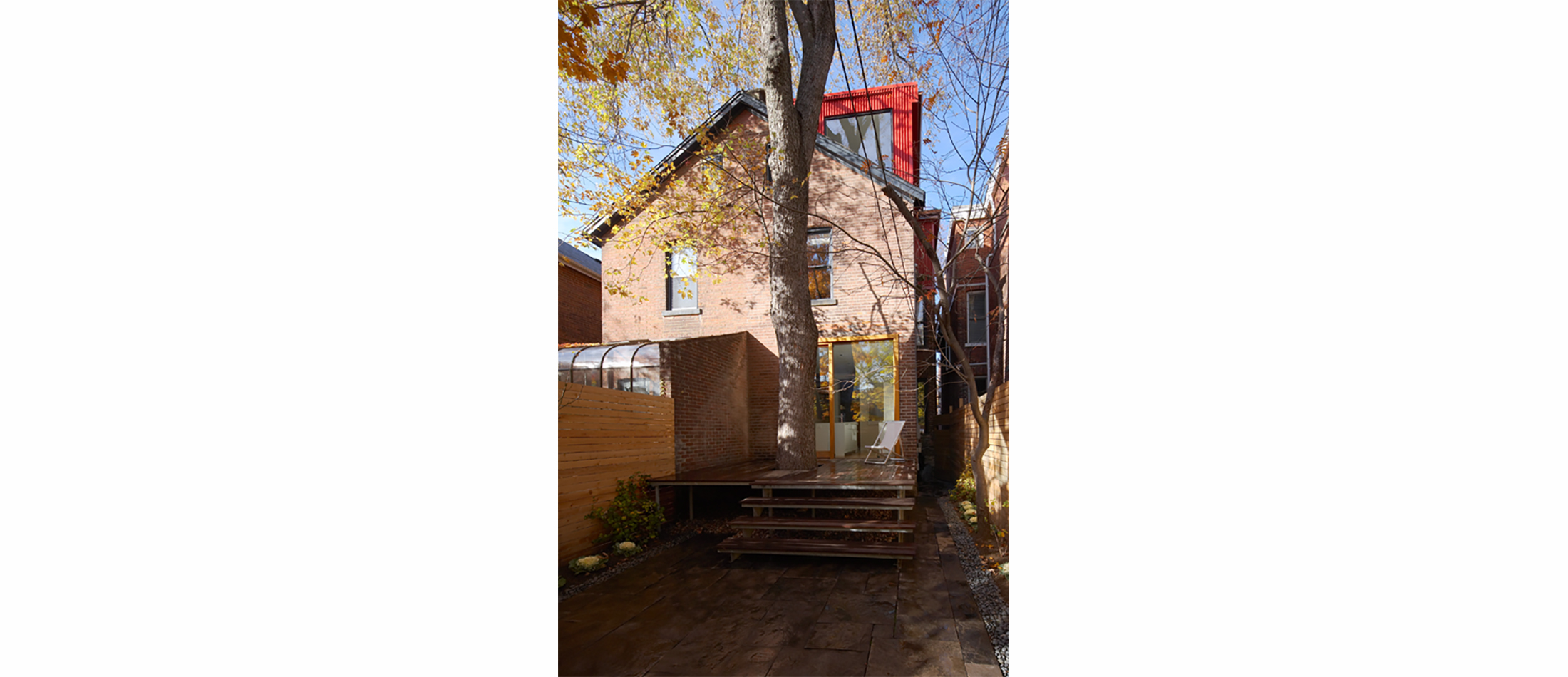
1890’s Annex House
+ MODERN INTERVENSION
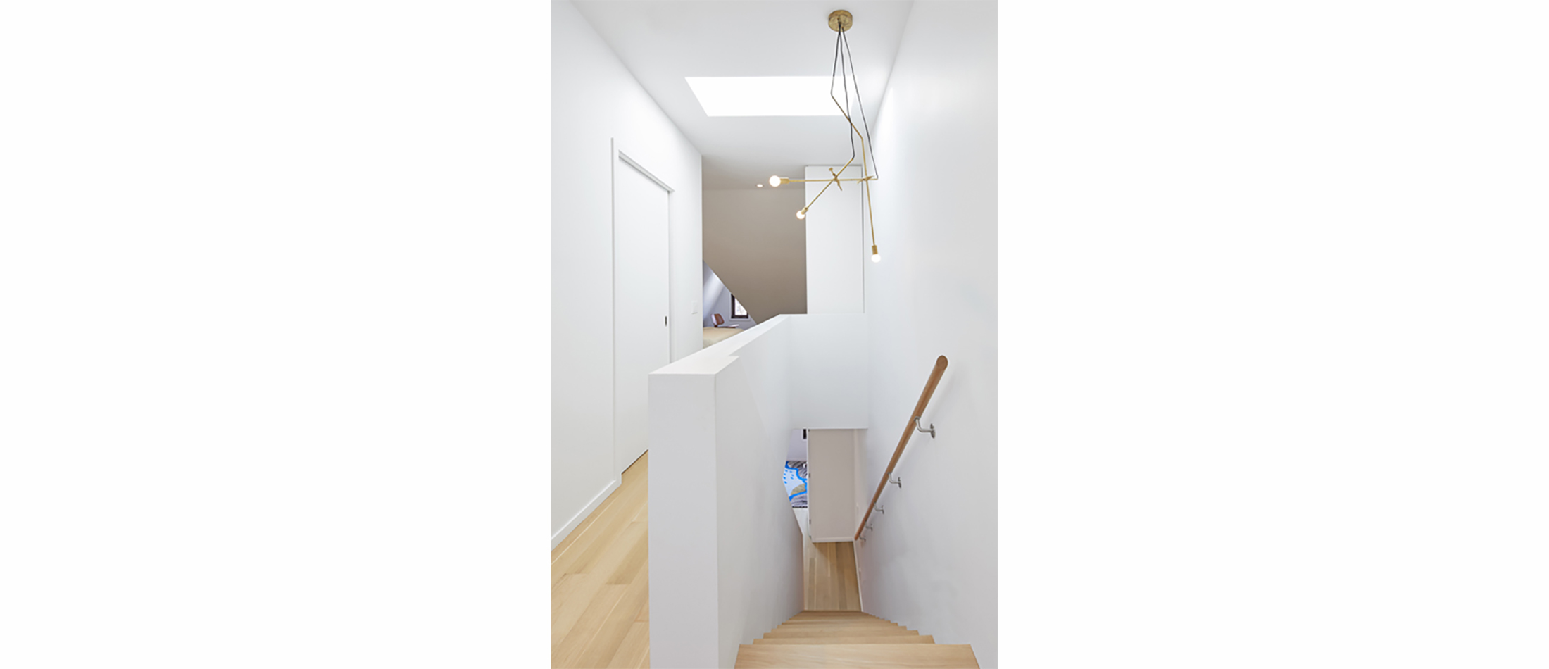
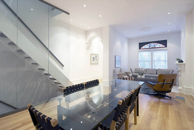
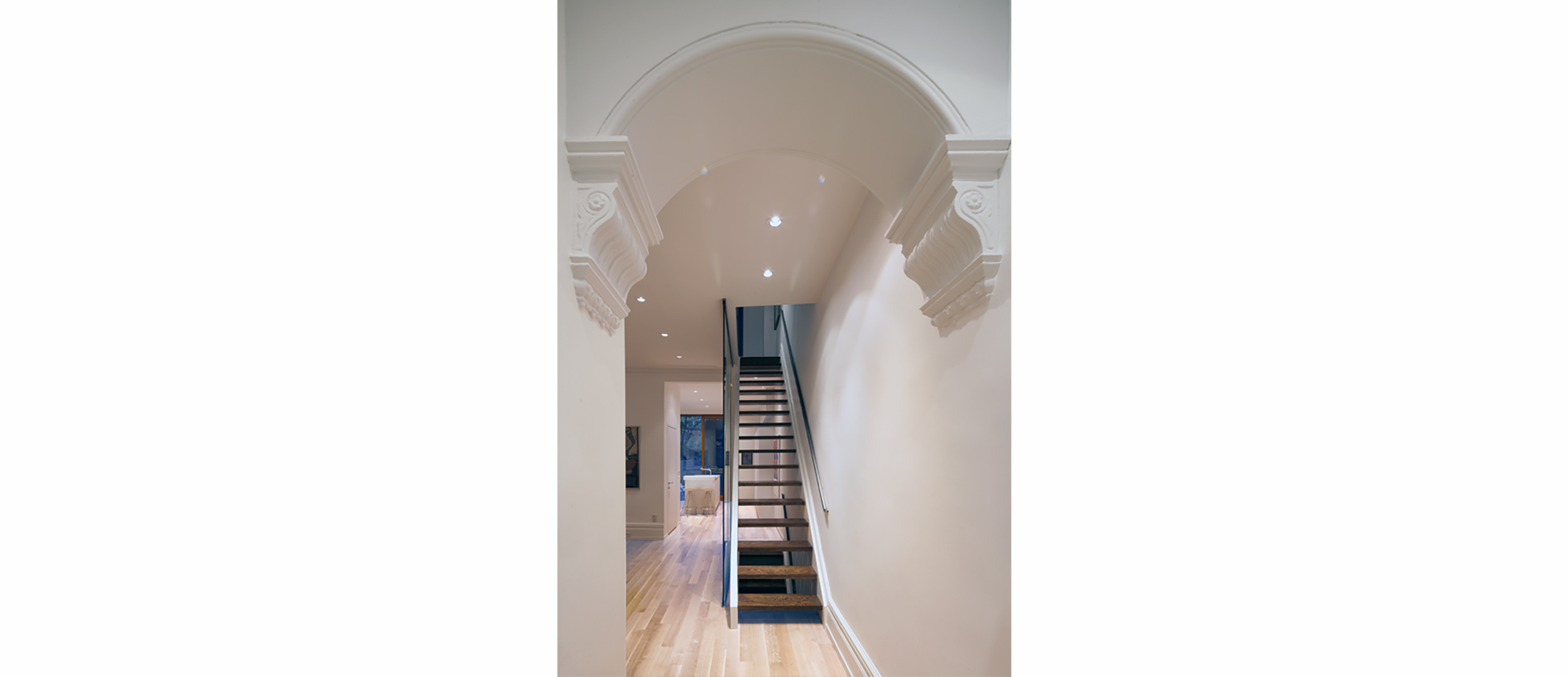
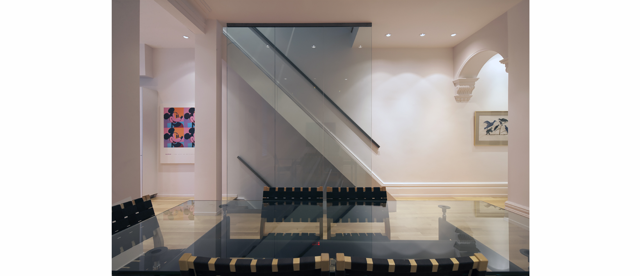
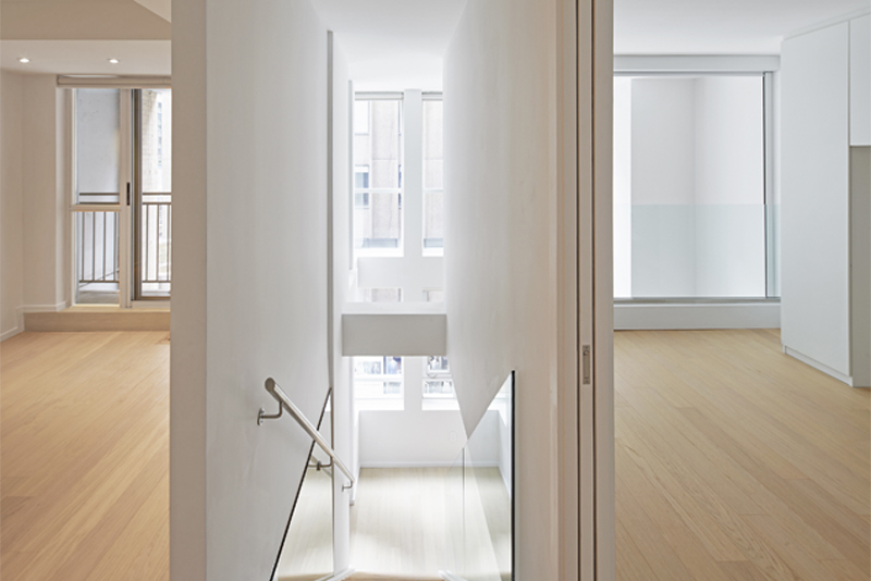
The Toronto Annex is one of the few designated historical districts in the city. This house constructed in 1890, is an example of well -crafted Victorian exterior architecture. Although the original floor plan was intact, there was very little of the interior detailing left. A typical semi–detached Victorian floor plan is long and narrow. It usually consists of a series of small rooms back to back with little exposure to natural light. The stairs are efficiently placed at the side of the main entrance and follow the 4 floors from basement to the top of the residence.
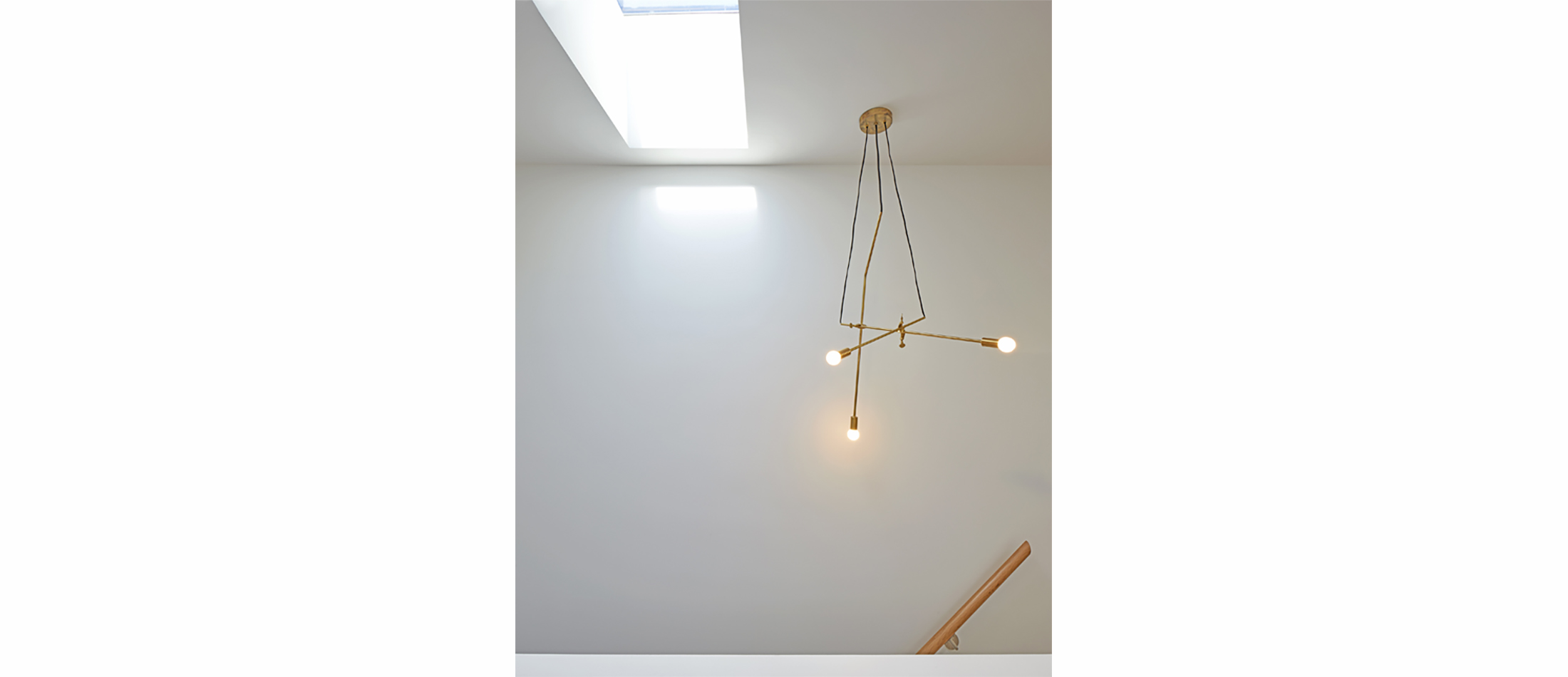
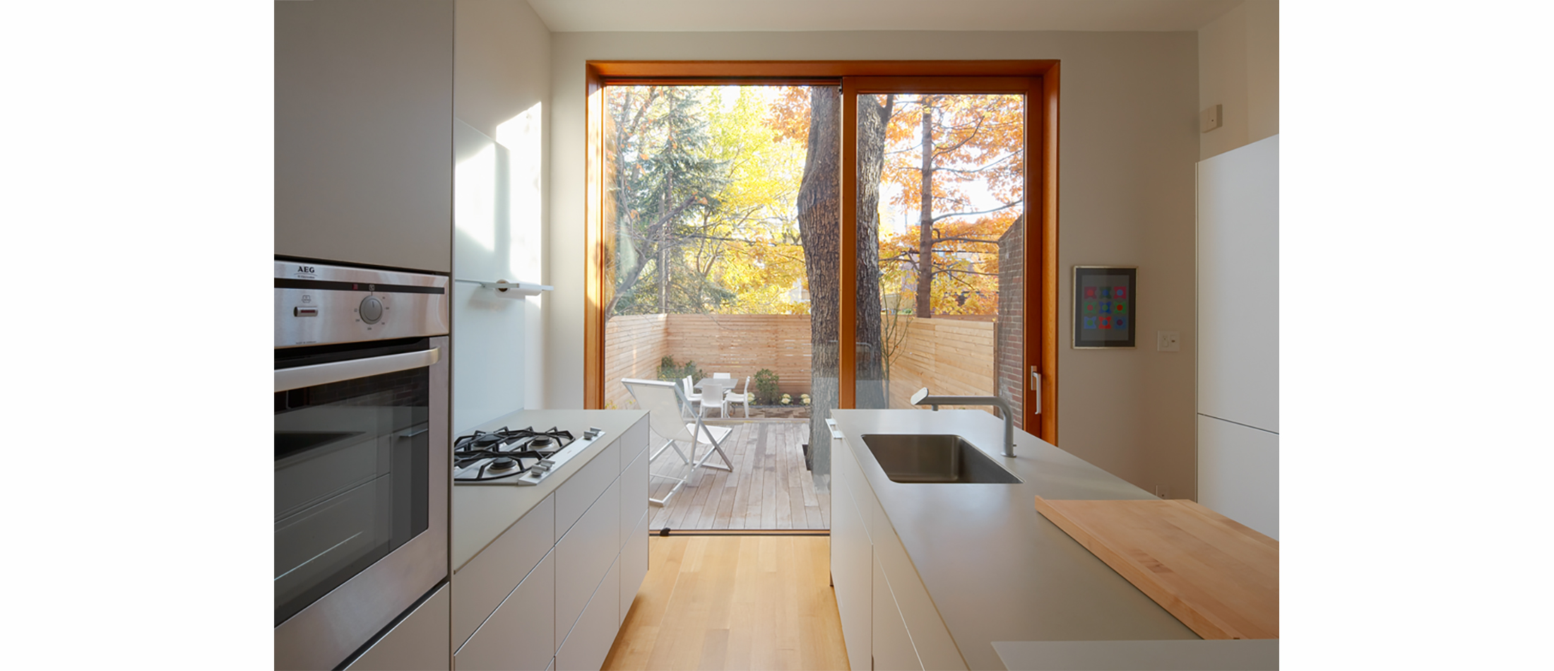
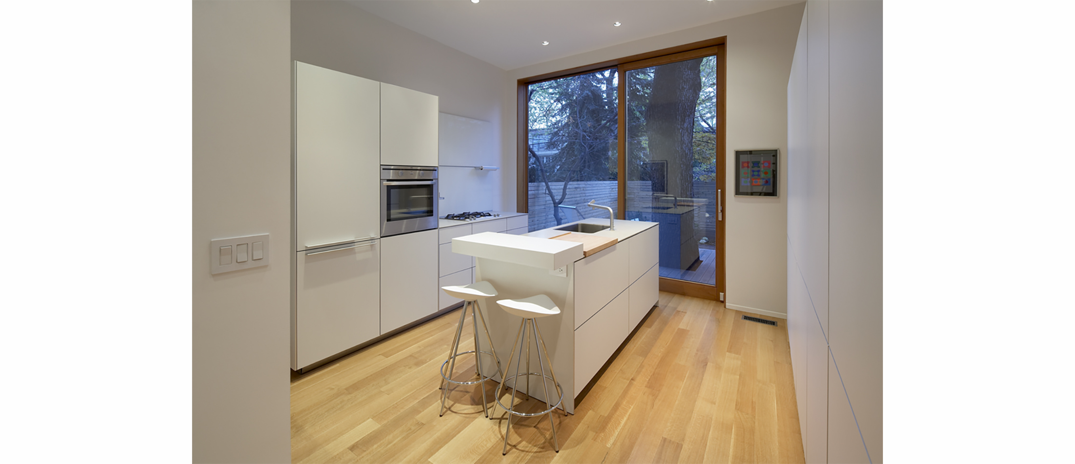
A strategy was developed to transform this generic Victorian house plan to accommodate a contemporary lifestyle and more light. The original stairs were kept as a single straight run; but replaced with wooden oak open risers. The back portion of the roof was raised and skylights inserted. Two major structural walls were removed. Both were replaced with hidden ceiling beams so as to maximize the height and open width of the plan and fully utilize the 4 m. across .Thin glass walls replaced the old stairwell walls and the central glass wall penetrated the 3 floors of the house creating an airy continuous material flow through the house. This flooded the interior space with natural light and spaciousness.
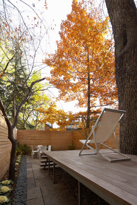
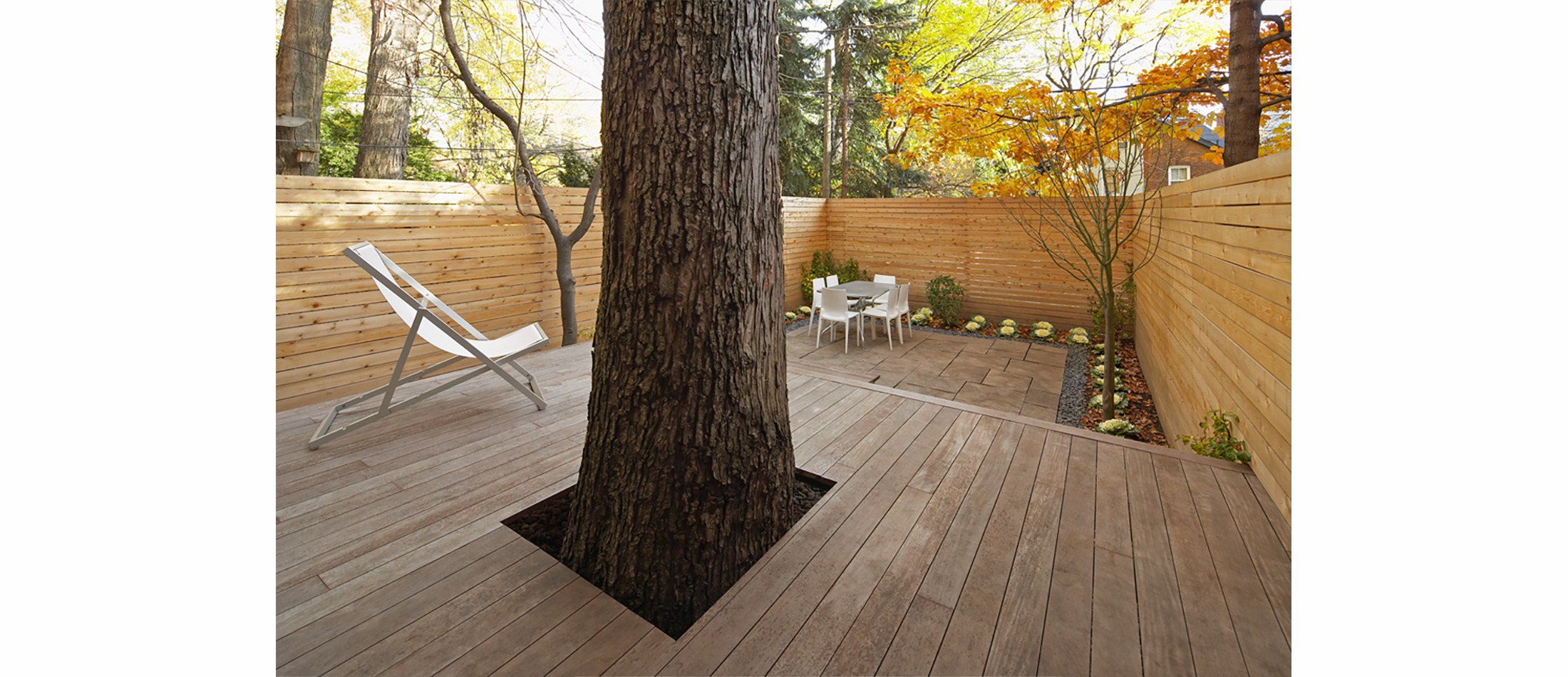
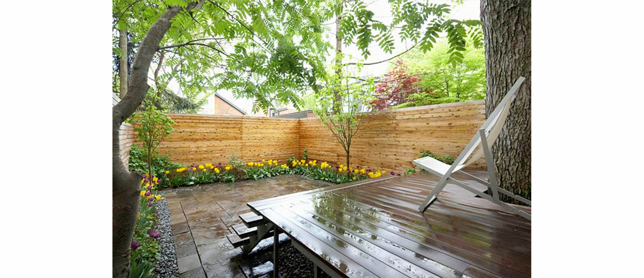
The south facing glass wall of the kitchen was designed to absorb passive solar energy. A large maple tree in the middle of the back deck was maintained for the sculptural effect of the massive trunk, and as a shade umbrella for the home during the hot summer months. This created a stronger connection between inside and outside and was reinforced through the ipe deck which maintained the continuous flow of the wooden kitchen floor into the back garden.
An “exacting minimalist approach to detail” was taken. A Bulthaup kitchen, custom cabinetry throughout the house and cold rolled steel handrails repeated this design principle and reinforce the modernist architectural continuity.
Memory traces of Victorian life were retained in the few Victorian architectural details left untouched by past renovations; an exposed rafter of the former third floor roof; stain glass windows, an arched entry vestibule, a whimsical living room fireplace and plaster medallions in the ceiling.
+ Project Details
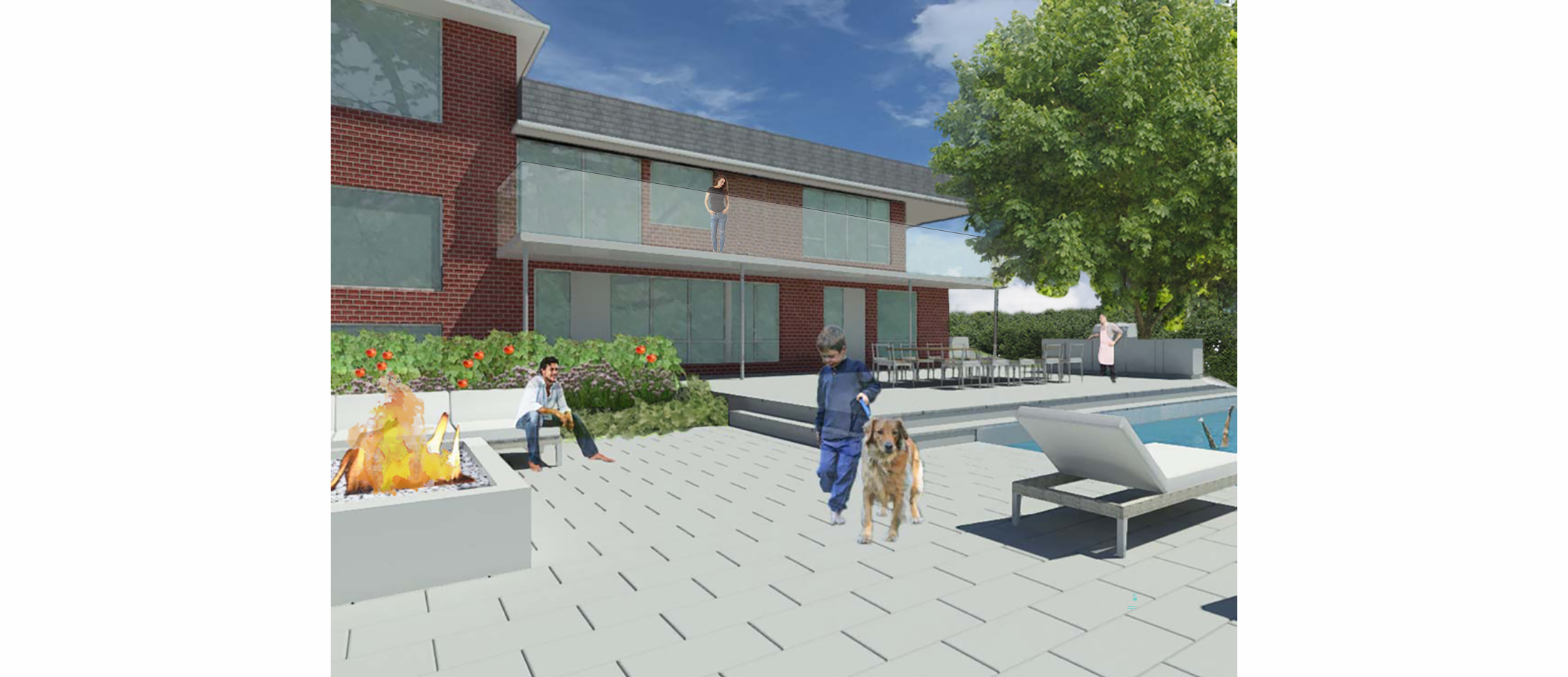
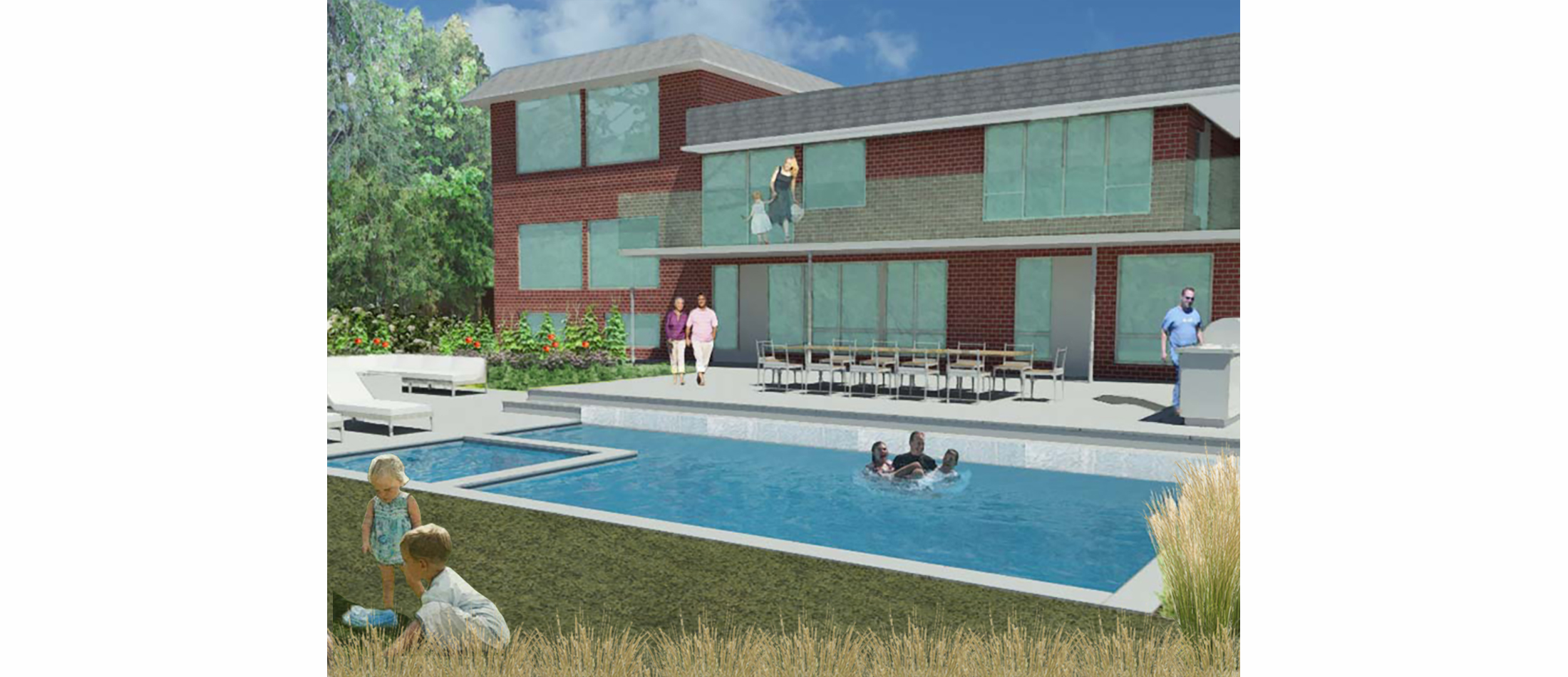
FAMILY FRIENDS AND FUN

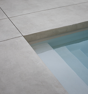
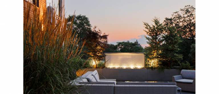
+ A WATER GARDEN
The clients choose to build a pool garden instead of purchasing a garden. Its main purpose was to create a place of entertainment for family and friends. The strong sounds of falling water was added to the pool structure to camouflage city sounds and bring the natural environment into the space.


+ Project Details
SUBURBAN RETREAT
+ SUBURBAN RETREAT
This is a typical subdivision home built in the 1970s with no distinguishing features. The one outstanding feature was its location at the edge of a ravine. The challenge was to create a garden that enhanced the architecture and connected it visually and functionally to the ravine. The garden was centered functionally around suburban life with an outdoor kitchen, BBQ and swimming pool. Existing topography was used to create stepped terraces down to the ravine. Perennial planting in a wild configuration mimic its naturalness. A trellis wrapped around the edge of the ravine with views oriented the clients to the ravine tying the more ridged geometry of the garden structure with the naturalness of the ravine.

+ Streetscapes
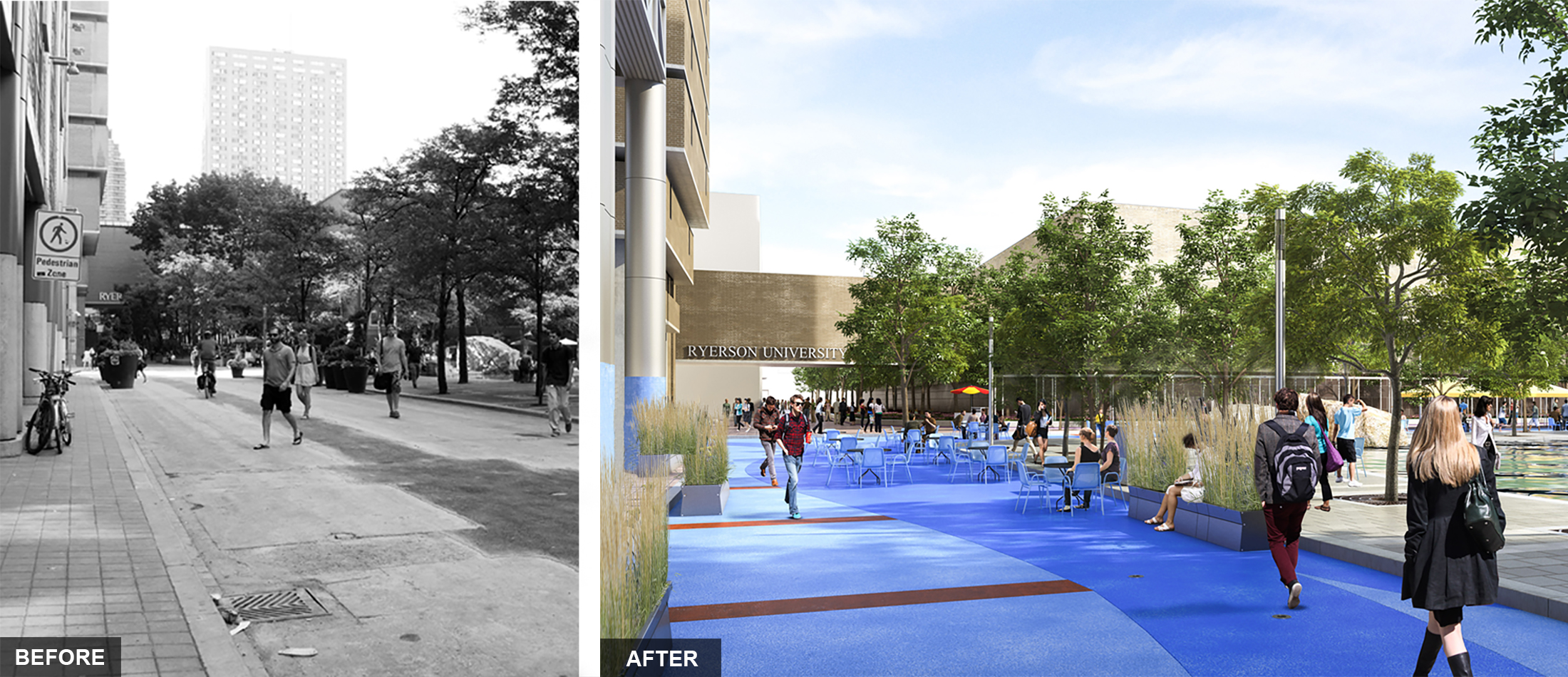
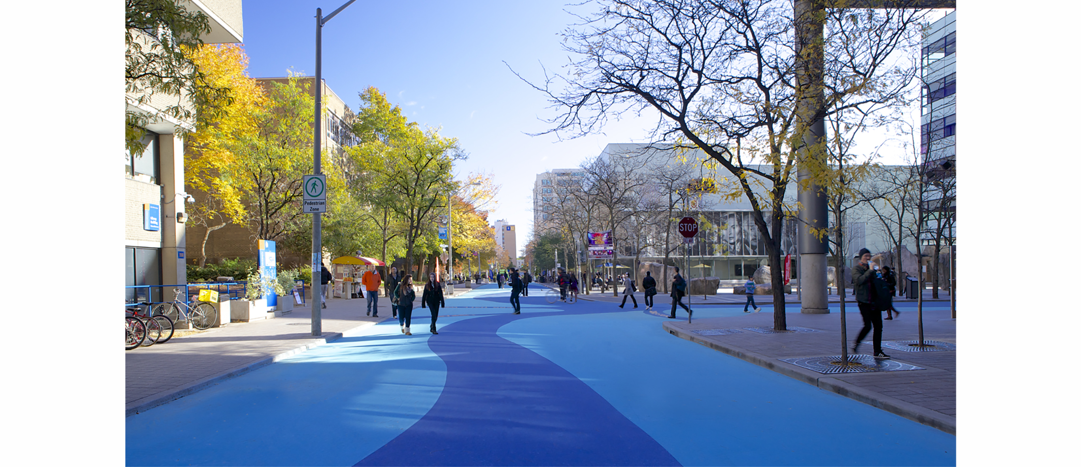
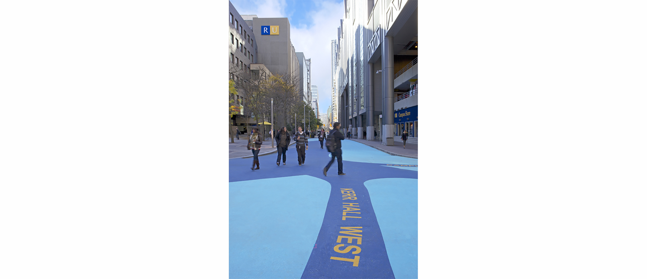
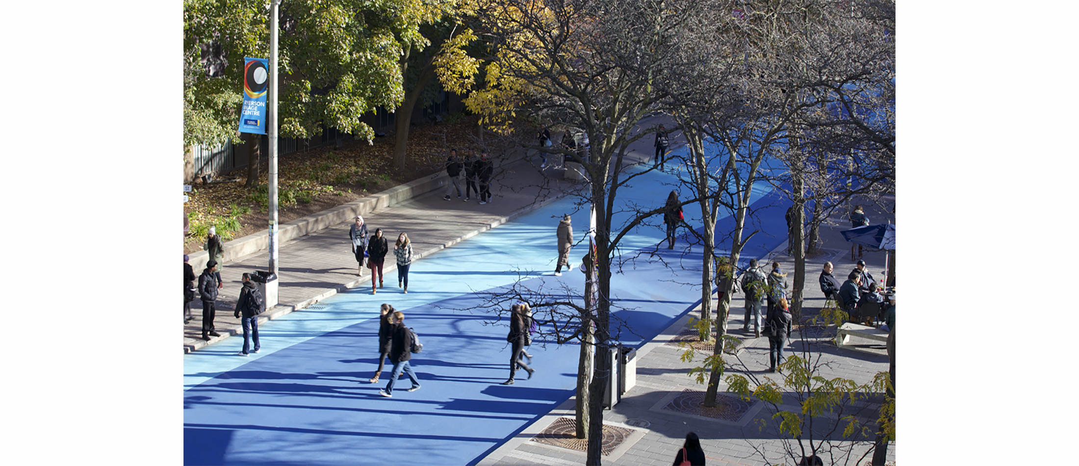
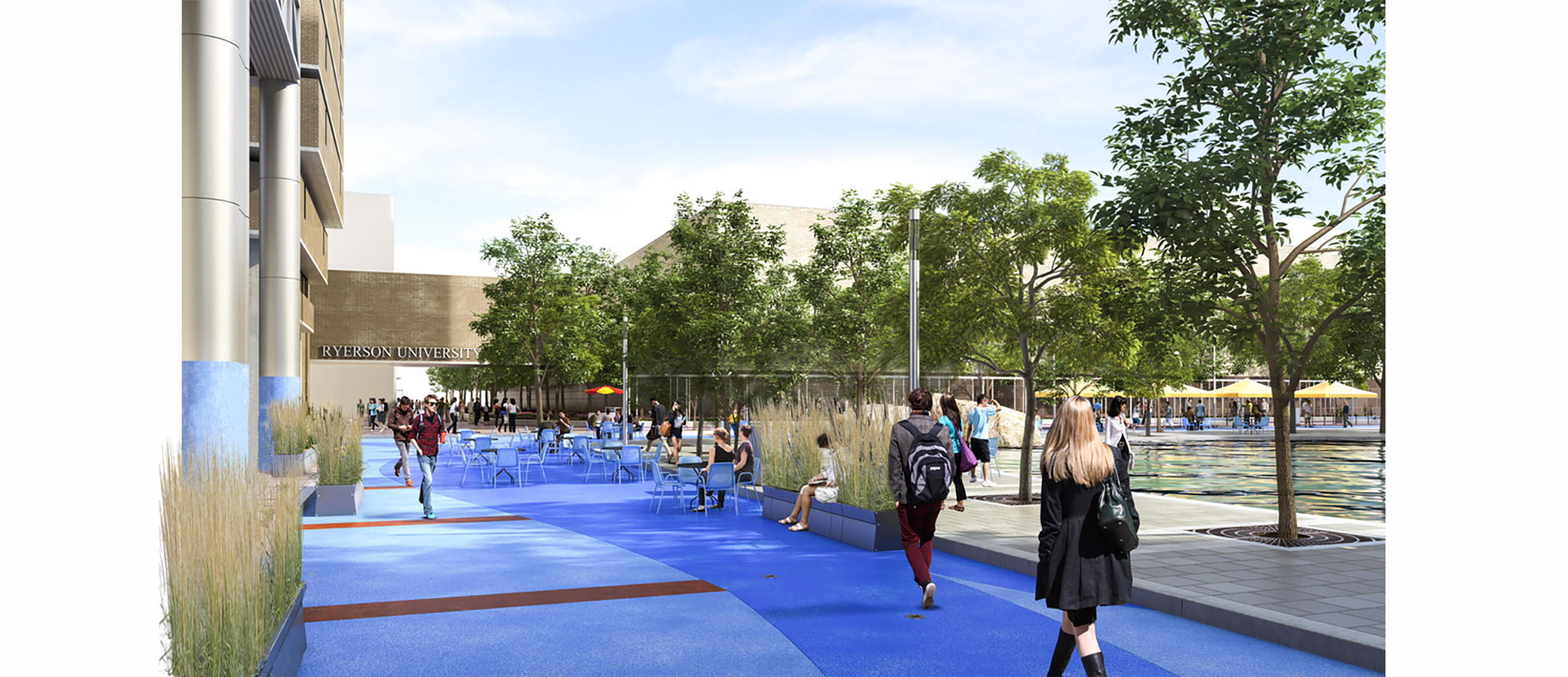
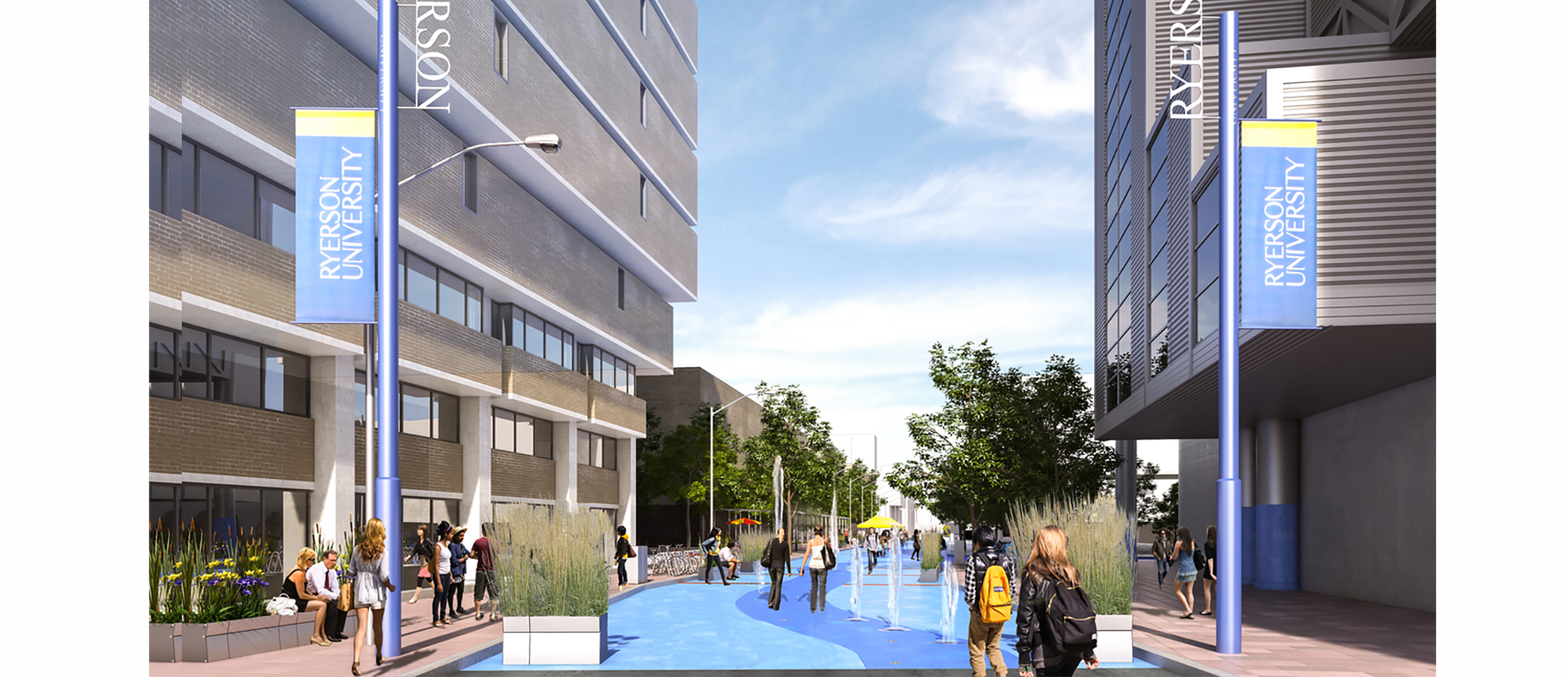
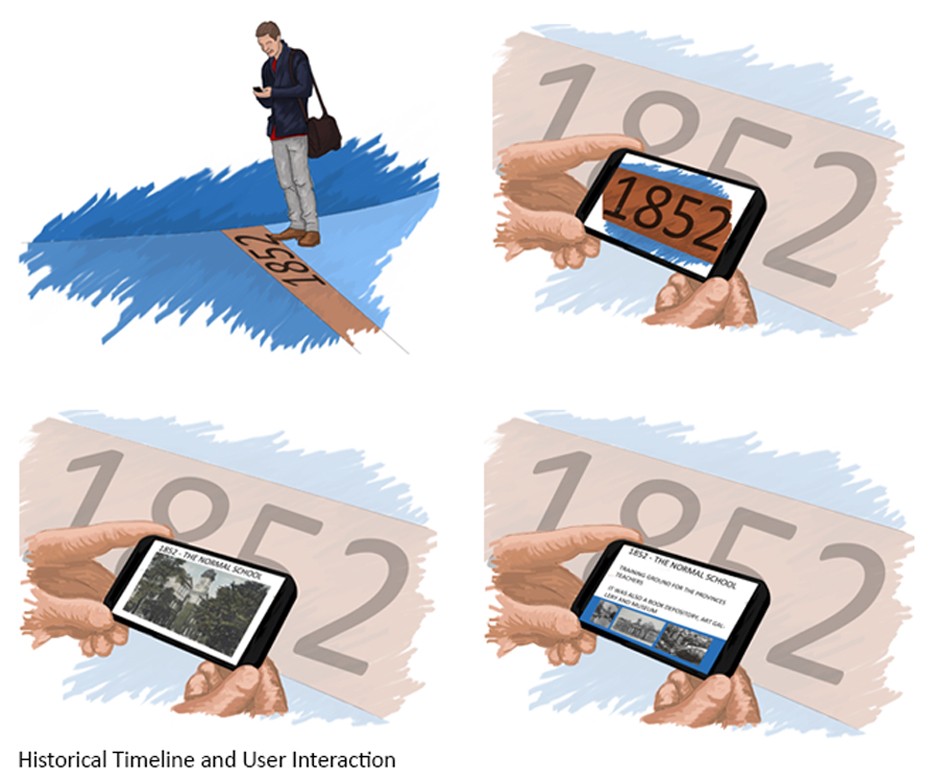
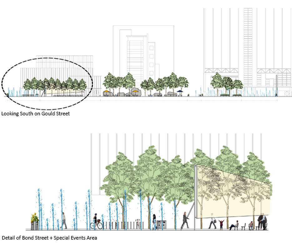
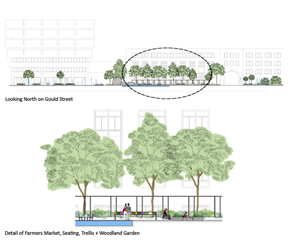
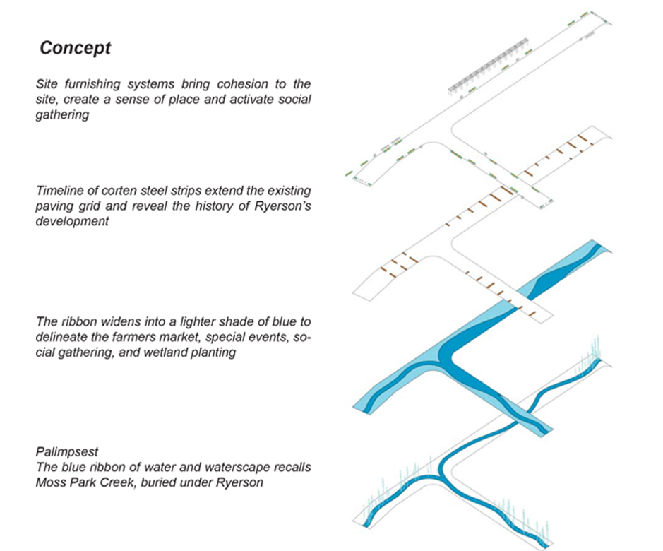
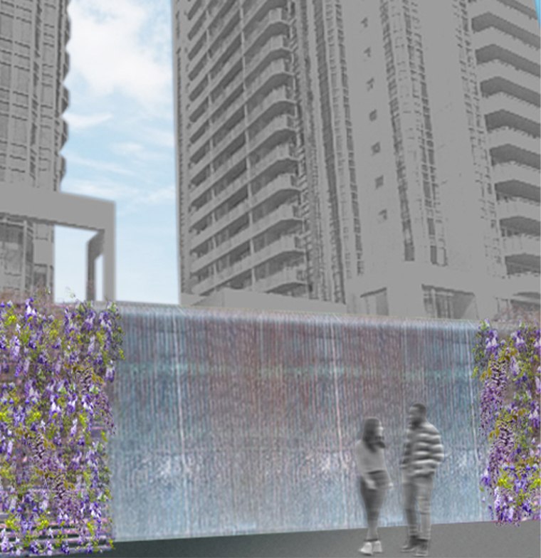
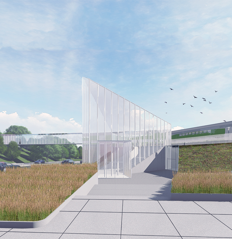
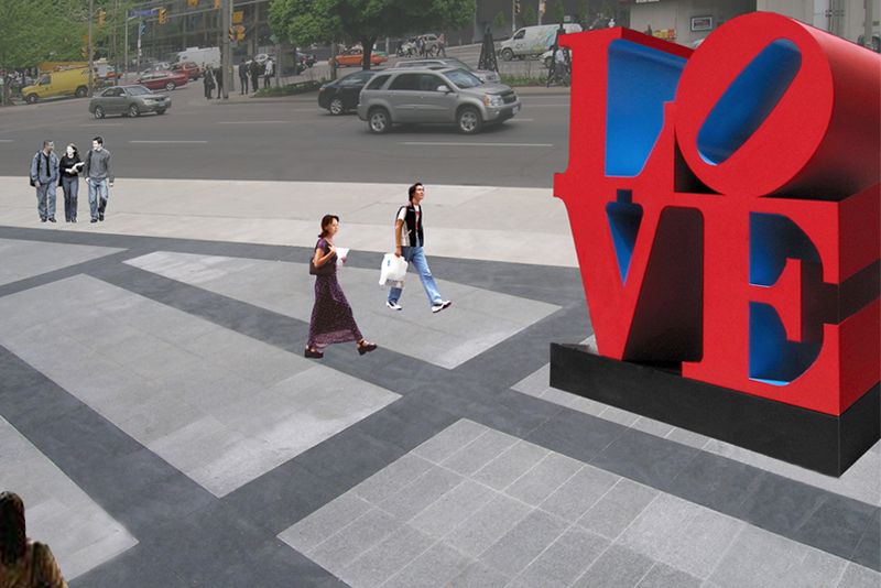
RYERSON UNIVERSITY PEDESTRIAN WALKWAY


+ GOULD/VICTORIA ST. REVITALIZATION
Concept Central to the concept are two elements, which relate to the evolution of the site. The ribbon of water and the timeline. The ribbon of water, is a palimpsest – an abstract painted portrait of Moss Park Creek, which once flowed through the site. It is painted on the existing asphalt through bold use of form and colour, in various shades of Ryerson blue. It flows along Gould and Victoria Streets, accommodating circulation, programmatic elements (eg. seasonal farmers market), and wayfinding. The timeline is a morphological history of Ryerson University. It is delineated through continually rusting brown corten steel strips which extend the existing grid of the paving around “Lake Devo”. Each corten strip is marked with a significant date of Ryerson’s evolution. Spatial Organization: The ribbon of water promotes circulation and wayfinding, as it widens into three shades of Ryerson blue to accommodate, where necessary, the various functions of the site. Places for gathering and conversation, café seating and event space are delineated in dark blue. A medium blue outlines the temporary farmers market. The light blue represents the banks of Moss Park Creek, and contains wetland planting that once flourished along the water’s edge. The light blue also contains benches which activate areas for social interaction. The corten strips, an extension of the existing grid, organize the placement of bike racks, benches, planters and recycling/waste receptacles, spaced throughout to foster social interaction and ease of access. Gateways, Site Access, City Visibility, Viewpoints and Waterscapes: Key to the success of the space is the visibility and ease of access from the surrounding city. Three series of waterscapes are visible gateways into Ryerson from Yonge, Church and Dundas Streets and rise up at the entry points as water columns and mist, between steel planters and for a short distance along the ribbon of water. The columns rise up to varying heights. They terminate viewpoints from within the campus at the end of each street, and highlight the city beyond. The ribbon of water serves pragmatic purposes in addition to expressing the creek. It helps students with wayfinding as a bold market, and visually extends the Ryerson campus into the city, inviting the public in, with its captivity and boldly coloured surface form. The flexibility of this form, with its corten strips, allows easy expansion from Ryerson boundaries into the City itself.