+ Interiors
Working Title
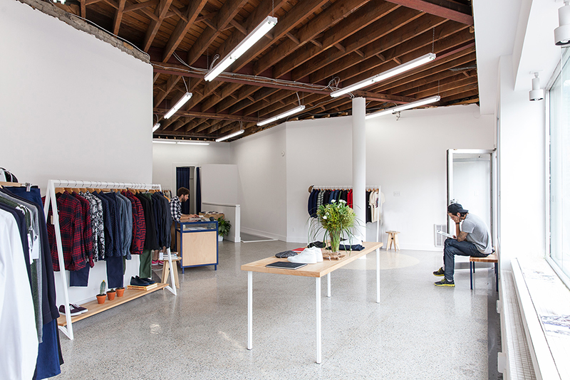
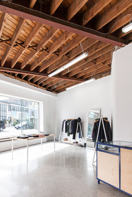
+ RETAIL IN EVOLUTION
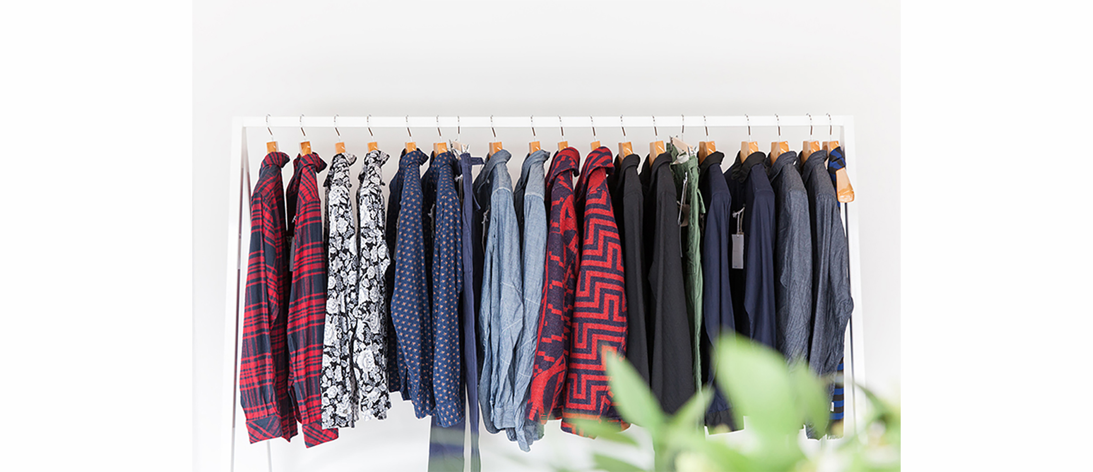
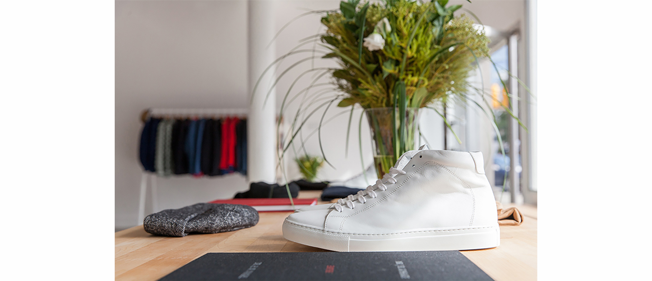
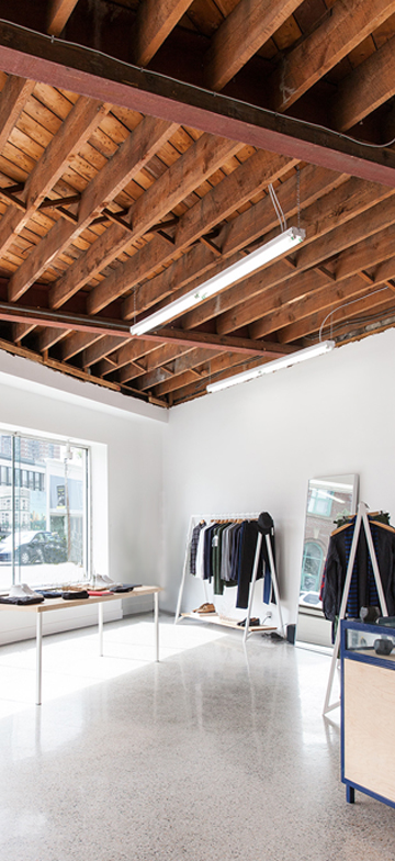
The owners concept was bifold; a men’s clothing store and lower level art book store and gallery. The atmosphere they wanted to create was a reflection of their design sensibility; a minimal mix of avant-garde and classic modern design in men’s fashion and art. Our intent was to combine both these three elements in the interior.
We exposed and restored the existing classic modern terrazzo flooring. In contrast, to create an avant-garde atmosphere, we exposed the raw structure of the wood ceiling and added industrial lighting. All fixtures for clothing, display shelving and tables, were minimally detailed to highlight the products and carry through the owners aesthetic of minimal fashion into the interior architecture.
- Related Projects
+ Interiors
A Victorian Semi Gets a Lift


+ RAISE THE ROOF BEAMS
Elias + was approached by a young couple who needed more living space for their growing family. Buying a larger home was out of the question given the increased cost of Toronto real estate. It made more financial sense to renovate the home they had been in for seven years.
In order to do this we had a three-branched strategy.
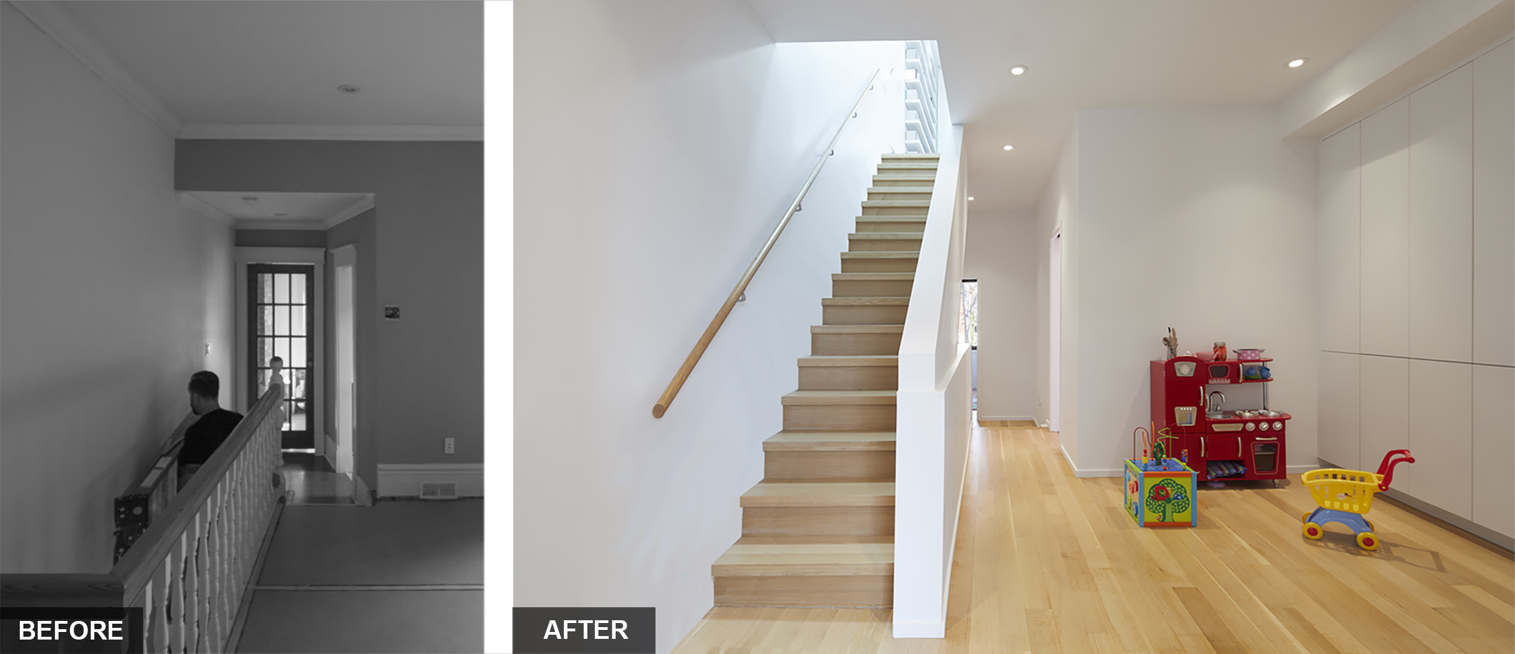
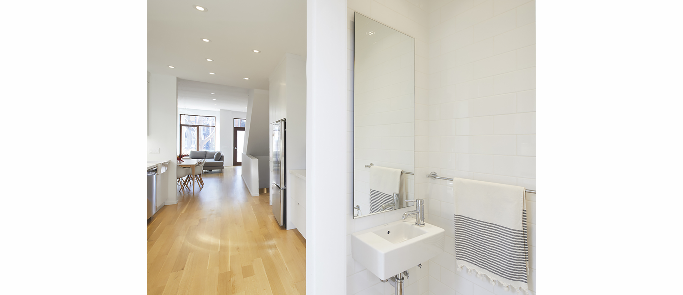
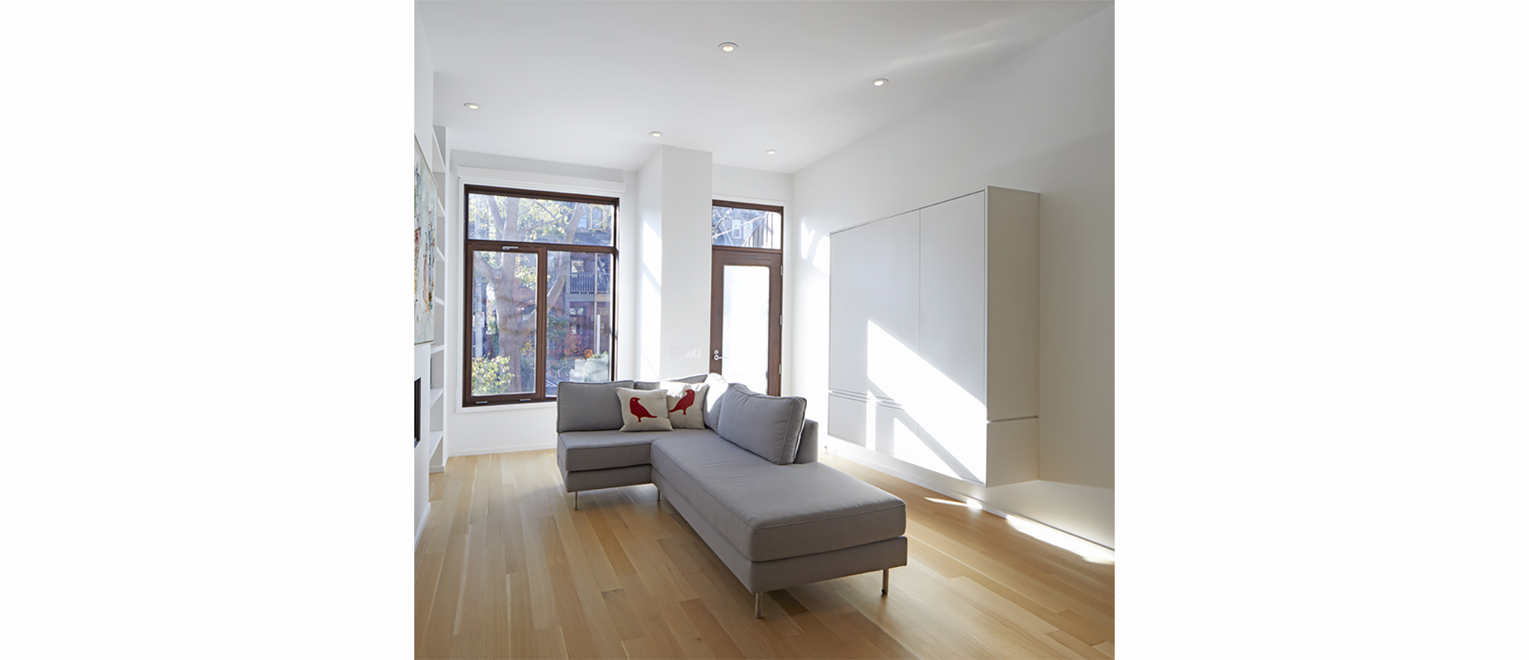
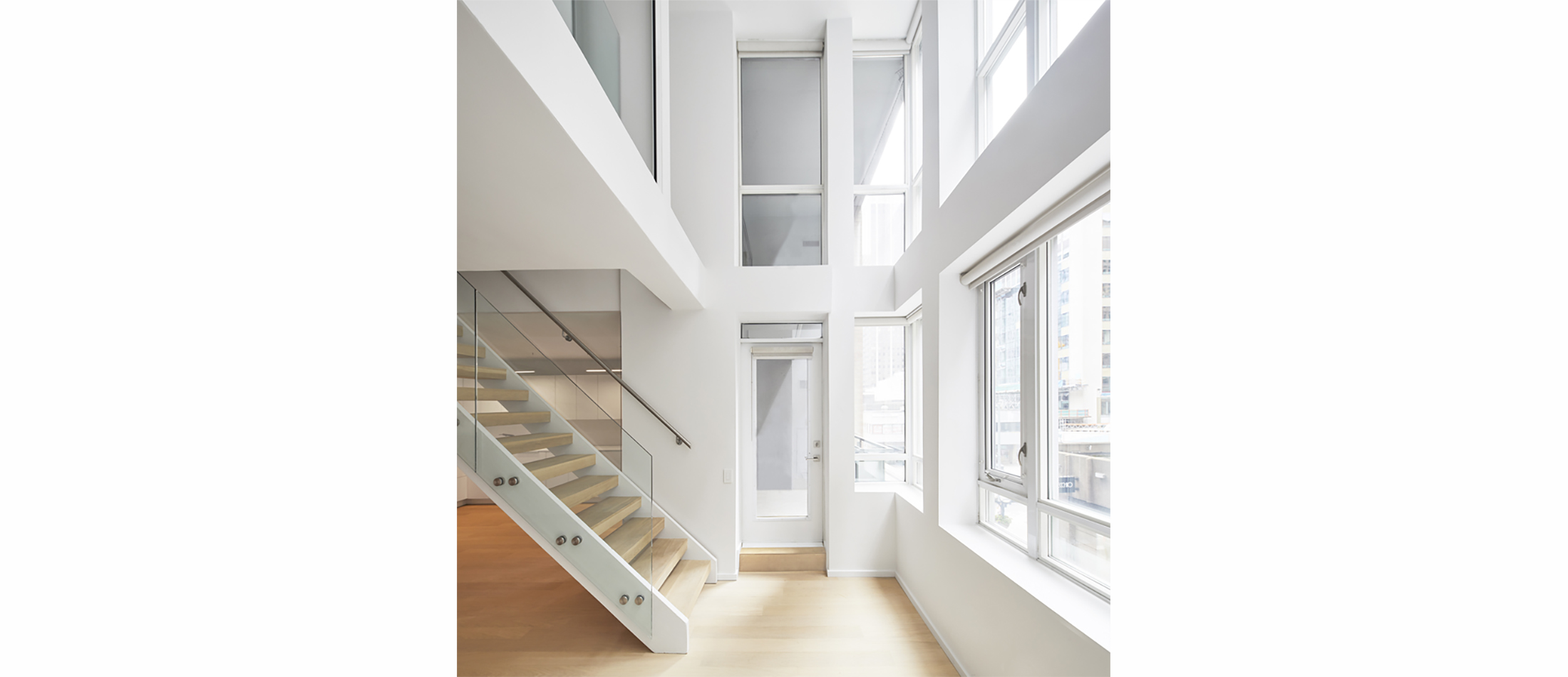
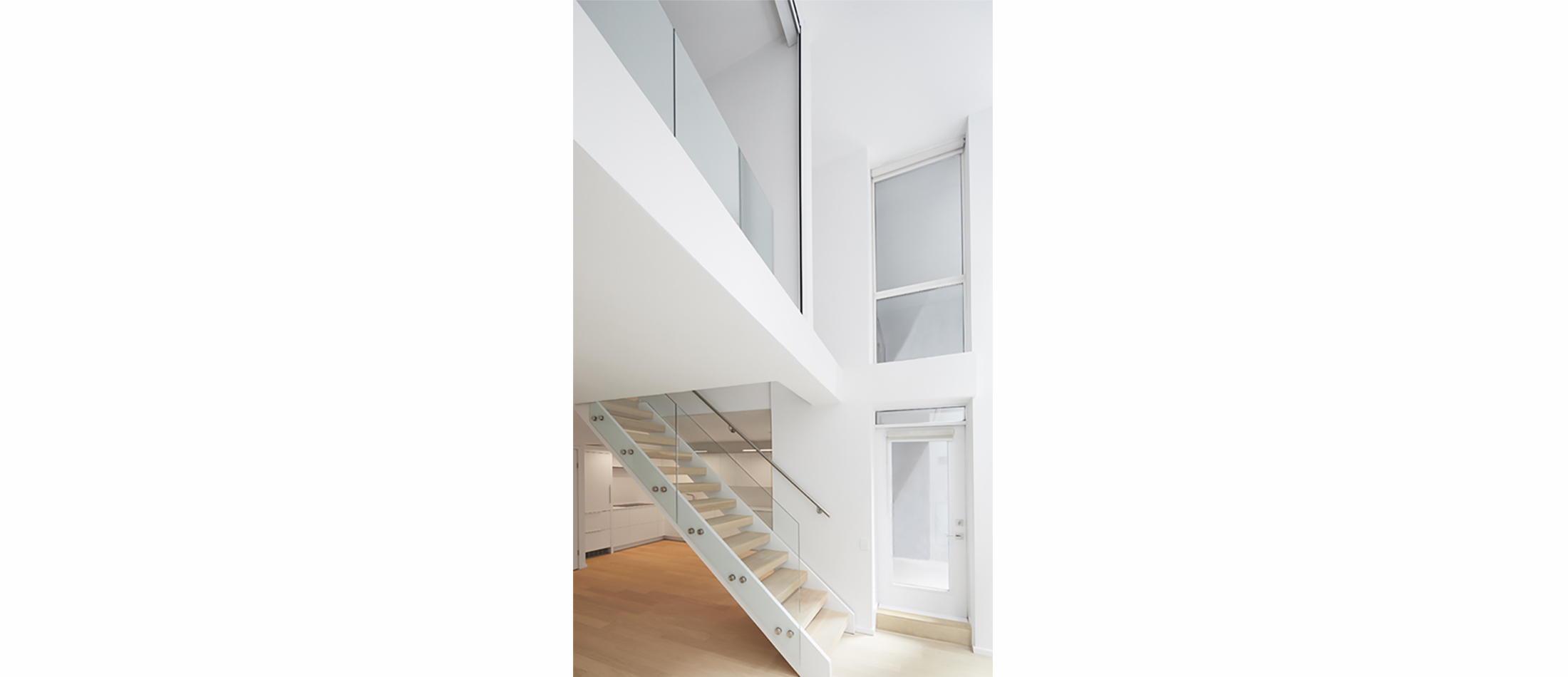
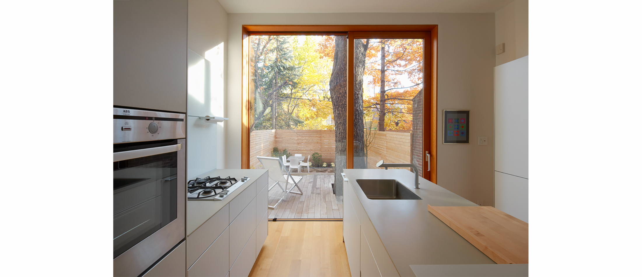
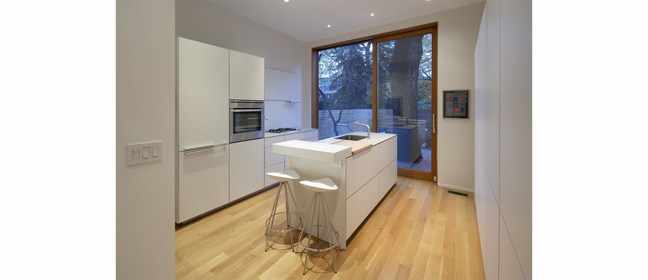
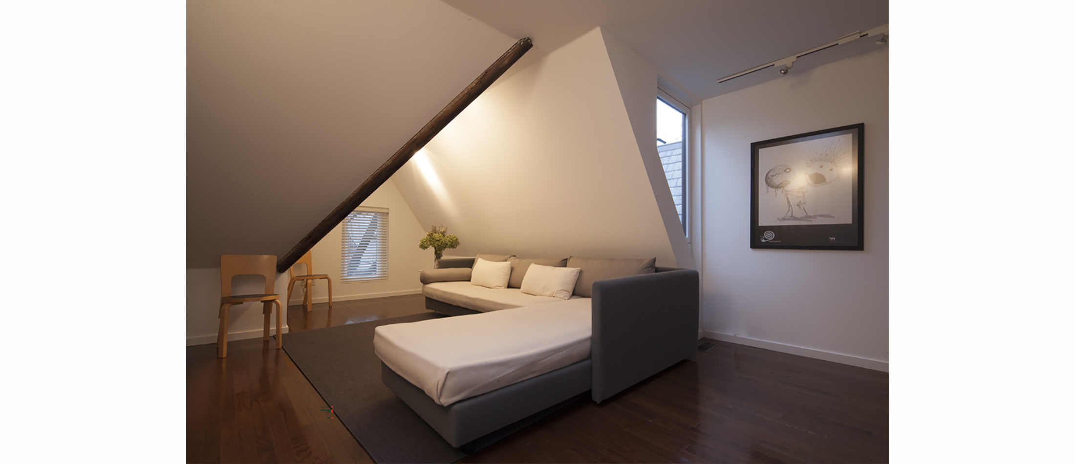
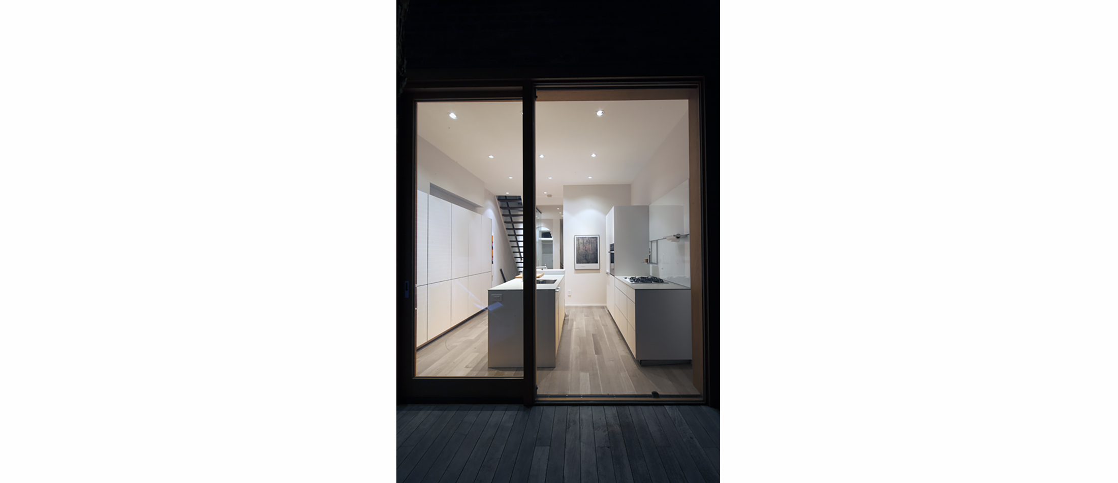
The first branch was to open the interior, unify common areas into an open plan, and raise the home’s roof forming a third story master suite. This allowed us to create a bright airy open space. A two story addition increased the square footage to include a new powder room and expand the back of the first floor to flow into the garden via sliding doors. This let light penetrate the formerly dark kitchen area.
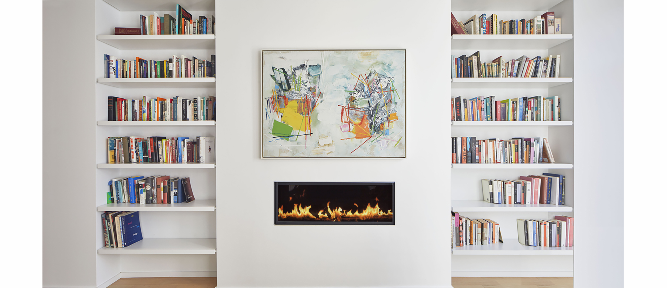
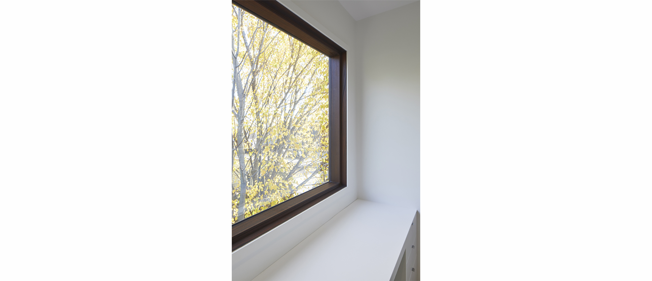
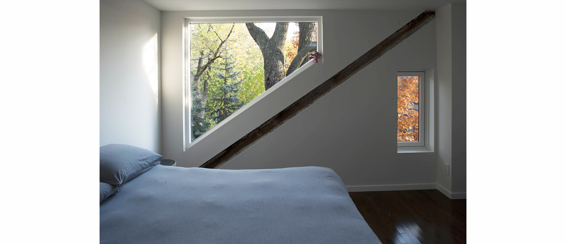
Minimalist detailing replaced deteriorated neo-traditional wainscoting, crown molding and baseboards. Doors and windows, previously diminished by framing and mullions, were replaced with large expanses of glass, maximizing light penetration.
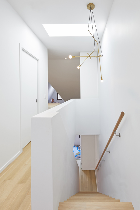
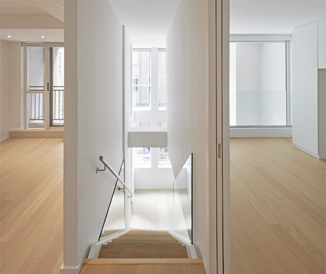
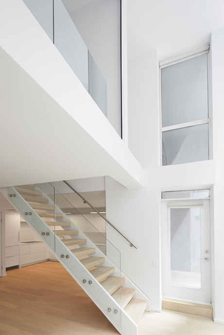
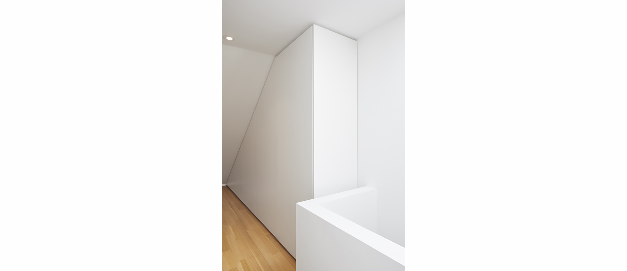
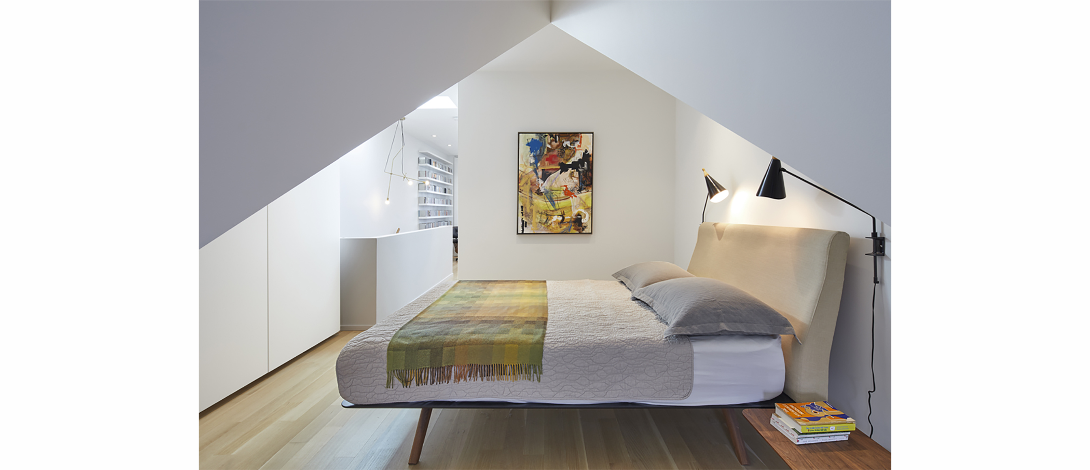
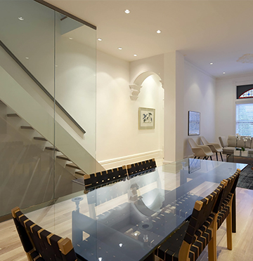
A newly designed contemporary staircase became a sculptural element and unifying device for all three levels.
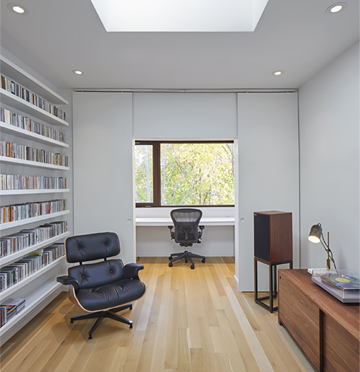
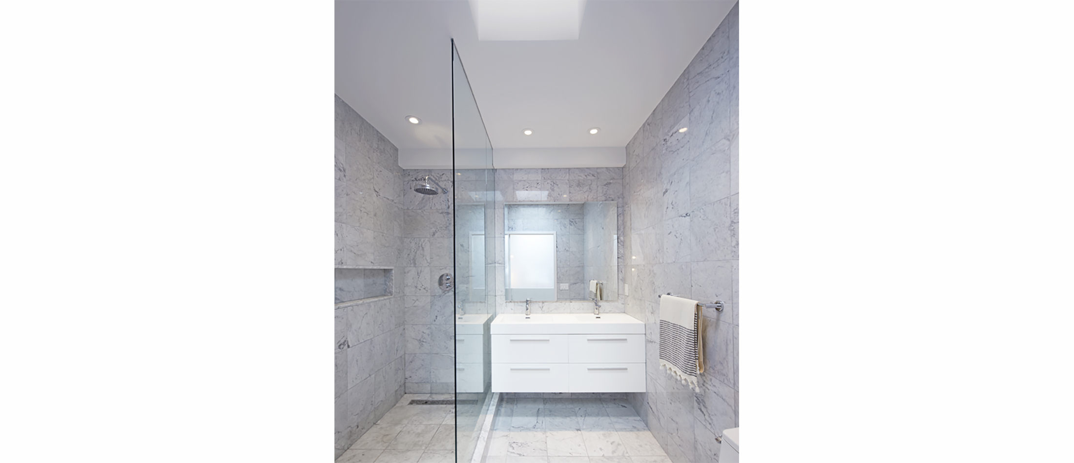
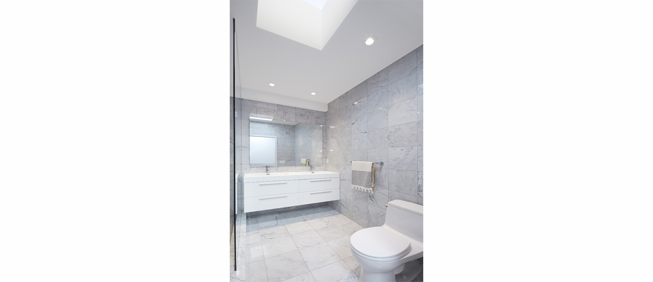
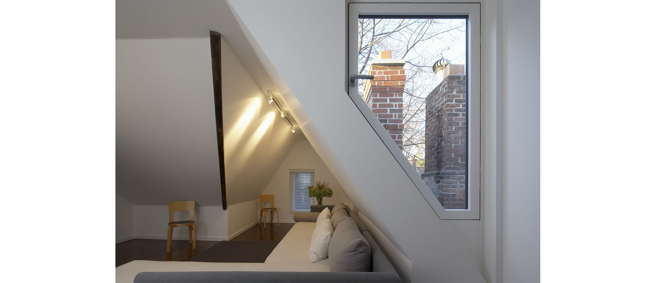
The second floor bathroom was moved to allow more open space for a play area. One of the children’s bedrooms was expanded onto the roof of the addition.
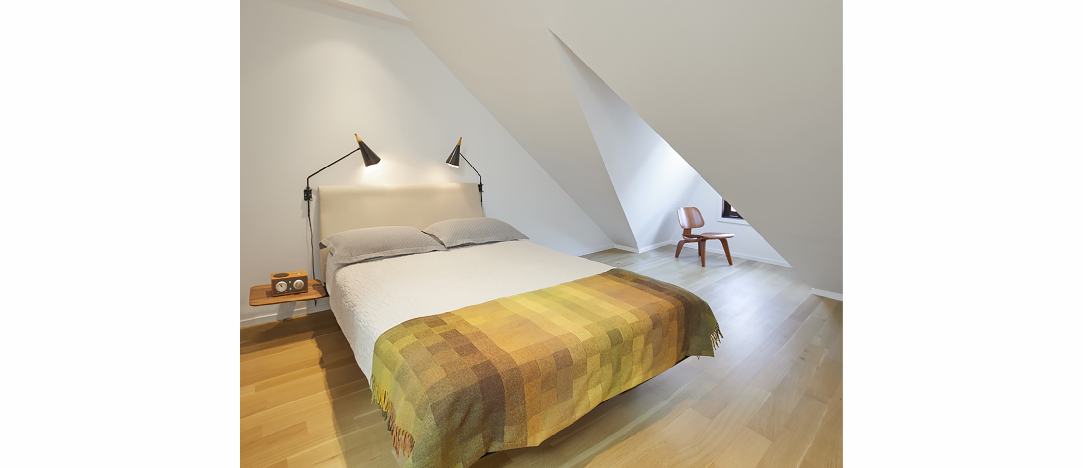
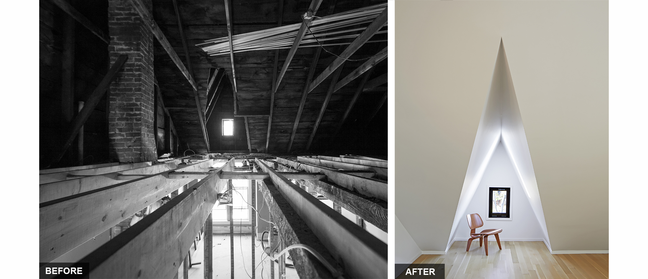
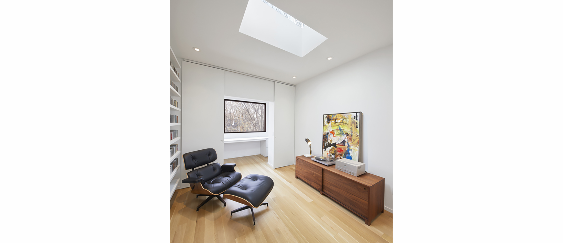
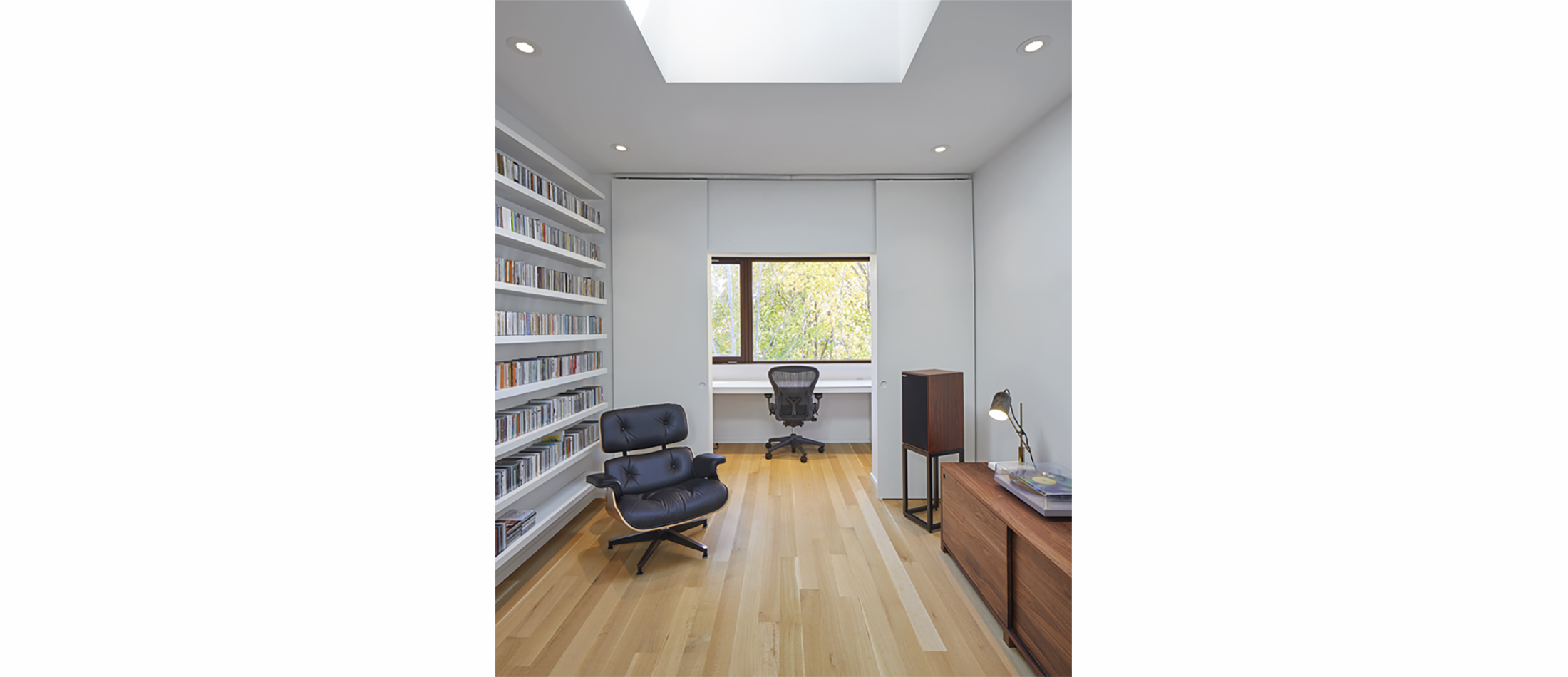
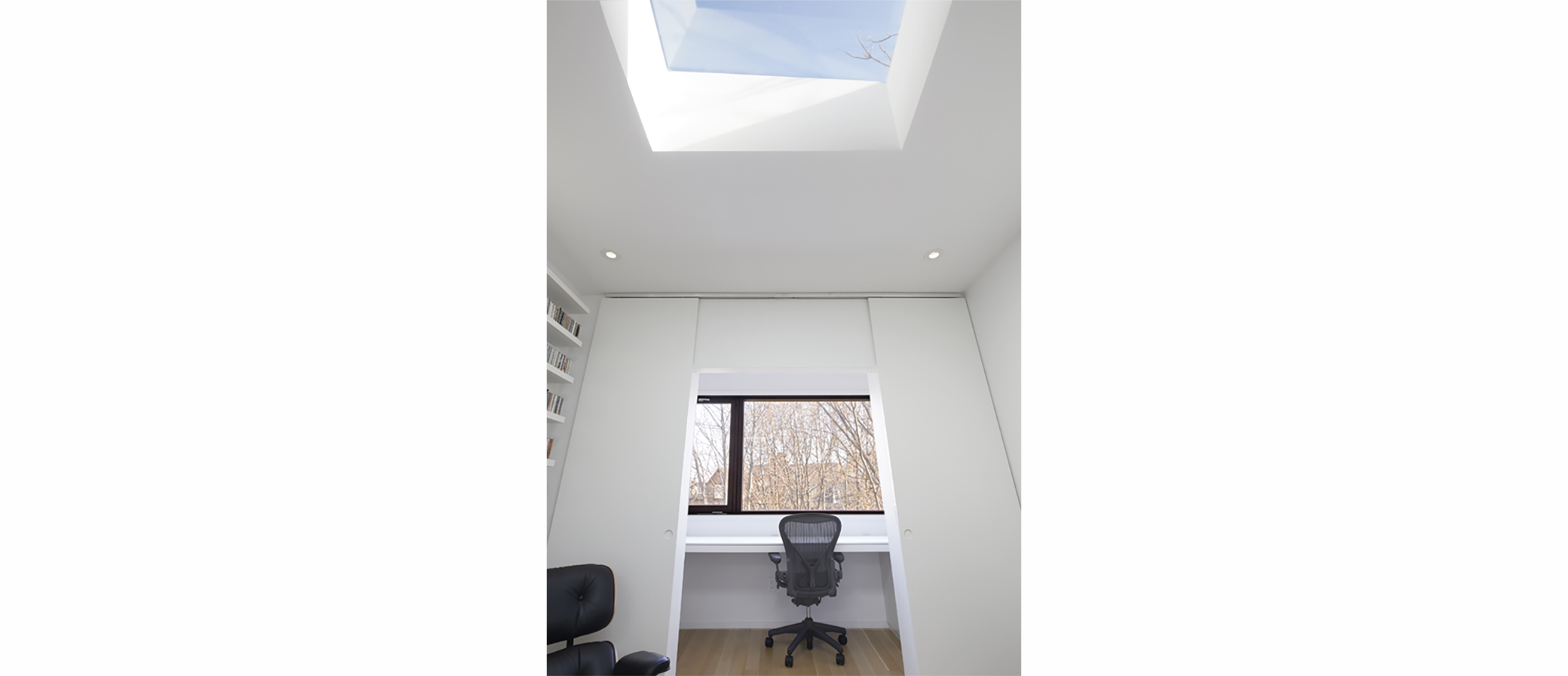
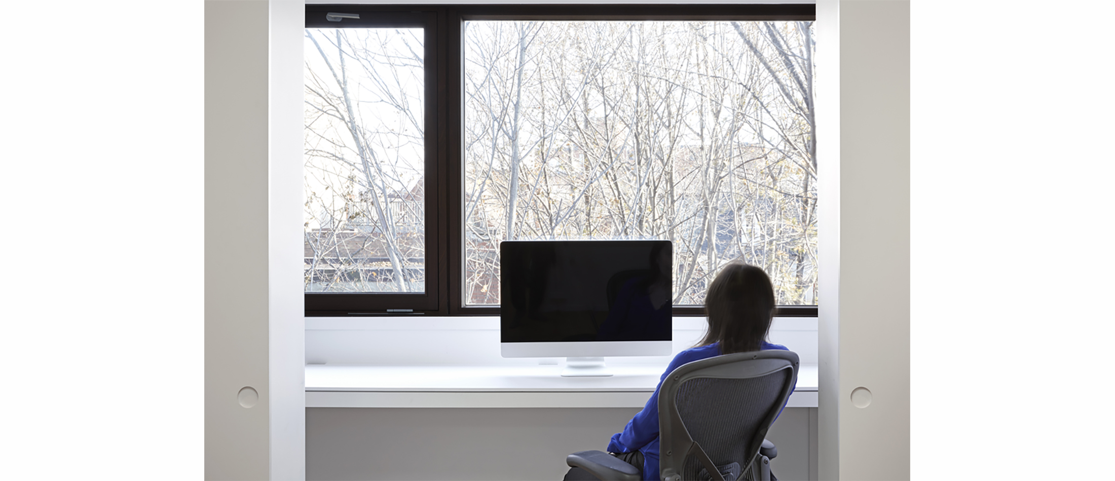
The program requested by the clients for the master suite was complex and challenging for such a small space. Both husband and wife were university professors commuting to their jobs out of the city and wanted individual workspaces away from the children. Elias + created two small study areas at the back of the suite facing the back garden separated by barn doors. Maintaining the original roof geometry created dramatic sculptural spaces in the master bedroom at the front of the home. A master bathroom separated sleep and workspaces. This resulted in a series of rooms unified by a hall which sculpturally folded into the staircase. Numerous skylights further enhanced the bright and airy living space.
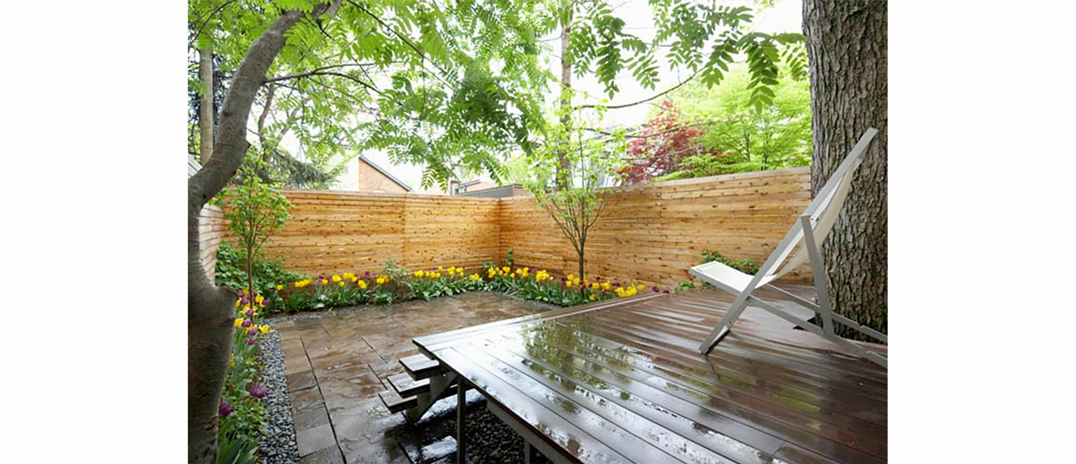
The second branch connects the inside to the outside bringing the natural elements visually closer to the family’s living spaces. Rooms were focused towards particular views of nature.
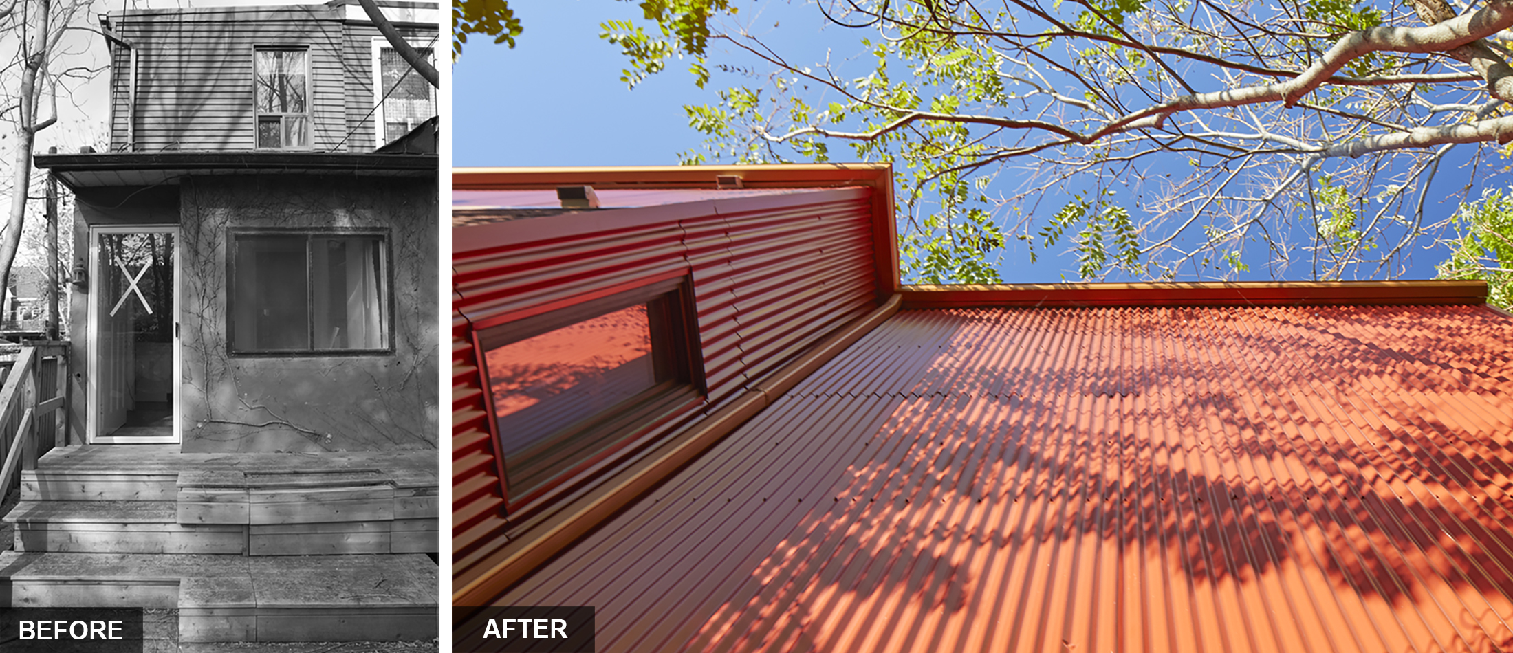
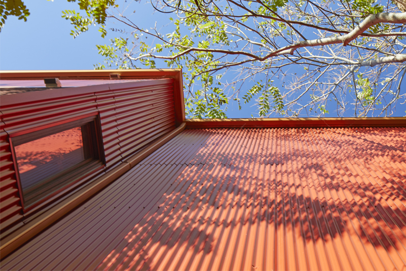
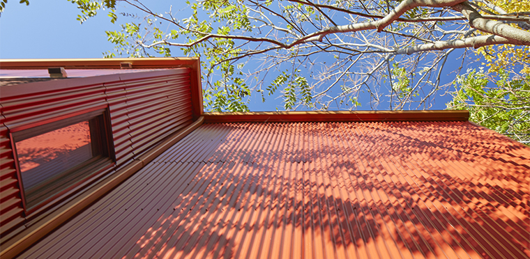
The third branch seamlessly melded the historic and contemporary design elements and maintained street character. The scale of the windows and doors were kept. The raised third floor conserved the original roof pitch geometry of adjacent gables. Due to the limited budget, red corrugated metal, which matched the red Victorian brick, was used to clad the addition and allow contemporary interior changes to blend with the exterior. The existing brick on the front of the house (to be repaired and restored later) was kept intact in an effort to maintain the character of the Victorian streetscape.


- Related Projects
+ Interiors
A Victorian Semi Gets a Lift

+ RAISE THE ROOF BEAMS
Elias + was approached by a young couple who needed more living space for their growing family. Buying a larger home was out of the question given the increased cost of Toronto real estate. It made more financial sense to renovate the home they had been in for seven years.
In order to do this we had a three-branched strategy.
The first branch was to open the interior, unify common areas into an open plan, and raise the home’s roof forming a third story master suite. This allowed us to create a bright airy open space. A two story addition increased the square footage to include a new powder room and expand the back of the first floor to flow into the garden via sliding doors. This let light penetrate the formerly dark kitchen area.
Minimalist detailing replaced deteriorated neo-traditional wainscoting, crown molding and baseboards. Doors and windows, previously diminished by framing and mullions, were replaced with large expanses of glass, maximizing light penetration.
A newly designed contemporary staircase became a sculptural element and unifying device for all three levels.
The second floor bathroom was moved to allow more open space for a play area. One of the children’s bedrooms was expanded onto the roof of the addition.
The program requested by the clients for the master suite was complex and challenging for such a small space. Both husband and wife were university professors commuting to their jobs out of the city and wanted individual workspaces away from the children. Elias + created two small study areas at the back of the suite facing the back garden separated by barn doors. Maintaining the original roof geometry created dramatic sculptural spaces in the master bedroom at the front of the home. A master bathroom separated sleep and workspaces. This resulted in a series of rooms unified by a hall which sculpturally folded into the staircase. Numerous skylights further enhanced the bright and airy living space.
The second branch connects the inside to the outside bringing the natural elements visually closer to the family’s living spaces. Rooms were focused towards particular views of nature.
The third branch seamlessly melded the historic and contemporary design elements and maintained street character. The scale of the windows and doors were kept. The raised third floor conserved the original roof pitch geometry of adjacent gables. Due to the limited budget, red corrugated metal, which matched the red Victorian brick, was used to clad the addition and allow contemporary interior changes to blend with the exterior. The existing brick on the front of the house (to be repaired and restored later) was kept intact in an effort to maintain the character of the Victorian streetscape.


+ Interiors
Modern Toronto City Living
+ A YOUNG FAMILY’S AFFORDABLE SPACE
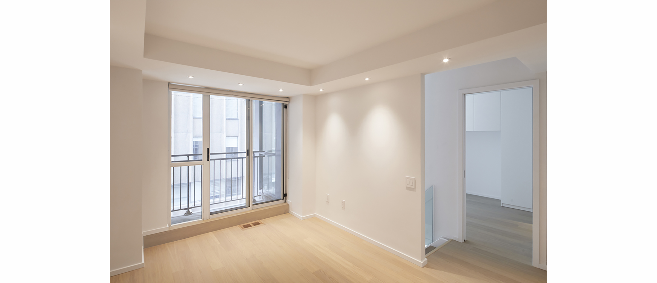
There were two interesting features in this condo that we wanted to highlight and improve upon. It was an atypical two-story 1 bedroom + den condo with an interesting atrium structure and a large expanse of two-story glazing. However, in spite of these features, it was a poorly planned living space. Ceilings in general were low. There was still a lack of natural light. Three large bathrooms took up an unnecessary amount of space. Storage was limited.
Our central concept was to open up the space, create a better flow of movement and function, increase natural light and highlight the delightful existing architectural structure of the atrium.
The kitchen was closed in with a low ceiling, cutting out light. An L shaped counter chopped up the kitchen from the dining space. It was removed and reorganized to open up the dining, kitchen and living areas. Ceilings were raised where possible. New task lighting was added.
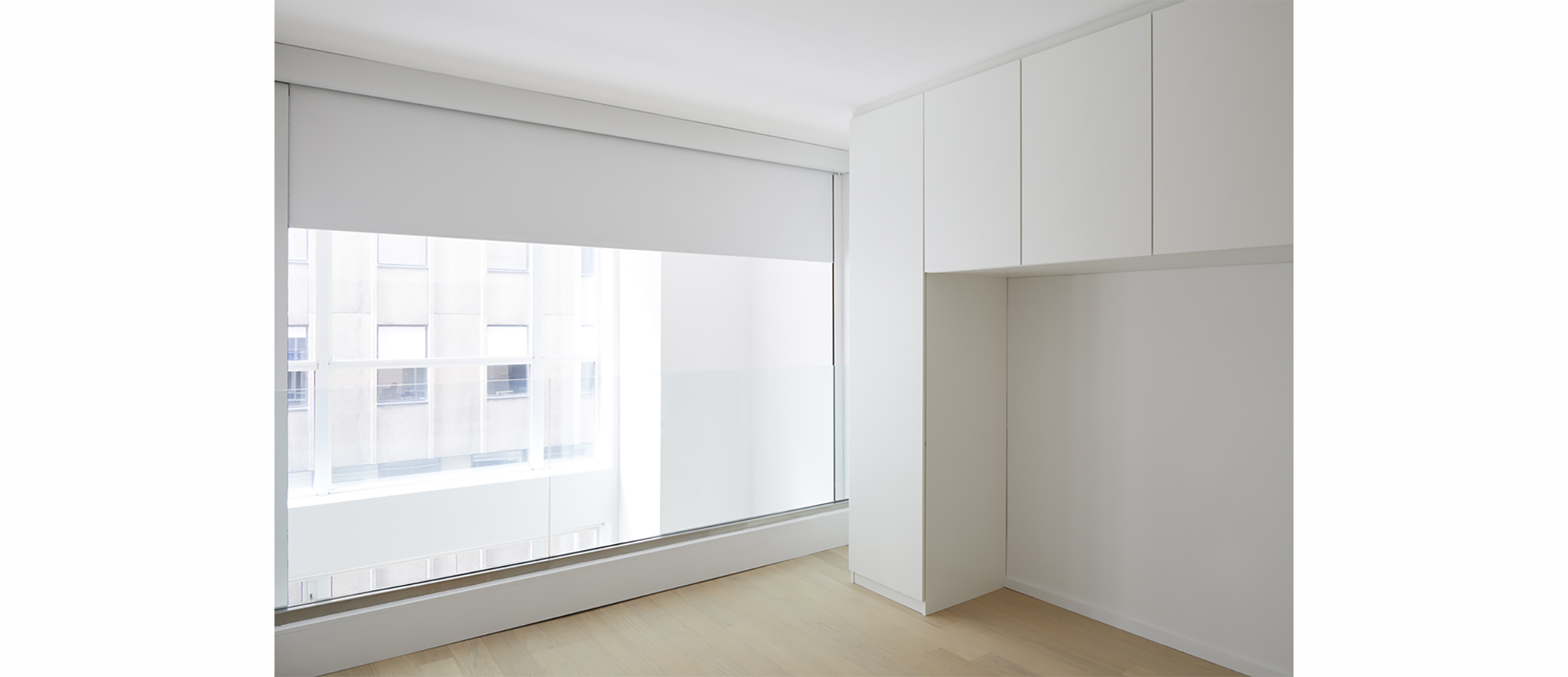
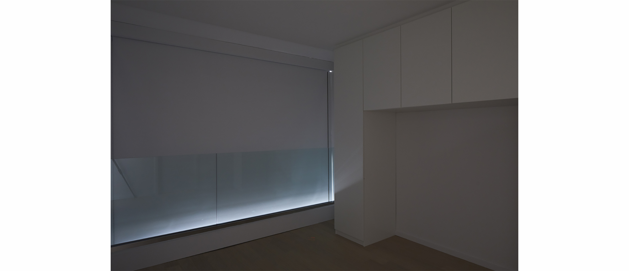
The owners were a young couple establishing a new family. They wanted to create a nursery in the den without permanently blocking natural light. We installed an automated black out blind that became a movable wall, which would allow daylight to penetrate and darken the room as necessary. This also allowed air conditioning and heating to flow freely through the area.
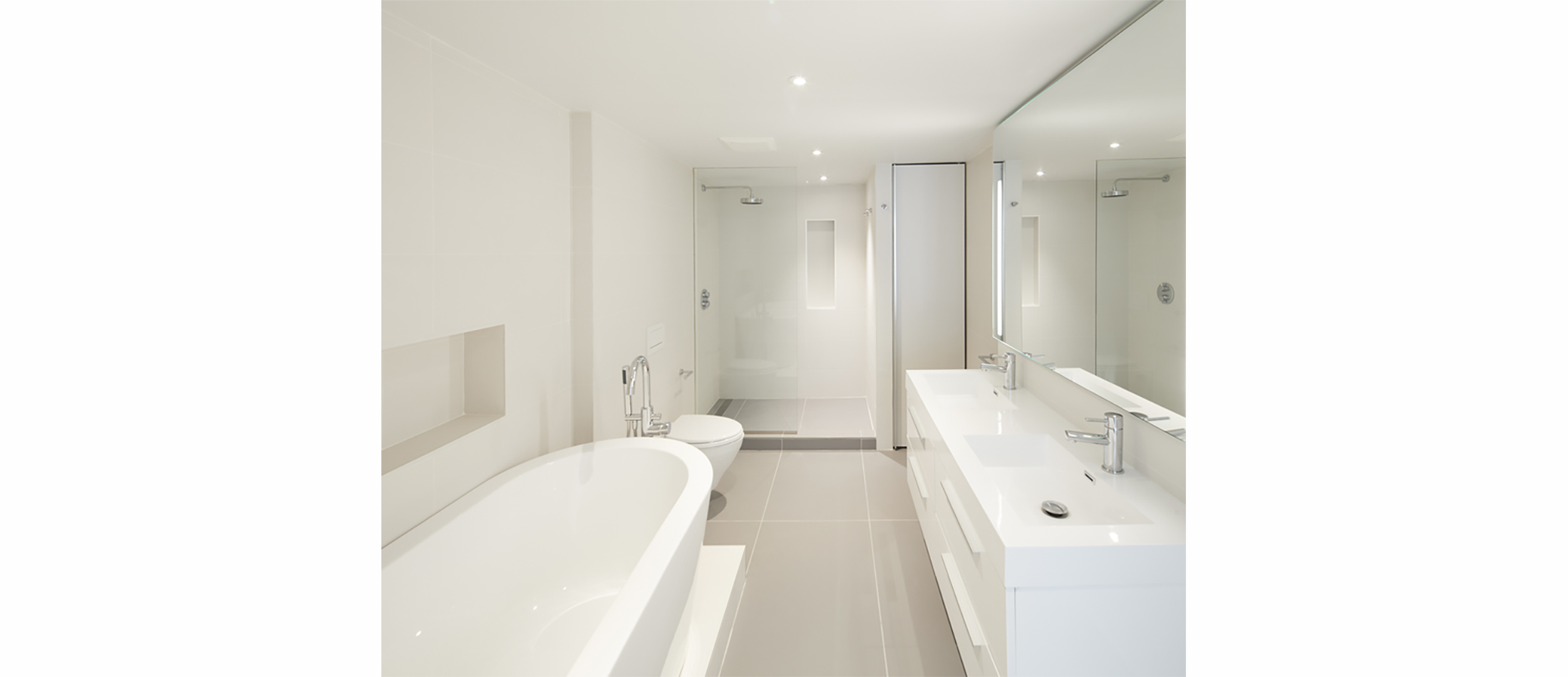
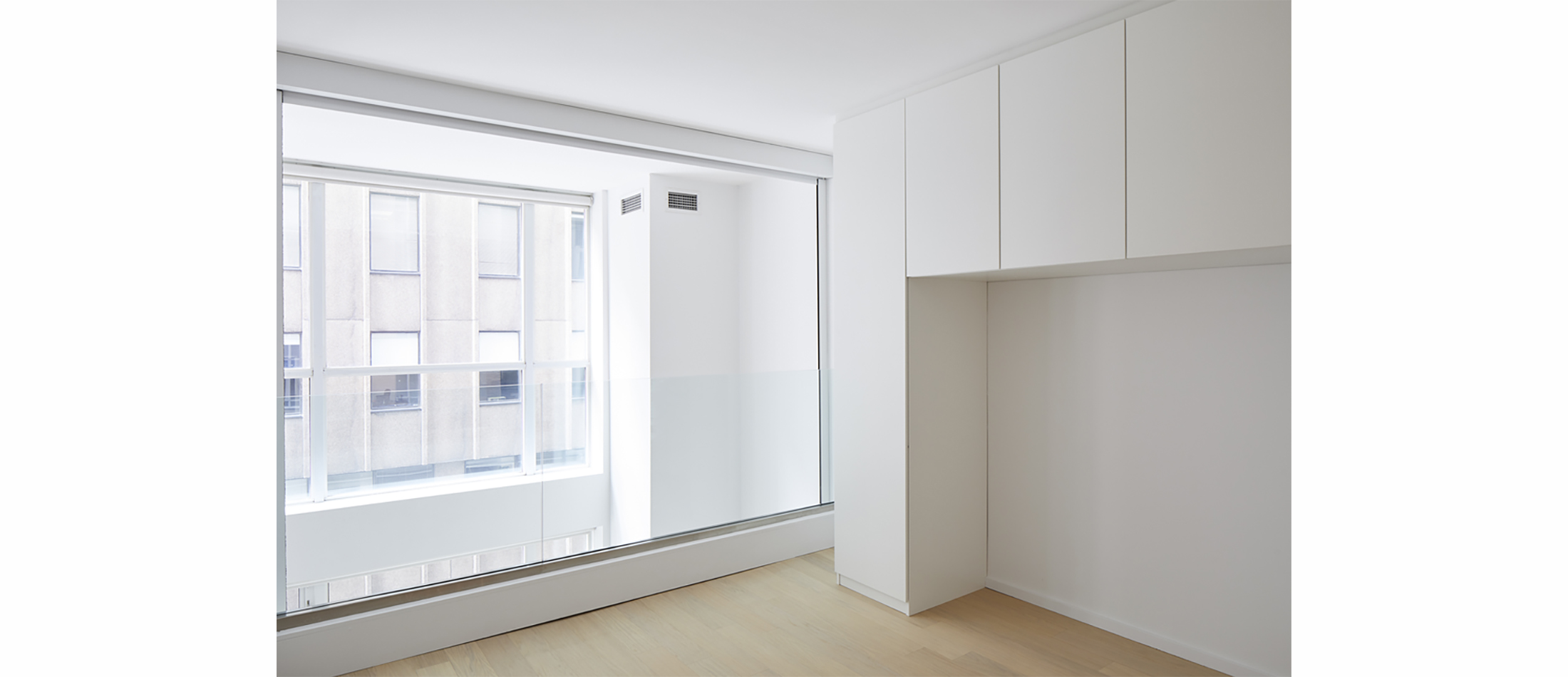
There were two awkward tiny bathrooms on the second story and the master bedroom ceiling was extremely low. We raised the ceiling and removed one of the bathrooms to open up the space and create a large area for a wardrobe and one large adjoining bathroom as part of the master suite and the nursery. Pocket doors were installed between the bedrooms for privacy when necessary.
+ Interiors
A Victorian Semi Gets a Lift

+ RAISE THE ROOF BEAMS
Elias + was approached by a young couple who needed more living space for their growing family. Buying a larger home was out of the question given the increased cost of Toronto real estate. It made more financial sense to renovate the home they had been in for seven years.
In order to do this we had a three-branched strategy.
The first branch was to open the interior, unify common areas into an open plan, and raise the home’s roof forming a third story master suite. This allowed us to create a bright airy open space. A two story addition increased the square footage to include a new powder room and expand the back of the first floor to flow into the garden via sliding doors. This let light penetrate the formerly dark kitchen area.
Minimalist detailing replaced deteriorated neo-traditional wainscoting, crown molding and baseboards. Doors and windows, previously diminished by framing and mullions, were replaced with large expanses of glass, maximizing light penetration.
A newly designed contemporary staircase became a sculptural element and unifying device for all three levels.
The second floor bathroom was moved to allow more open space for a play area. One of the children’s bedrooms was expanded onto the roof of the addition.
The program requested by the clients for the master suite was complex and challenging for such a small space. Both husband and wife were university professors commuting to their jobs out of the city and wanted individual workspaces away from the children. Elias + created two small study areas at the back of the suite facing the back garden separated by barn doors. Maintaining the original roof geometry created dramatic sculptural spaces in the master bedroom at the front of the home. A master bathroom separated sleep and workspaces. This resulted in a series of rooms unified by a hall which sculpturally folded into the staircase. Numerous skylights further enhanced the bright and airy living space.
The second branch connects the inside to the outside bringing the natural elements visually closer to the family’s living spaces. Rooms were focused towards particular views of nature.
The third branch seamlessly melded the historic and contemporary design elements and maintained street character. The scale of the windows and doors were kept. The raised third floor conserved the original roof pitch geometry of adjacent gables. Due to the limited budget, red corrugated metal, which matched the red Victorian brick, was used to clad the addition and allow contemporary interior changes to blend with the exterior. The existing brick on the front of the house (to be repaired and restored later) was kept intact in an effort to maintain the character of the Victorian streetscape.

- Related Projects
+ Interiors
A Victorian Semi Gets a Lift


+ RAISE THE ROOF BEAMS
Elias + was approached by a young couple who needed more living space for their growing family. Buying a larger home was out of the question given the increased cost of Toronto real estate. It made more financial sense to renovate the home they had been in for seven years.
In order to do this we had a three-branched strategy.
The first branch was to open the interior, unify common areas into an open plan, and raise the home’s roof forming a third story master suite. This allowed us to create a bright airy open space. A two story addition increased the square footage to include a new powder room and expand the back of the first floor to flow into the garden via sliding doors. This let light penetrate the formerly dark kitchen area.
Minimalist detailing replaced deteriorated neo-traditional wainscoting, crown molding and baseboards. Doors and windows, previously diminished by framing and mullions, were replaced with large expanses of glass, maximizing light penetration.
A newly designed contemporary staircase became a sculptural element and unifying device for all three levels.
The second floor bathroom was moved to allow more open space for a play area. One of the children’s bedrooms was expanded onto the roof of the addition.
The program requested by the clients for the master suite was complex and challenging for such a small space. Both husband and wife were university professors commuting to their jobs out of the city and wanted individual workspaces away from the children. Elias + created two small study areas at the back of the suite facing the back garden separated by barn doors. Maintaining the original roof geometry created dramatic sculptural spaces in the master bedroom at the front of the home. A master bathroom separated sleep and workspaces. This resulted in a series of rooms unified by a hall which sculpturally folded into the staircase. Numerous skylights further enhanced the bright and airy living space.
The second branch connects the inside to the outside bringing the natural elements visually closer to the family’s living spaces. Rooms were focused towards particular views of nature.
The third branch seamlessly melded the historic and contemporary design elements and maintained street character. The scale of the windows and doors were kept. The raised third floor conserved the original roof pitch geometry of adjacent gables. Due to the limited budget, red corrugated metal, which matched the red Victorian brick, was used to clad the addition and allow contemporary interior changes to blend with the exterior. The existing brick on the front of the house (to be repaired and restored later) was kept intact in an effort to maintain the character of the Victorian streetscape.
+ Interiors
1890’s Annex House
+ THE CHALLENGES
+ Interiors
1890’s Annex House
+ THE CHALLENGES
+ Interiors
1890’s Annex House
+ MODERN INTERVENTION
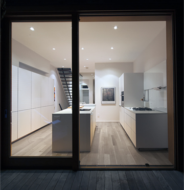
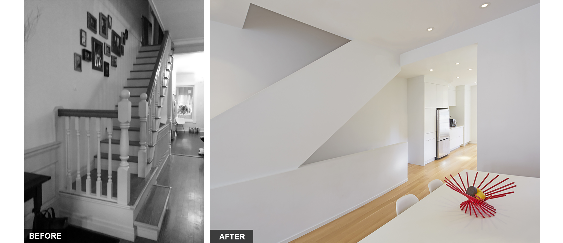
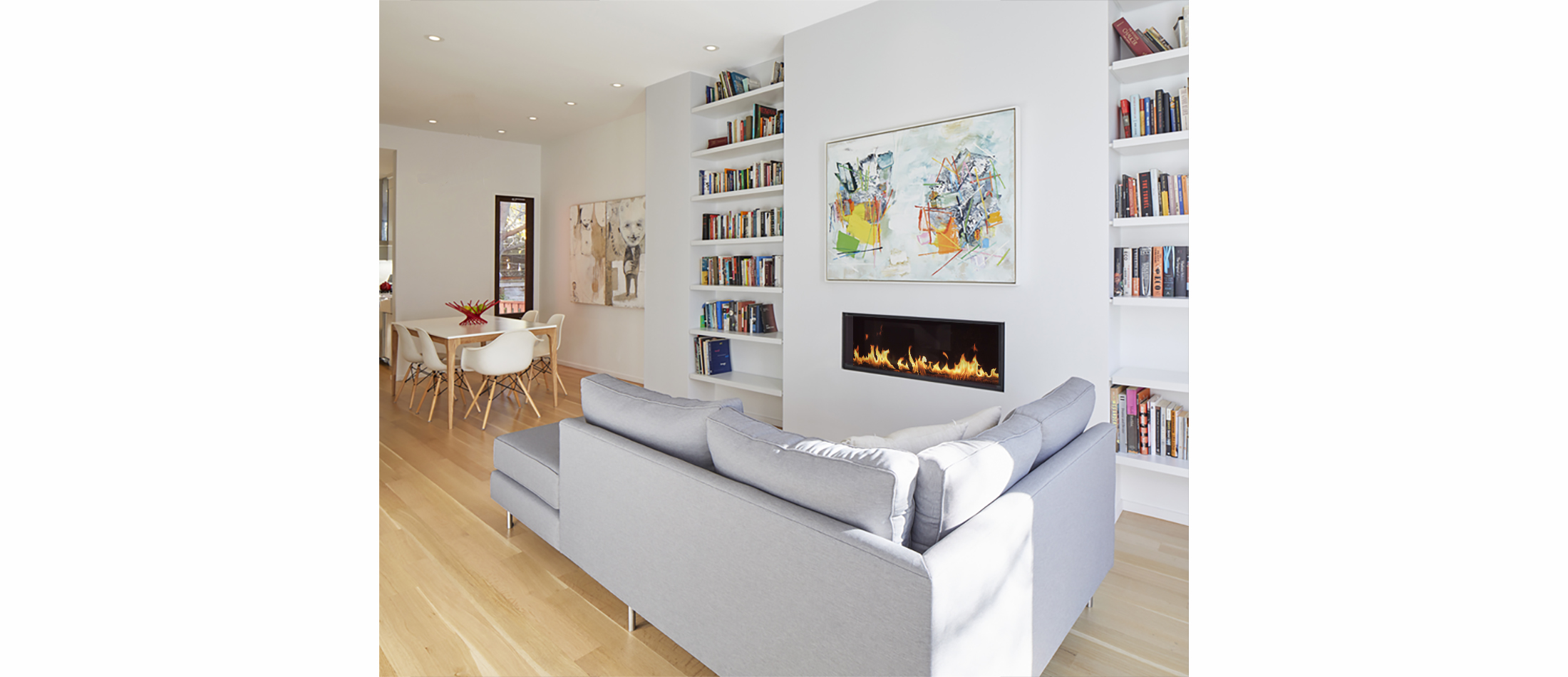
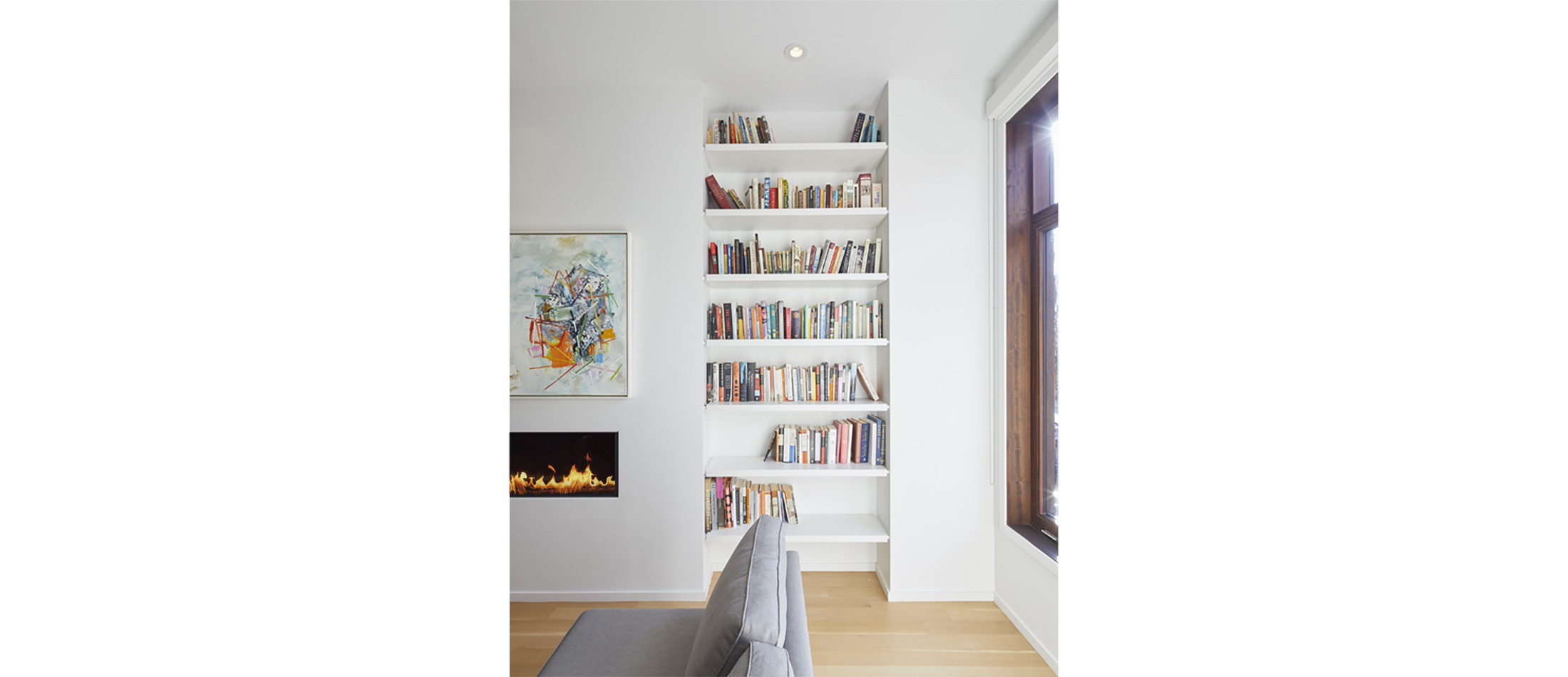
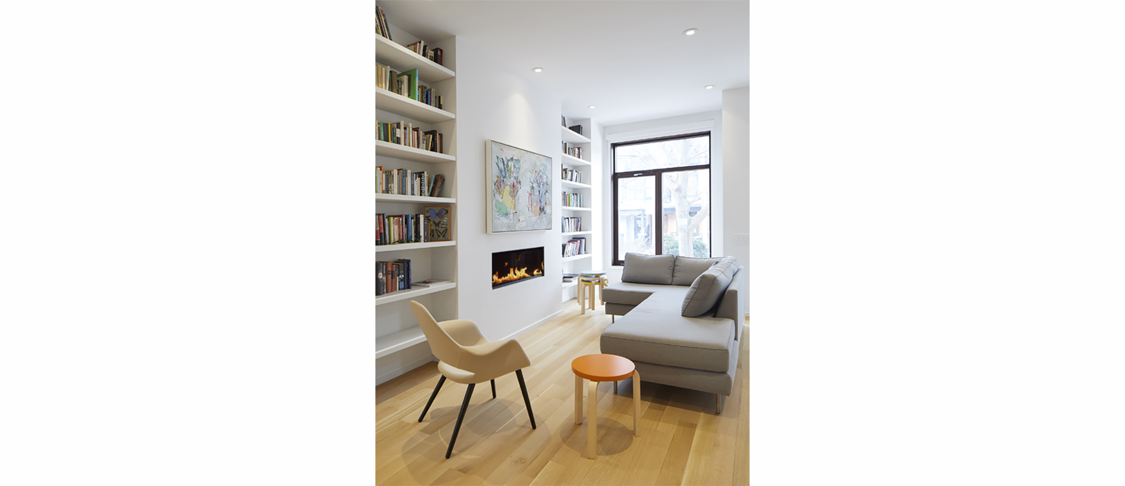
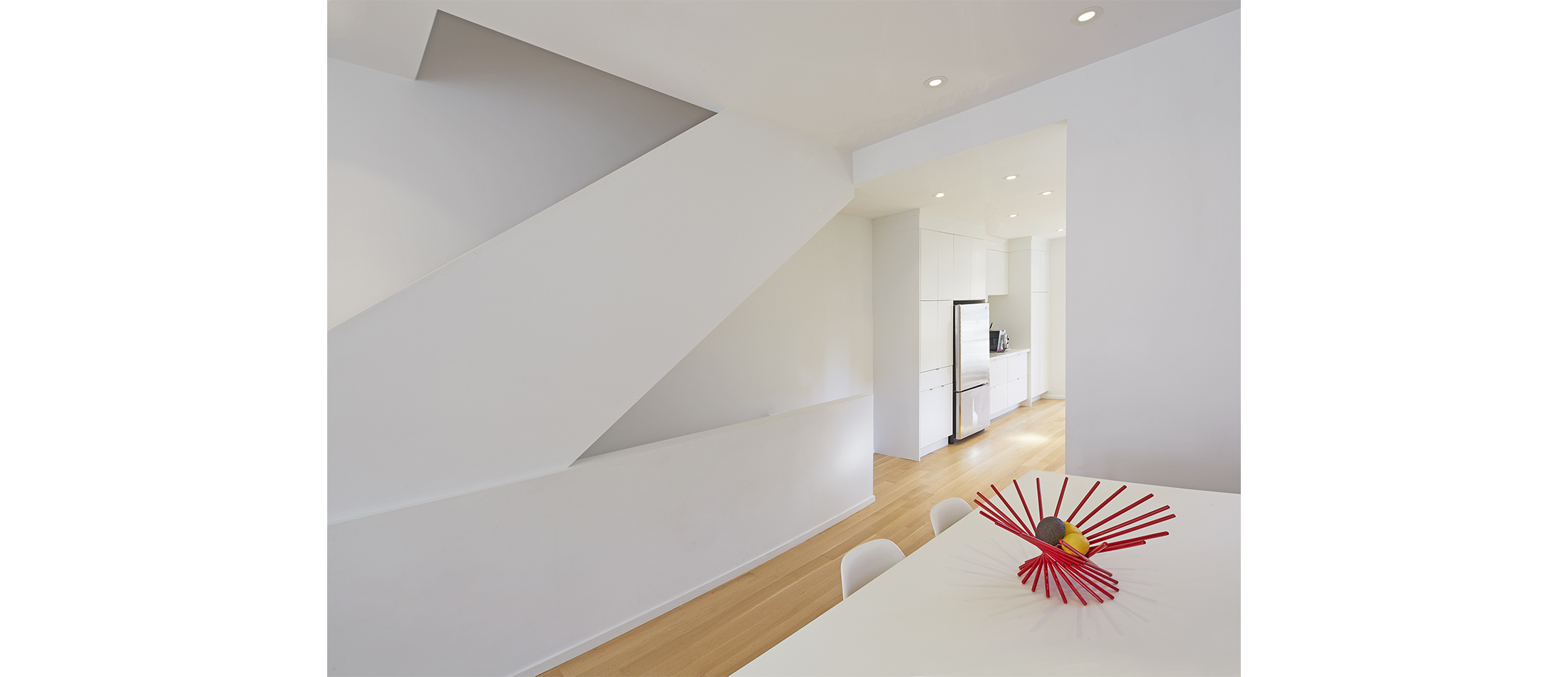
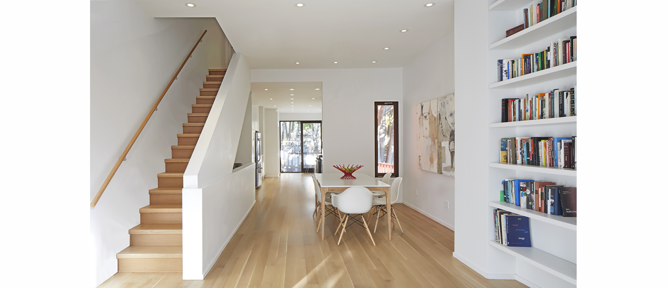
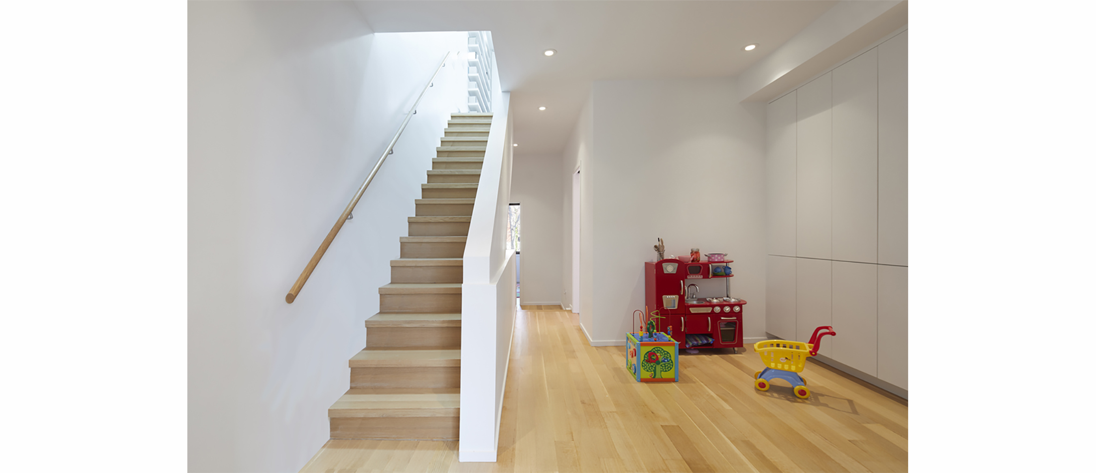
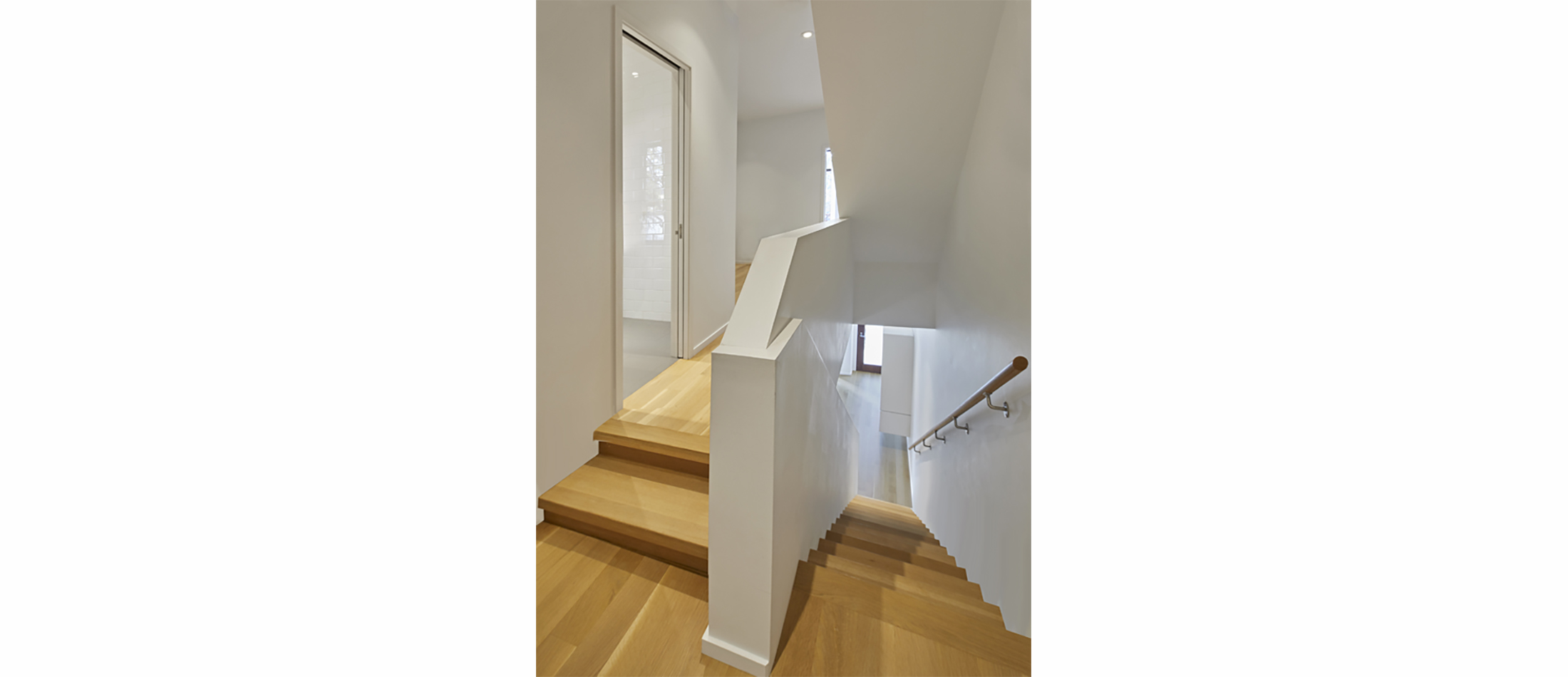
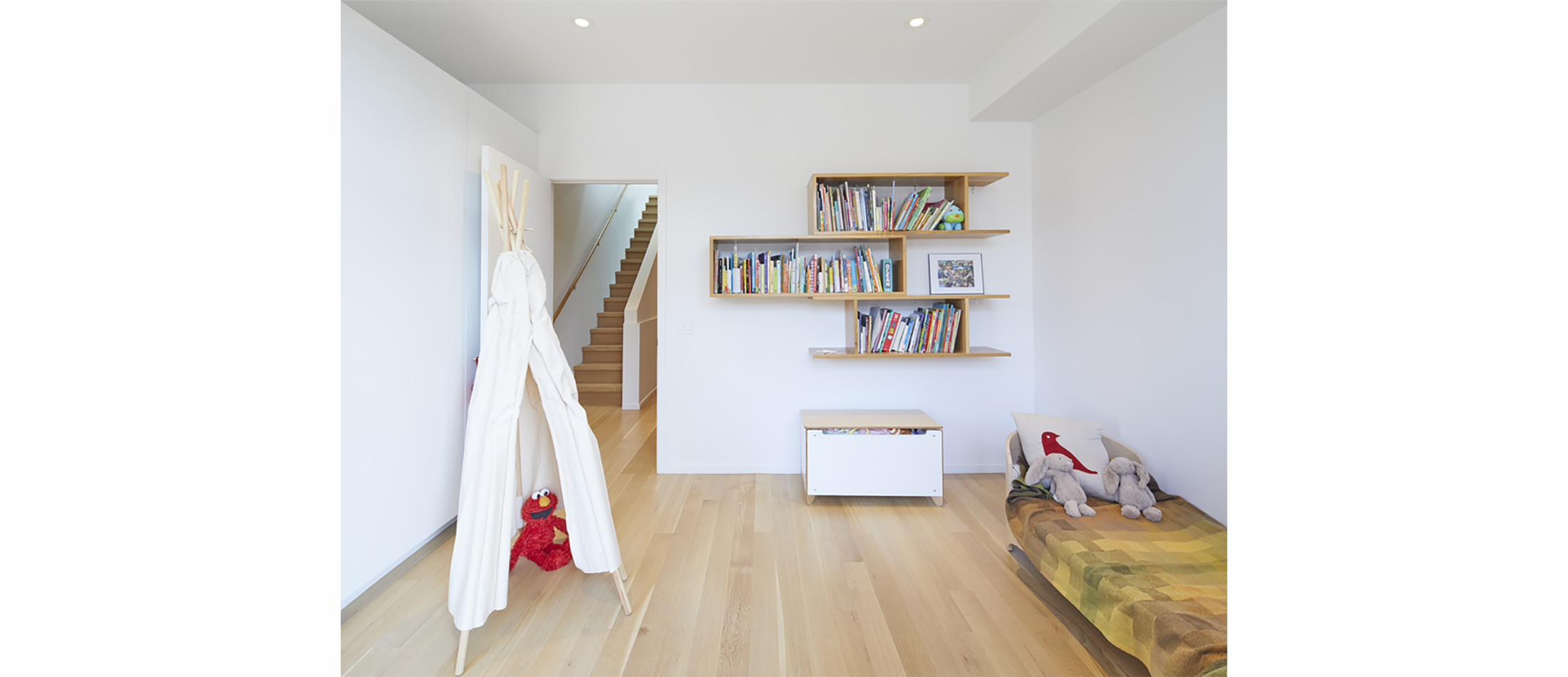
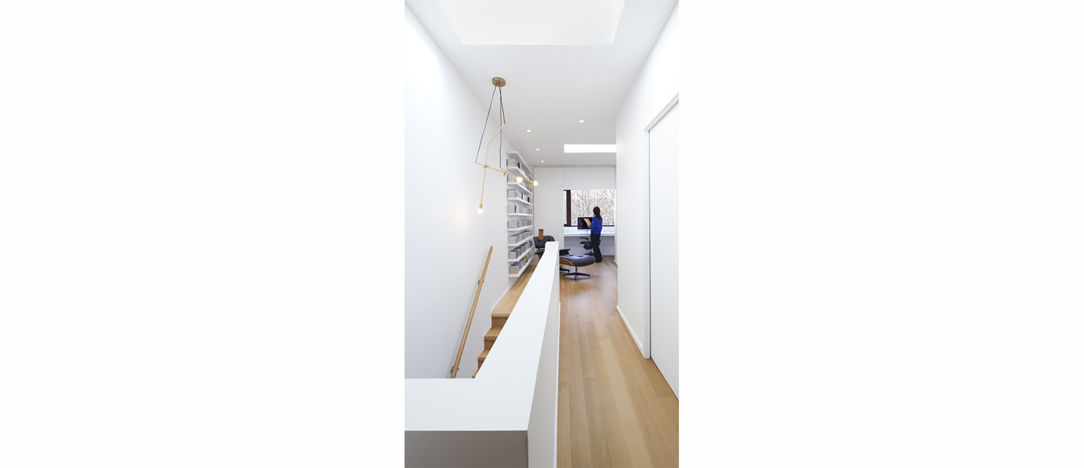
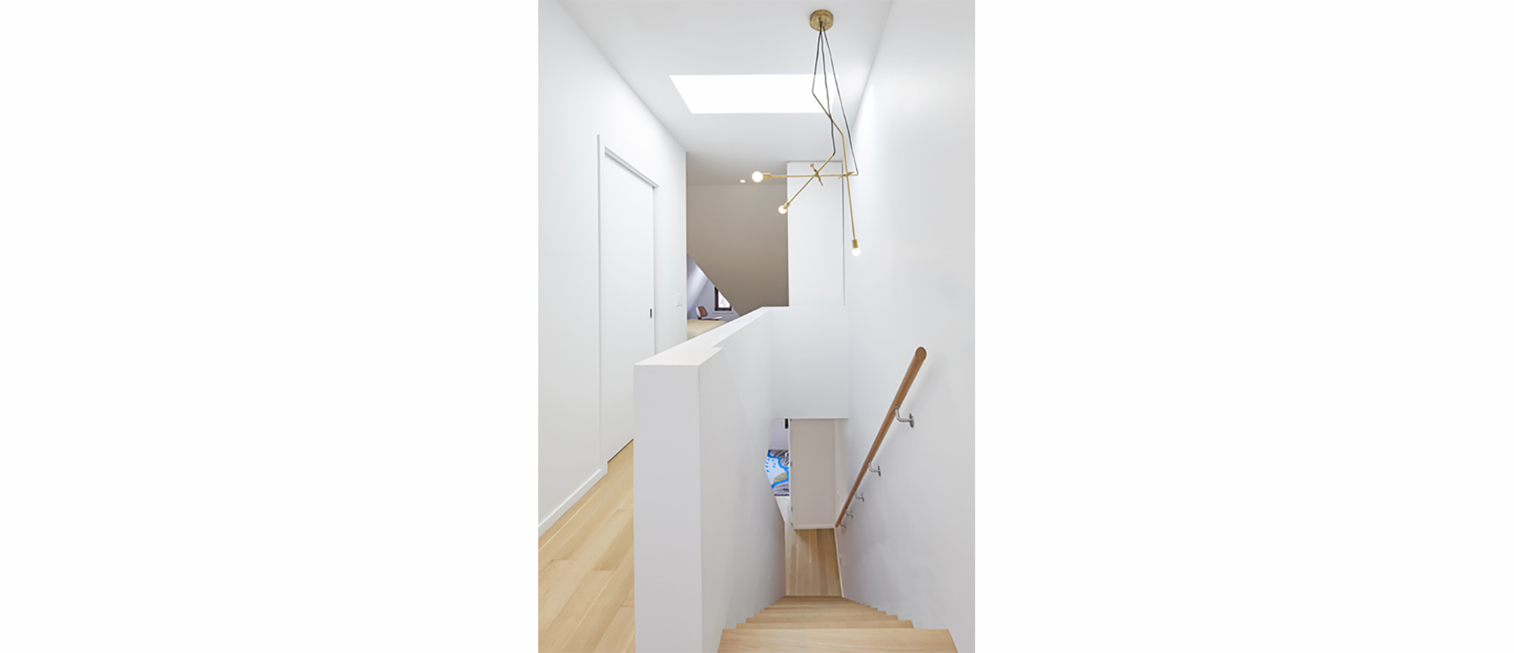
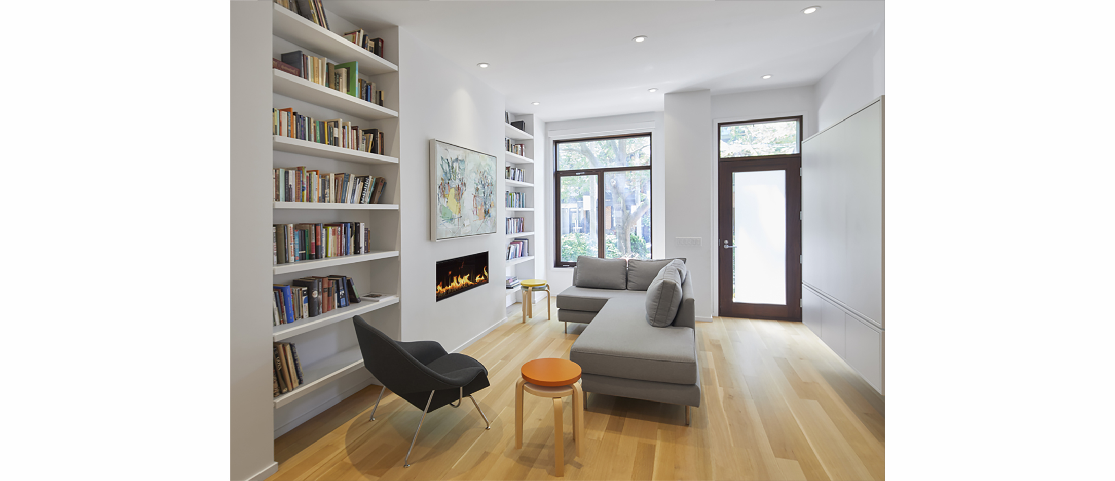
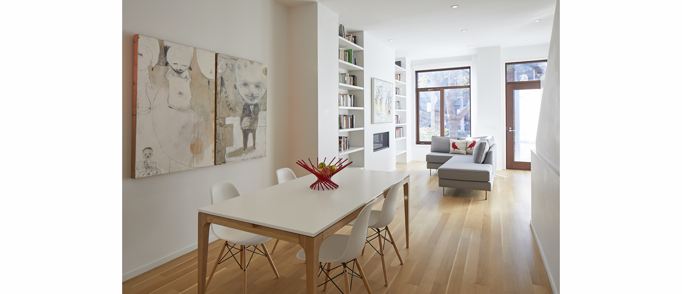
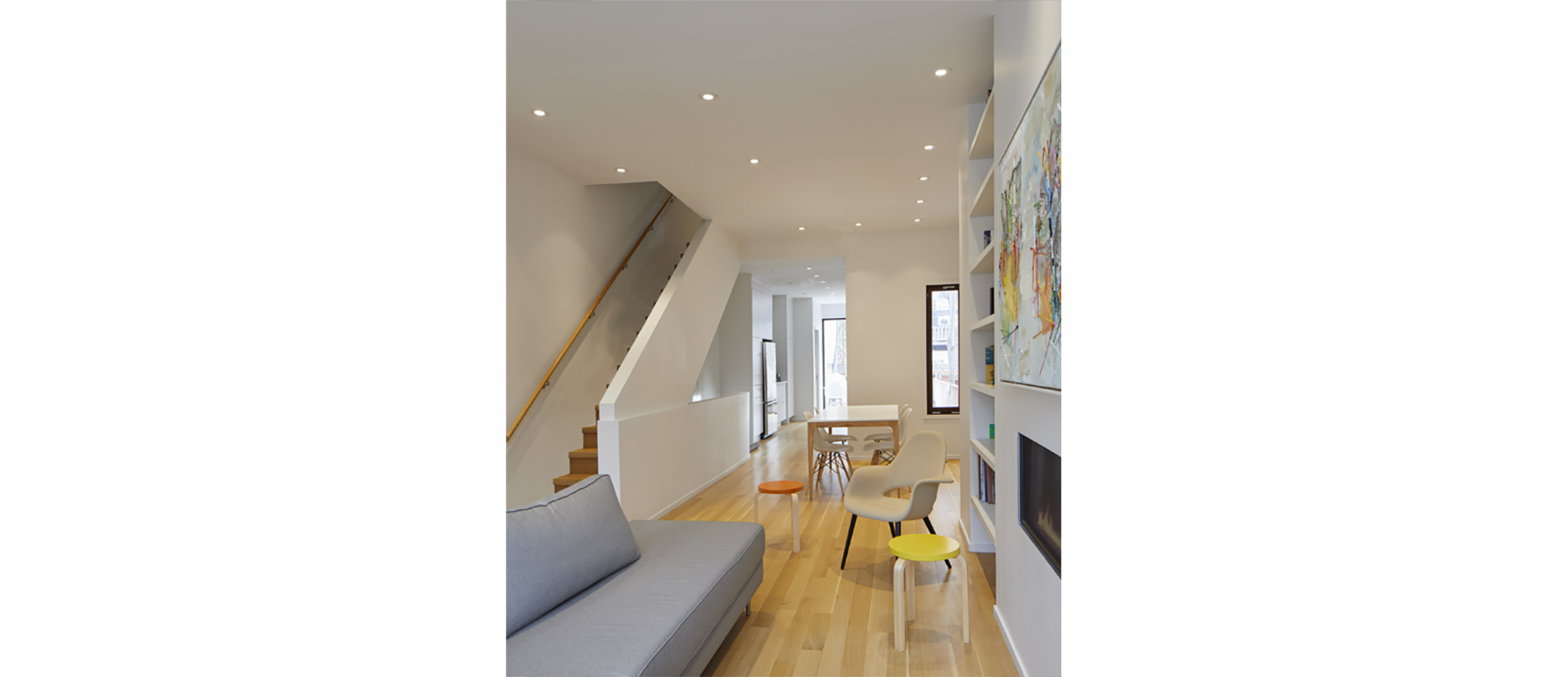
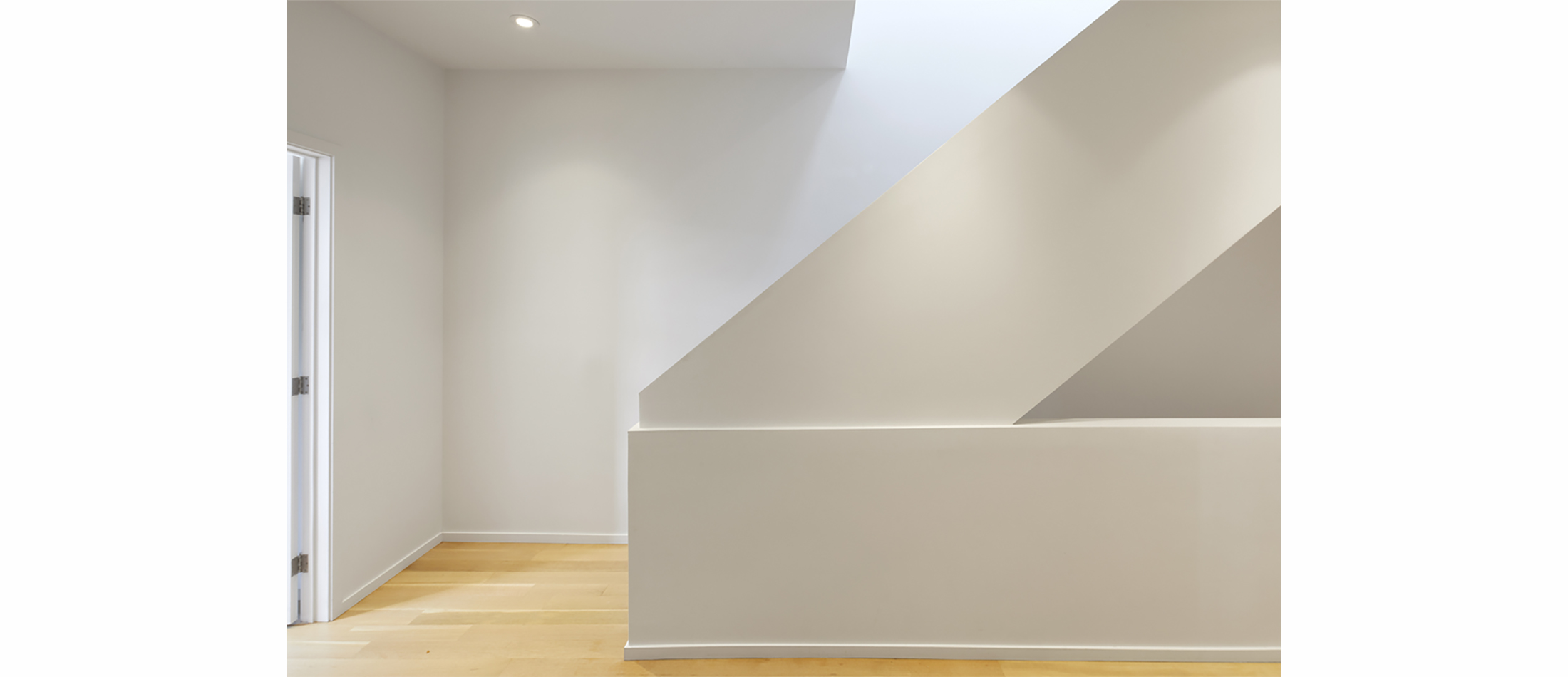
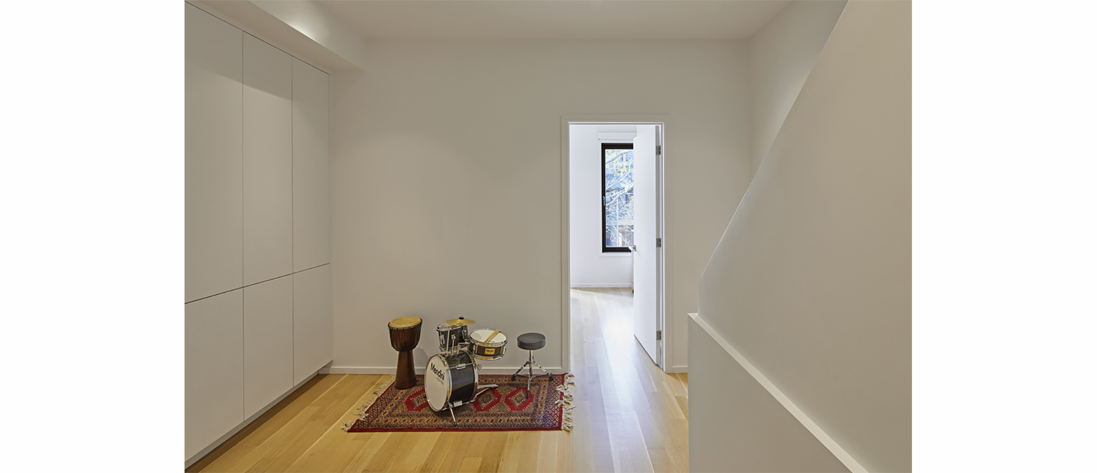
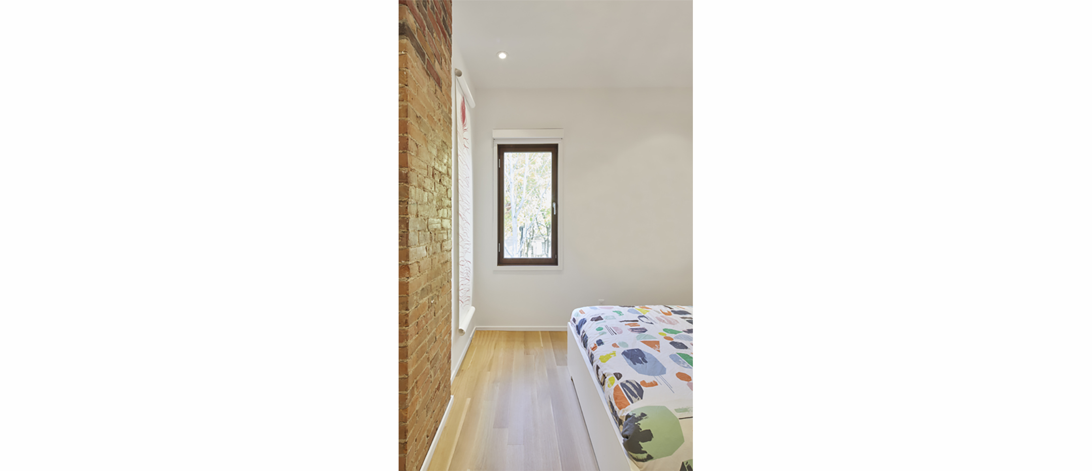
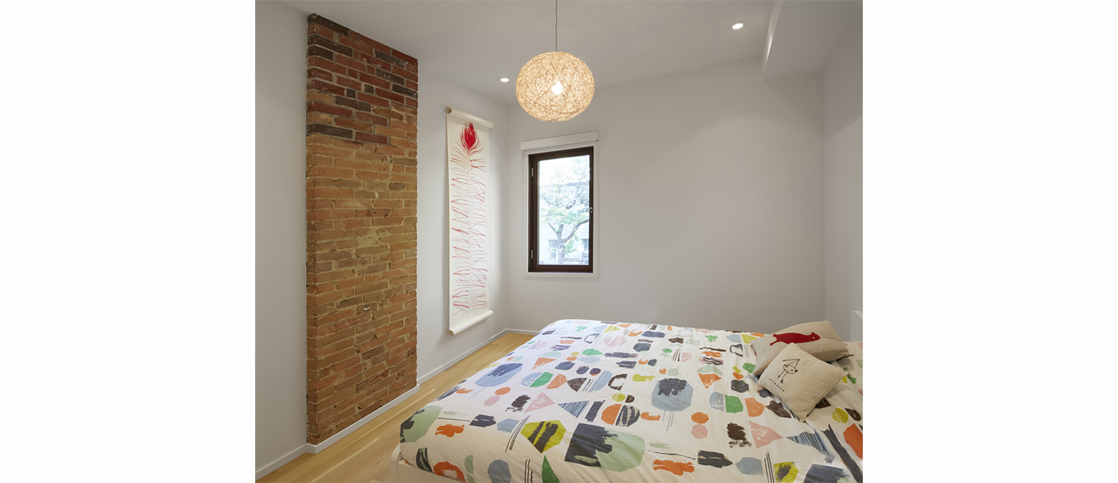
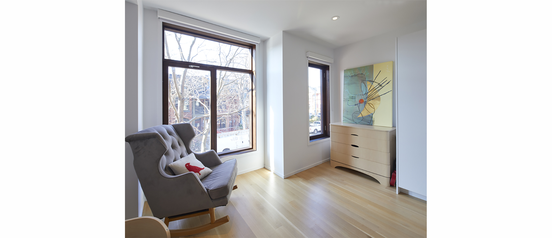
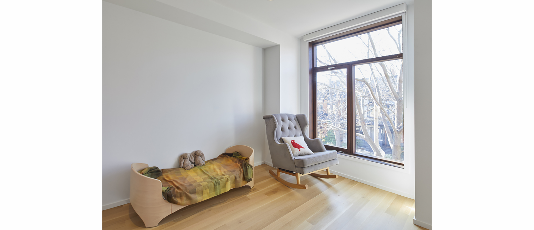
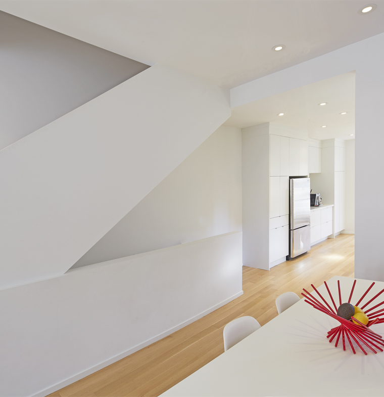
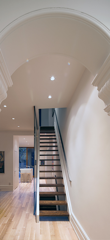
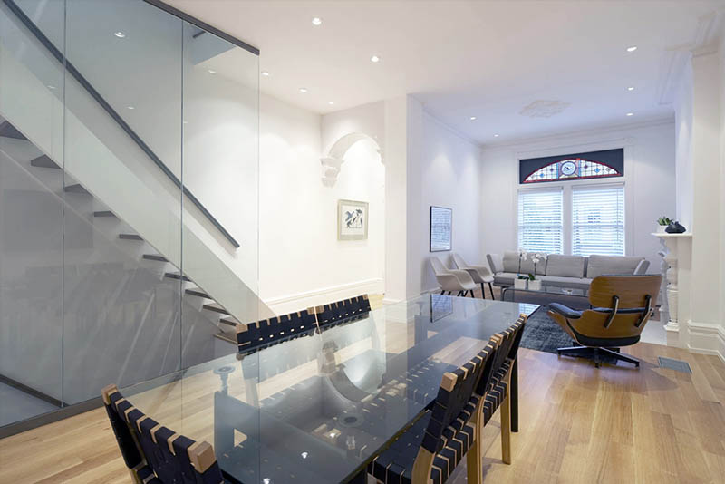
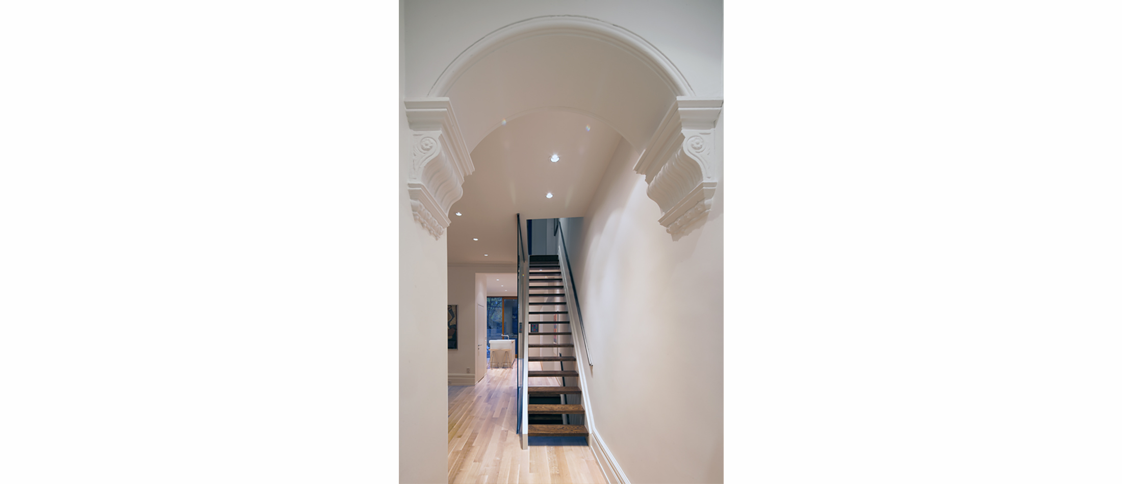
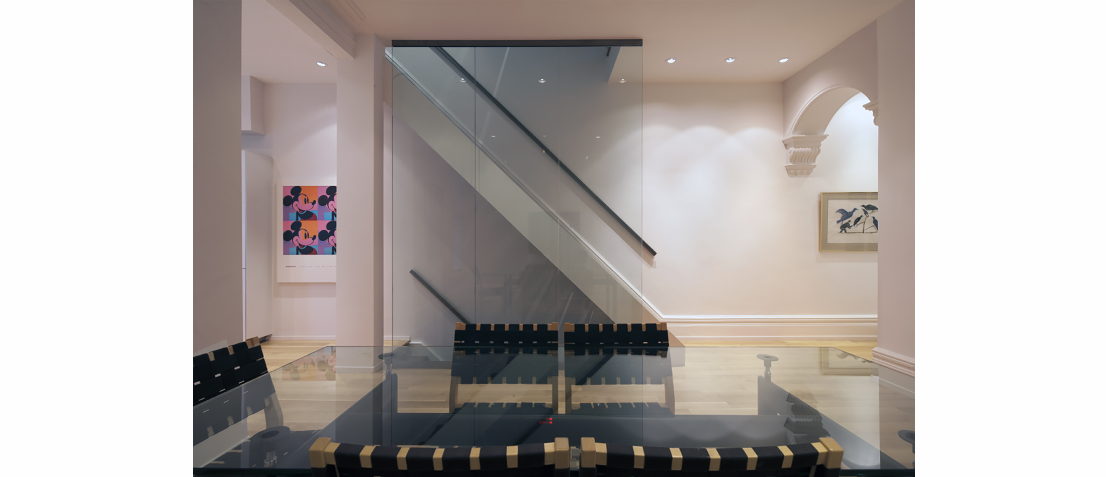
The Toronto Annex is one of the few designated historical districts in the city. This house constructed in 1890, is an example of well -crafted Victorian exterior architecture. Although the original floor plan was intact, there was very little of the interior detailing left. A typical semi–detached Victorian floor plan is long and narrow. It usually consists of a series of small rooms back to back with little exposure to natural light. The stairs are efficiently placed at the side of the main entrance and follow the 4 floors from basement to the top of the residence.
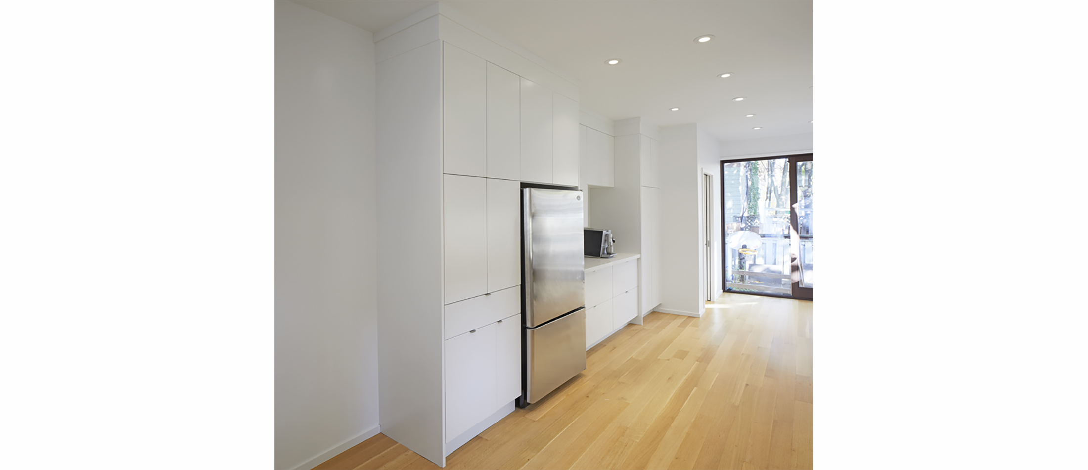
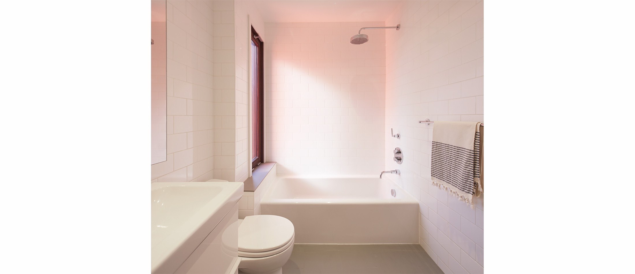
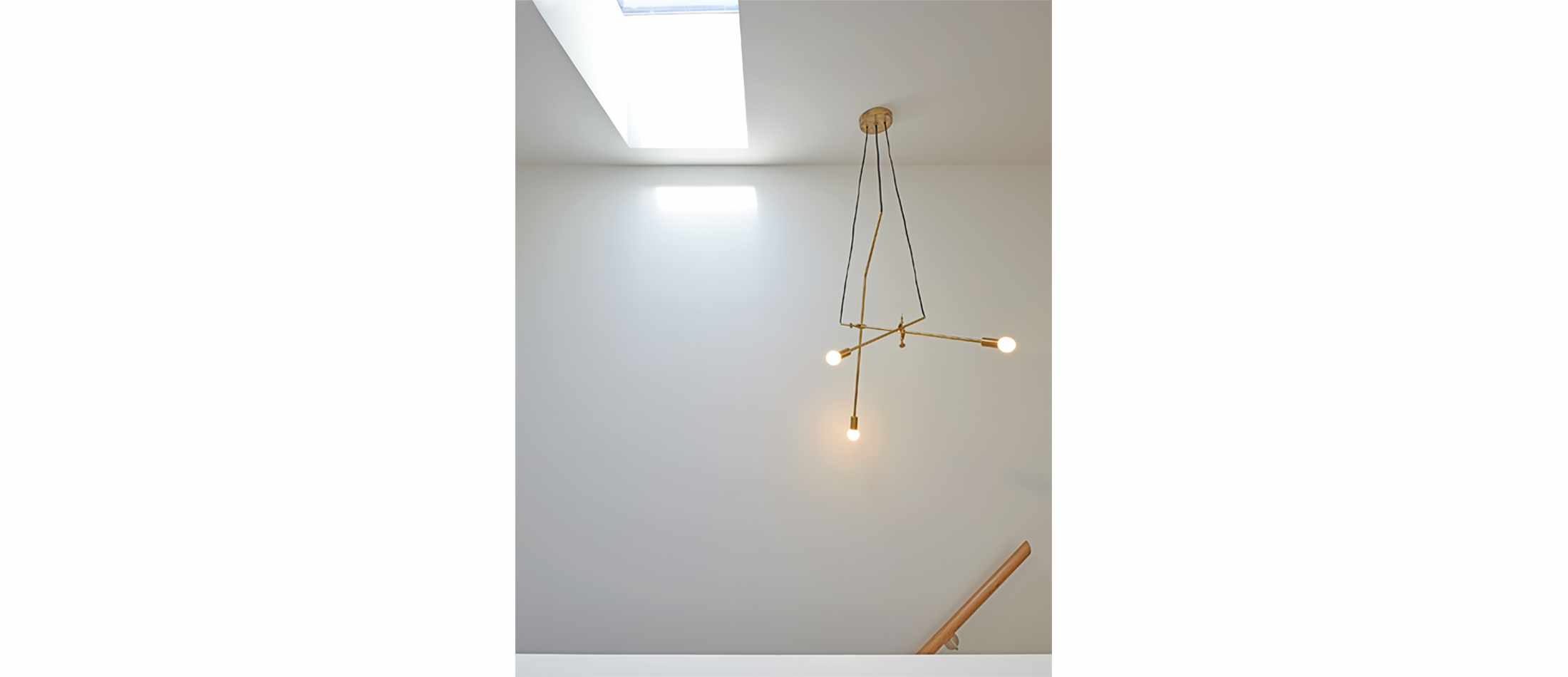
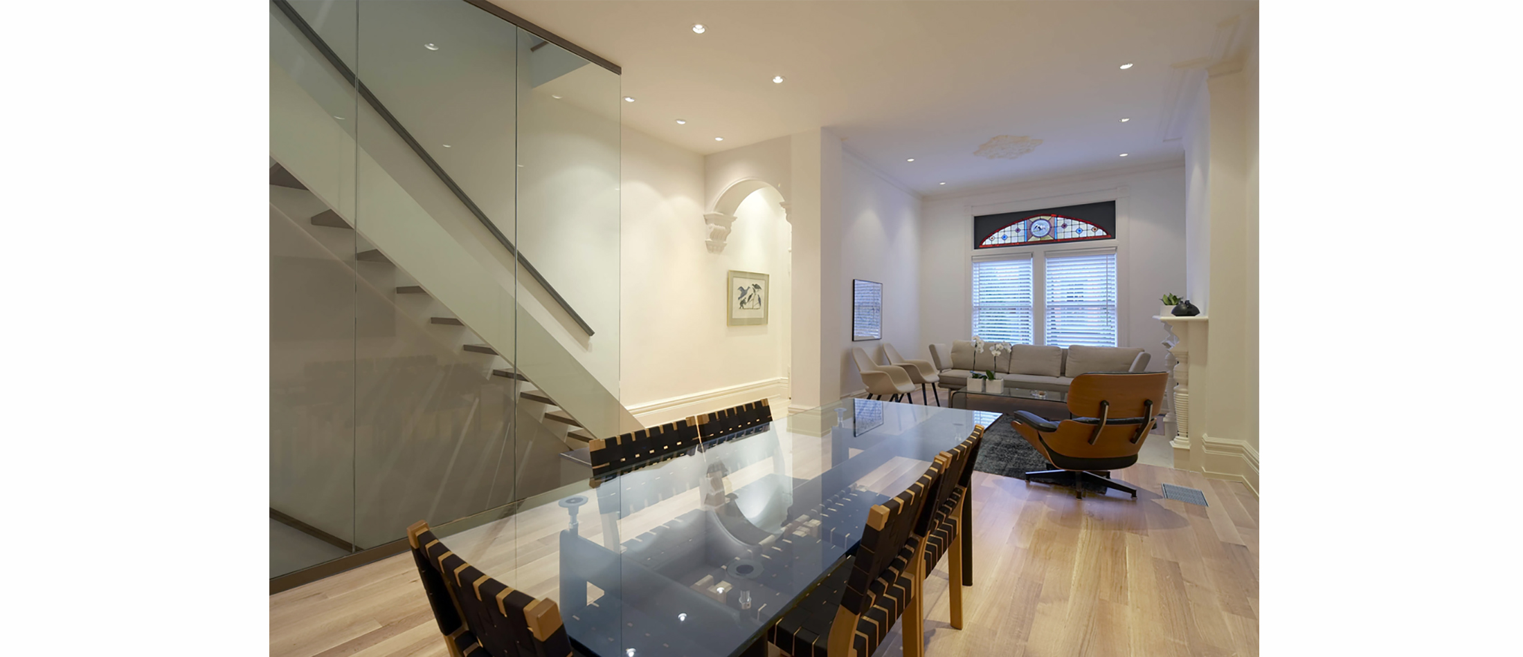
A strategy was developed to transform this generic Victorian house plan to accommodate a contemporary lifestyle and more light. The original stairs were kept as a single straight run; but replaced with wooden oak open risers. The back portion of the roof was raised and skylights inserted. Two major structural walls were removed. Both were replaced with hidden ceiling beams so as to maximize the height and open width of the plan and fully utilize the 4 m. across .Thin glass walls replaced the old stairwell walls and the central glass wall penetrated the 3 floors of the house creating an airy continuous material flow through the house. This flooded the interior space with natural light and spaciousness.
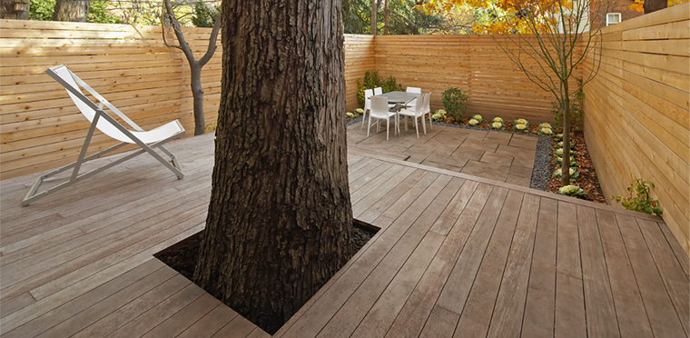
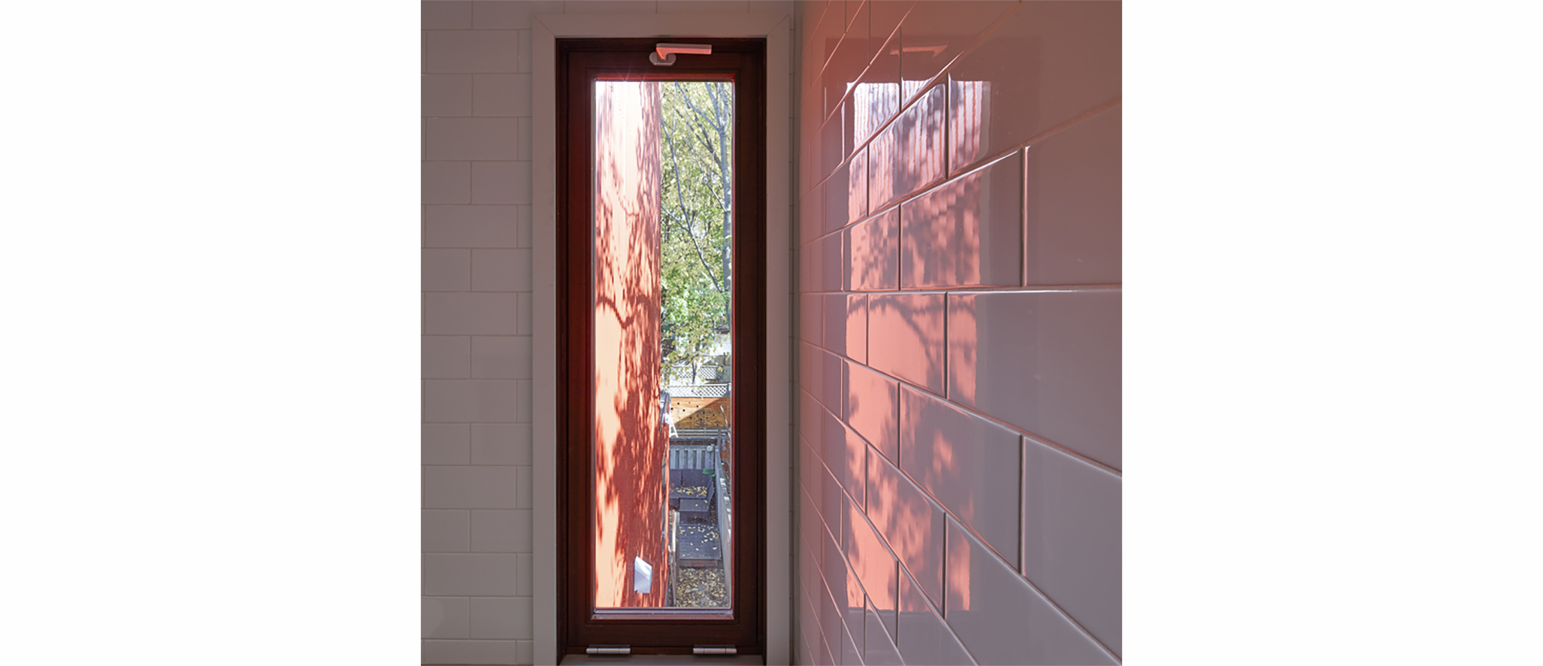
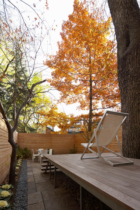
The south facing glass wall of the kitchen was designed to absorb passive solar energy. A large maple tree in the middle of the back deck was maintained for the sculptural effect of the massive trunk, and as a shade umbrella for the home during the hot summer months. This created a stronger connection between inside and outside and was reinforced through the ipe deck which maintained the continuous flow of the wooden kitchen floor into the back garden.
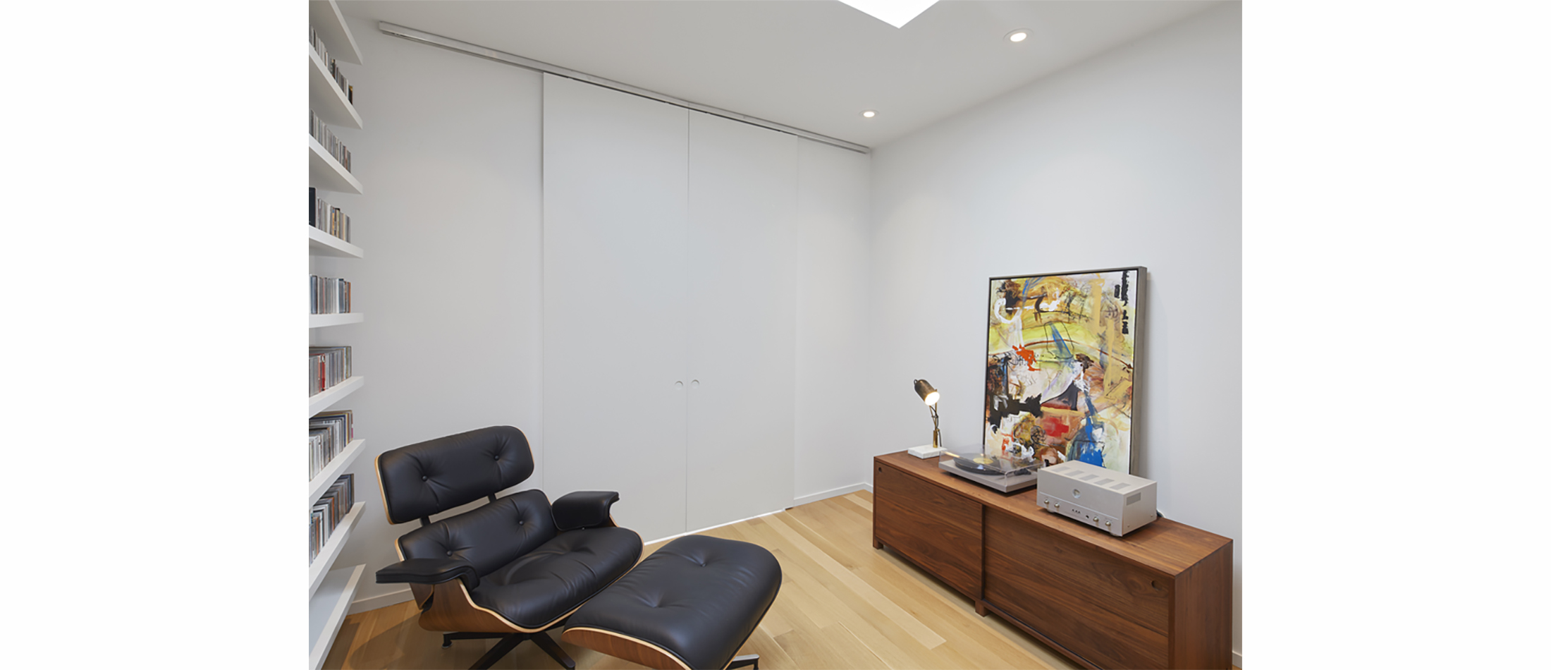
An “exacting minimalist approach to detail” was taken. A Bulthaup kitchen, custom cabinetry throughout the house and cold rolled steel handrails repeated this design principle and reinforce the modernist architectural continuity.
Memory traces of Victorian life were retained in the few Victorian architectural details left untouched by past renovations; an exposed rafter of the former third floor roof; stain glass windows, an arched entry vestibule, a whimsical living room fireplace and plaster medallions in the ceiling.

+ Interiors
1890’s Annex House
+ THE CHALLENGES
- Related Projects