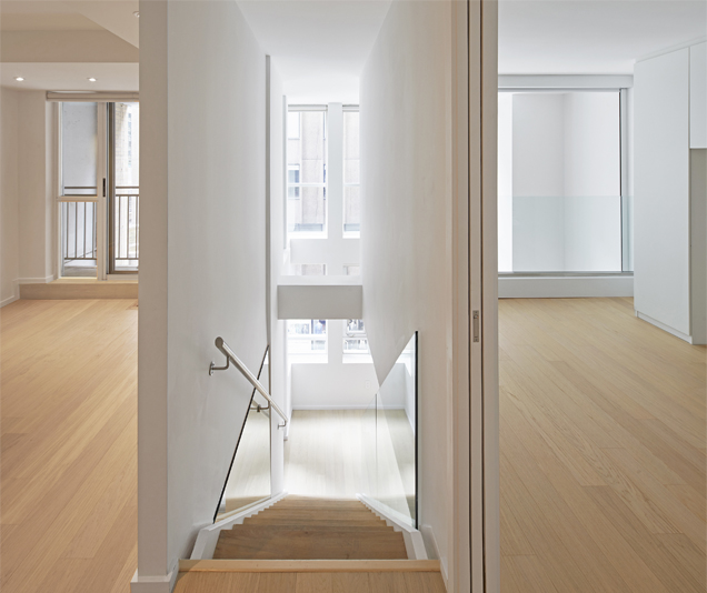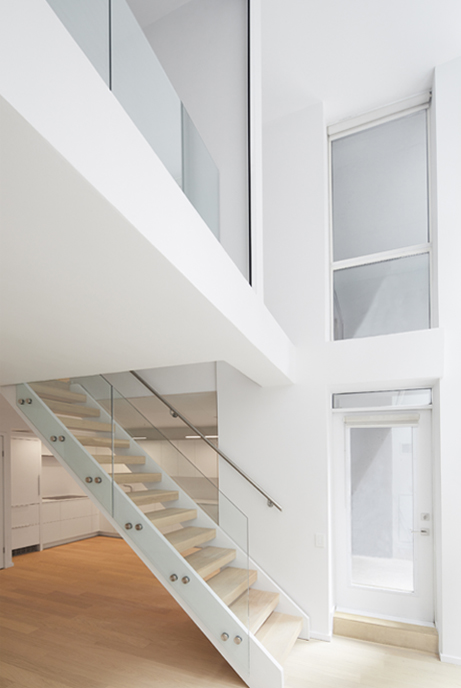

There were two interesting features in this condo that we wanted to highlight and improve upon. It was an atypical two-story 1 bedroom + den condo with an interesting atrium structure and a large expanse of two-story glazing. However, in spite of these features, it was a poorly planned living space. Ceilings in general were low. There was still a lack of natural light. Three large bathrooms took up an unnecessary amount of space. Storage was limited.
Our central concept was to open up the space, create a better flow of movement and function, increase natural light and highlight the delightful existing architectural structure of the atrium.
The kitchen was closed in with a low ceiling, cutting out light. An L shaped counter chopped up the kitchen from the dining space. It was removed and reorganized to open up the dining, kitchen and living areas. Ceilings were raised where possible. New task lighting was added.
The owners were a young couple establishing a new family. They wanted to create a nursery in the den without permanently blocking natural light. We installed an automated black out blind that became a movable wall, which would allow daylight to penetrate and darken the room as necessary. This also allowed air conditioning and heating to flow freely through the area.
There were two awkward tiny bathrooms on the second story and the master bedroom ceiling was extremely low. We raised the ceiling and removed one of the bathrooms to open up the space and create a large area for a wardrobe and one large adjoining bathroom as part of the master suite and the nursery. Pocket doors were installed between the bedrooms for privacy when necessary.